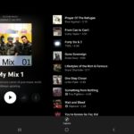
YouTube Music is the next Google App to show some love to tablets. The updated interface brings a slight change to landscape mode display that better utilises the available space.
Rather than having the track list under album art, this is now moved to the right with the playback controls under the art. This leaves the controls on screen at all times, with the track list easily scrollable.
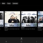
There are also less prominent changes in the search inerface with watch again and personal mixes now easier to navigate. These are just some of the changes being impemented on Google apps in readiness for the Pixel Tablet launch next year.

