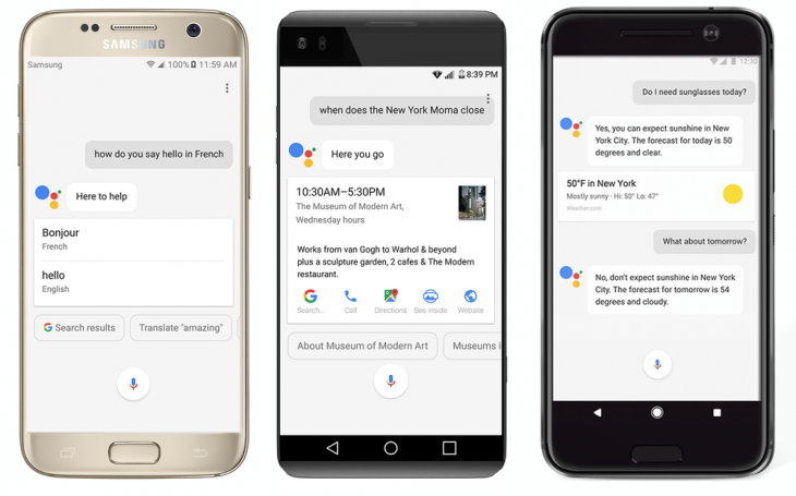
Google Assistant has slowly but surely been changing to a more visual experience, especially with the advent of smart displays over the last year. Once the realm of card-based responses that had few visual elements, Assistant can now return images, on-screen controls and much more.
From today, Google is now rolling out changes that will bring this experience to Assistant on the mobile as well, and though we’ve not got the update yet, the images from Google look promising.
The focus on these new updates is “better visual responses and more complete information at a glance.” Cards will now present “key information” that users are asking for in a straightforward manner with better formatting.
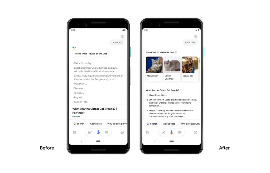
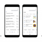
The first major change is changing some responses to be more visual, to return results that look less like a web-page search result and more like something you’d find useful. Take for example this query about “cute cats”:
For other results which don’t lend themselves to this new format, you would previously get a horizontally-scrolling carousel of text results. This looked pretty ordinary, and didn’t give you “at a glance” visibility of the results available. These are now gone, replaced with a vertical list more akin to Google search results:
Other features are getting an update too. Stock results will feature an in-line graph which is fully interactive. News stories – including AMP results – will appear below the typical stock information.
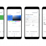
Events are also being updated, with map or image previews and filters. Users can also save events using the built-in bookmarking feature. There’s also a handful of new tools, such as a tip calculator for our American friends (who don’t pay their servers an appropriate minimum wage), a metronome music pacer, a HEX colour mixer and even a virtual spirit level.
These features are coming to Google Assistant soon, and you should probably see them within a week or so.

