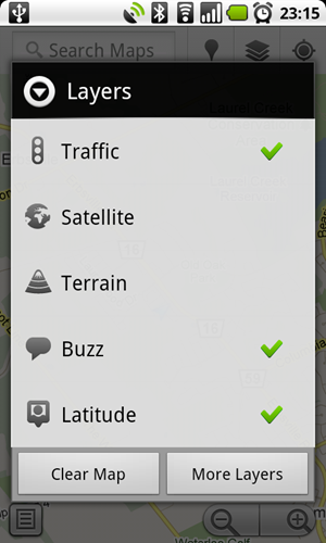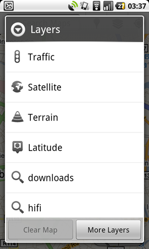

What you see above is the same menu found in Google Maps 4.60, but on the left is how it appears in Android 2.3 (Gingerbread) and on the right is how we see it in Android 2.2 (Froyo). There is no secret option to turn this design on, it was found by a Freenode IRC user canadiancow who noticed that API level 9 (Gingerbread) was a folder within the APK and recompiled it as an API level 9 app and it came out like this.
I for one think the new UI design is very, very nice and makes Android look for more profession and slick. It looks very Adobe Air/TweetDeck which is a good look. What are your thoughts?


These changes look so minor, I doubt I would even notice without a side-by-side comparison.
You think the current phones like the Desire, Galaxy S, Nexus One will get Gingerbread at some point in time? I assume the only thing in question would be the hardware specs of the phones.
But what am I saying, I have a Galaxy S and still waiting for 2.2. If Samsung announce 2.3 will come to the Galaxy S, I guess the ETA would be somewhere in the new decade?
I really hope the UI improvements extend more than just some simple aesthetical changes. This screen shot is very underwelming.
Gingerbread is meant to be a lot of UI changes.
I hope so. I can’t say that this story or screen shot was much to comment about that. I would like to see the UI overhauled, not just brushed up. HTC did a fantastic job of their android software. If I could have the same UI experience on a Samsung Galaxy S, I would be very happy.
The squared off look is nice. Not entirely sure about removing the lines between items in the menu. Sure it looks ‘clean’ but at the expense of easy understanding of the items. I would imagine it’s merely an option to have them or not anyway. In general though it looks more polished.
The black band at the top of the layer window makes a huge difference as it’s true black. If you have a Super Amoled Display you’ll know what I’m talking about 😛