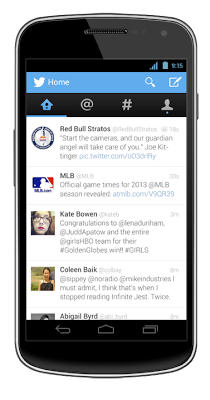
The official Twitter app has been updated to version 4.0, bringing with it a new design that finally fits in with Android’s Holo design language, autocompletion of usernames and hashtags and the ability to show photo galleries, apps and product listings in Tweet detail screens.
Having been quite a critic of previous versions, I have to say I’m impressed. The new design is clean, simple to use and importantly; flows with the rest of the Android system. Lateral swipe controls have been added, allowing you to swipe left/right to navigate naturally between the Timeline, Connect, Discover and Me tabs. Subtle transitions between view modes in the app help also to give you a physical sense of where you are
You’ll find that the new 4.0 version brings better integration with external Tweet sources (games, other apps, etc), allowing you to open or even install the relevant app if you don’t already have it. This brings a nice benefit to developers who allow users to share content via Twitter’s API.
Twitter also noted on their Blog:
As you type your Tweet or search, you’ll see username and hashtag suggestions, making it easier to connect with friends and join conversations.
Lack of autocomplete functionality was a very big bug bear for me (and most of the Ausdroid team). Why this wasn’t included three versions earlier, I’ll never understand!

[app]com.twitter.android[/app]
Is this overhaul enough to get you to look at the official app, or is it too little, too late? Let us know in the comments below.


This update was enough for me to install Twitter again. It’s feels quick and lite.
I know I can’t keep using Tweet Lanes, Twitter will eventually kill it off. For now, I’ll use both.
The Autocomplete and multiple accounts (thanks work) are two major bonuses.