For a long time, there was no guidance from Google on what an Android application should look like, and so application developers either designed their own UI from scratch, or more commonly, copied the design of iOS applications for want of anything better.
Once Google hired Matias Duarte to head up Android’s User Experience team, Android finally had a design direction, and a published set of guidelines to help developers and designers create applications that were uniquely Android. I’m a huge fan of the Android Design Guidelines, and there have been some truly beautiful applications created as a result, but there are still many applications out there that play by their own rules.
During the week, Yahoo updated their weather application for Android, and the result was beautiful, but the app did not follow Duarte’s design guidelines, most annoyingly having the legacy menu button pop up on smartphones with soft-keys, even though pressing it actually does nothing. (The application’s performance is not exactly buttery-smooth either, but that may be a separate problem). The application, and the coverage it’s been receiving around the internets prompted Duarte into writing a lengthy post on his Google+ page on the role of the design guidelines in application development and discussing the idea of ‘platform vs brand’, which has been a concern for some developers.
That’s where consistency fits in. The whole point of consistency is to make it easier on users to understand and use things. Let’s take a trivial example. Say you’re designing screw top lids for jars of marmalade. It would seem you could have complete creative freedom here right? I mean if you made the lid solid colored or checkered, short and wide or tall and narrow it’ll work just fine right? Your primary concern is how well does the lid represent your brand right?
Obviously not. Will your lid unscrew with clockwise rotation or counter clockwise rotation? By itself it’s an arbitrary choice right? I mean they both open the jar. Of course we know that’s not true. If you make your lid unscrew in a clockwise direction you will drive everyone crazy because everyone expects lids to unscrew in the opposite direction.
I have always felt that the design guidelines aren’t rigid rules, rather that they should be a framework on which developers can build, which is flexible enough to accommodate branding. After all, if every application used exactly the same styling, Android would be a very boring platform for users and developers alike. Twitter is actually a fairly good example of an application that adheres to the design guidelines, while still retaining their brand. The Twitter application on Android is unmistakably a Twitter application, but its iconography and styling is that of an Android application.

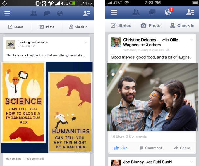
On the other hand, Facebook have taken the ‘brand first’ approach. The Facebook applications for Android, iOS and even Windows phone all look pretty much identical. Rather than use Android-specific UI elements, Facebook have opted to use their own UI elements across all their applications. It’s an example of prioritizing brand over platform, and I understand why Facebook have taken the approach they have, but I don’t think it’s ideal. The less time users have to spend adjusting to your own independent design conventions, the more time they can spend enjoying your application. I’m not suggesting that developers should give up the brand and identity of their applications, but that certain UI elements should be consistent across the platform that is being targeted, such as ‘new post’ and ‘share’ icons.
Consistency and conventions are there to help your users. They help users get things done and not worry about how to get things done. Design guidelines are there to help you understand the consistency and conventions, especially if you’re not from around here.
Does that mean you should slavishly adhere to all of them? Of course not. Especially if you have something new to add that brings unique value to your users. But if you’re being different for the sake of being different, or simply because “that’s how they do it in my country”, you might find that you’re not doing anyone any favors – even if they good naturedly tolerate your eccentricities.
There’s no doubt that Yahoo’s weather application is beautiful, but with only a few small changes, it would fit better with the Android platform and would be a much more enjoyable experience for users. The design guidelines are there to help developers create beautiful Android applications, not to ensure uniformity or to strip apps of their brands. It’s nice to hear Duarte say it himself though, and hopefully it’ll do something to quell the naysayers.
If you’re even mildly interested in design, I’d recommend giving the original post a read – it’s pretty interesting, and I love the jam jar analogy used throughout.