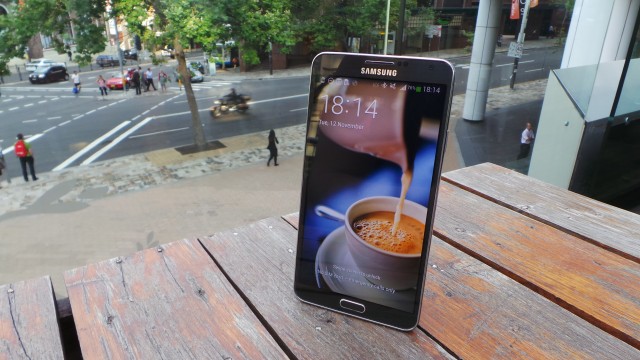
The Galaxy Note 3 is Samsung’s third iteration of its popular Galaxy Note series, which started with a phone that, on release, was considered “niche” because of its supersized dimensions and S Pen stylus input. That initial ambivalence has given way to acceptance and excitement around the device’s now annual revision cycle, after the “niche” device went on to sell over 38 million units over two releases.
Updates to the Galaxy Note series are now met with as much anticipation as Samsung’s Galaxy S series, and the Galaxy Note has inspired other, manufacturers to join in. Samsung themselves also saw fit to expand the series into 8-inch and 10-inch tablet territory, although the smartphone version remains the “primary” Note device, and the one commonly associated with the “Galaxy Note” moniker.
Compared to 2012’s Galaxy Note II, the Note 3 is improved in almost every way: It has a larger and higher resolution screen, weighs less, more RAM, more onboard storage, higher capacity battery, higher megapixel camera, USB 3.0, better processor and improved and updated software.
With the largest screen and best hardware specifications yet seen in the Galaxy Note phone series, it’s time to ask how the Note 3 compares to its competition at the larger end of the handset market, and whether it’s worth an upgrade for owners of earlier iterations of the device.
As a dedicated user of the Note II, I had high expectations for the Note 3. Generally, I was impressed.
- 5.7” 1080 x 1920 screen in a lightweight, comfortable body
- Snapdragon 800 SoC with 3GB RAM
- 32GB on-board storage with microSD expansion
- Excellent battery life
- Screen DPI set too high, fonts and icons are too large
- Notification UI is a mess and needs to be fixed
- Samsung’s Android customisations may delay updates
- Price compared to the competition
Hardware
The Note 3 is a stylish and impressive phone – for a Samsung, at least. The Korean manufacturer isn’t generally known for making iconic phones from a design perspective. The Note 3 isn’t going to take home any prizes in a beauty contest, but it’s a definite improvement.
The handset’s design feels closer to the Galaxy S II than the Note II. The corners are less rounded, as are the sides. It gives the phone an overall “squarer” appearance, and makes for a stylish improvement over the Note II. Unsurprisingly, the Note 3 shares a number of design elements with the Galaxy S4, like the central rear camera placement, chrome trim and speaker grille, cementing its place as a part of Samsung’s 2013 lineup.
The front of the device is instantly recognisable as a Galaxy series phone with the elongated hardware home button underneath the screen, chromed speaker grille and notification LED at the top. On either side of this home button are the backlit capacitive buttons we’ve come to expect on Samsung’s devices – back on the right, and menu on the left. While some will swear that the back belongs on the left, owners of other Samsung phones will be comfortable with this setup. The capacitive buttons can also be used with the S Pen, an unusual oversight on the Note II.
The screen has seen an increase in size from the Note II’s 5.3 inches to 5.7 inches in the Note 3, while the resolution has been bumped up to 1080p. It continues the Note II’s now-standard 16:9 aspect ratio. The bezels surrounding the screen have been reduced, allowing Samsung to squeeze the larger screen into roughly the same physical dimensions as the Note II – a trick that the company also impressed us with earlier this year on the Galaxy S4. The device’s physical width has increased by a barely-discernible 0.1mm. It weighs in at just 168g, and is noticeably lighter than the Note II.
Towards the top of the right edge, you’ll find the power button – positioned to line up with your thumb when holding it in your right palm, or a finger when holding it in your left. The volume rocker on the left edge lines up similarly well with your thumb or finger, so you could consider the phone ambidextrous. The headphone jack is also located in Samsung’s now-standard location – towards the left, on the top edge of the phone. None of these are surprising – Samsung’s used said button and port placement for a while now, and hasn’t sought to change that which isn’t broken.
What has changed, though, is the port on the bottom of the device. It’s a big, ugly, Micro USB 3 port. There’s little that can be said about it, though – it’s a standard connector, even if it’s not yet widely used, and you can still use your older Micro USB 2 cable at a pinch. To the right of this monstrosity is the slot that holsters the S Pen – now more of a square shape, rather than a triangle, which means there’s now 2 correct positions in which you can return the pen.
While much has been made of the faux leather back plate on the device, the truth is that it makes the device comfortable to hold and, really, it’s not too bad to look at. It adds grip, an improvement over the glossy and slippery plastic back plate of the Note II, and reduces the risk of the device slipping straight out of your hand. The original Galaxy Note had a textured back plate, and it’s good to see Samsung return to this design, even though it could be considered a bit cheesy. Time will tell whether it fades or scuffs easily, but quick eBay search guarantees it’ll be easily replaced by an official or third-party alternative.
One of the Note series’ strongest points is that behind that huge screen lies a similarly huge battery. Whatever your feelings on the faux leather back plate, it hides a 3200 mAh removable battery, which ensures that the Note 3 will keep going in even the most power-hungry of situations.
The rear camera lens and its LED flash protrude a little from the rear. Unfortunately this means they’ll always make contact with whatever surface the device is placed on, increasing the risk of scratching the lens.
Display
As you’d expect from a Samsung Super AMOLED screen, the display is bright and vibrant with appropriately high colour saturation. At 5.7 inches with a resolution of 1080p (1080 x 1920) is offers 386 PPI pixel density, so text and photos are sharp, crisp and noticeably clearer than any display I’ve used previously.
The gorgeous display is somewhat let down by the Note 3’s software. The UI DPI which controls the size of onscreen elements is set at 480. In my opinion, this is far too high, and results in unusually large icons and text, wasting the expanse of screen space. The UI elements felt so unnaturally large that I had to check whether I’d accidentally enabled some kind accessibility feature to magnify the screen, but unfortunately this setting cannot be changed – even changing to the Tiny font doesn’t make the UI elements small enough for my liking.
The solution? You’d have to root the device and change the DPI in your build.prop, but this is beyond the average user. This actually really annoyed me about the phone, and I consider it to be one of the few cons.
Connectivity
The N9005 is the only model of the Note 3 released in Australia, and it supports all 3G and 4G/LTE bands used by Australian carriers – with the exception of Optus’ nascent “4G Plus” network in Canberra. Where supported by your carrier, HD Voice is present. Dual-band wi-fi a/b/g/n/ac is supported, but there’s no FM radio in this model.
Call volume is satisfactory, as is the reception – better than the Note II, which attracted complaints of low call and speaker volume.
IR Blaster & WatchON
The IR blaster and related software introduced with the Galaxy S4 are also present, meaning the Note 3 also has the ability to work as an IR Remote using the pre-installed app WatchON. The app asks for your location so it can present the current TV guide, then leads you through a setup wizard to determine the correct signals to control your TV. Setup took me under 5 minutes, and the Note 3 was able to power my TV on and off, change channels and volume.
While it’s a neat feature, I don’t see it replacing my Harmony One universal remote anytime soon – but it might be quite handy in a pub or a waiting room…
Performance
I used the Note 3 as my main phone for a couple of weeks, so it was loaded up with all my apps and settings to give it a proper workout. The performance didn’t blow me away as I had hoped.
Samsung phones have long been accused of suffering from “wake-up lag”, a 1-2 second pause between pressing the power or home button, and the phone “waking up” (switching the screen on). The general consensus has been that this lag is caused by Samsung’s Exynos chipset, which means that the Note 3 – with its Snapdragon 800 CPU – shouldn’t suffer from it. I didn’t notice any such wake-up lag, but I did notice some lag or slowdown at other times.
That’s not to say the phone performed poorly, but that it disappointed with some slowdown in different situations – for example, when browsing a large SMS database, occasionally when switching between apps, and sometimes while typing on SwiftKey.
I’d still rate the Note 3 as one of the fastest phones I’ve ever used, but I just expected more from a phone with a Snapdragon 800 and 3GB of ram.
Battery
Battery life is slightly better than the Note II due to a slightly larger 3200 mAh battery, and improved power management.
I classify myself as a heavy user – I run 4 Gmail accounts, Twitter, a Bluetooth headset and a few fairly active Hangouts, and I’ll frequently browse the web, make and receive phone calls and messages throughout the day. With that usage, the Note 3 comfortably saw me through from 6am to 7pm with about 30% left before I put it on charge for the night. That battery life is practically unheard-of on other devices, and the high capacity battery is a big plus for the Note series, although you might need it under some circumstances.
Gearing up
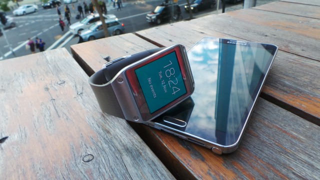
When paired with Samsung’s new Galaxy Gear smartwatch, the Note 3’s battery ends up taking a significant hit – somewhere in the order of 10% – 20%, depending on usage.
We’ll have a full review of the Galaxy Gear in the next few days.
Camera
The Note 3 features a 13 MP rear camera, and 2 MP on the front.
The rear camera protrudes slightly from the back cover, so when resting it’ll make contact with the surface, though thankfully not with the lens glass itself. This is OK on a flat surface, but still gives you pause when placing it down.
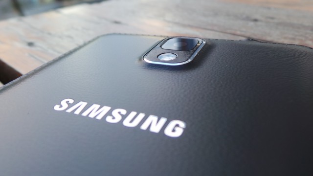
The main camera has autofocus and an LED flash, smart stabilization and is capable of 1080p “Full HD” recording 30fps.
The camera interface will be familiar to anyone who has used a Samsung before and is easy to use, with enough settings and filters to keep most people happy. There are also many preset scene modes, but notably the ‘night’ mode from previous Galaxy phones is missing – a shame, since many pictures are taken in dark settings or low light, though perhaps understandable given the poor results it often produces.
Camera performance is quite good, with autofocus responding quickly, and photos appear sharp without seeming over-processed.
Software
The Note 3 runs on a modified version of Android 4.3 Jelly Bean, which was – up until last month’s KitKat announcement – the most recent version of Android available at launch. Samsung deserves credit for ensuring it’s launching devices with up-to-date software, although perhaps their timing could be better.
It’s worth remembering that Samsung hasn’t seemed as committed in the past to updating its Note devices with the latest Android OS. Prospective customers might take pause from the Note II’s update saga, which saw the device stuck on Android 4.1 until this week, when the 4.3 OS update was finally released (Samsung skipped 4.2 entirely). Whether a similar fate will befall the Note 3 remains to be seen.
Samsung’s now-standard deep customisation of the operating system changes the appearance of everything – from the lockscreen, to settings, to notifications. Many aspects of the OS and user interface can be changed with third-party apps from Google Play, but this doesn’t apply to everything.
Launcher
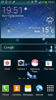
Samsung’s launcher is the default launcher and, for the majority of users, will probably remain so. It features a number of neat tricks that go above and beyond the standard Android launcher like draggable screen indicators to quickly switch screens, but also makes some operations like adding shortcuts to your home screen more obtuse – while the enhancements are welcome, it seems likely that the difficulties are intentionally put in place to avoid patent litigation.
One such annoyance is that the dock icons cannot be changed. You’re stuck with Phone, Contacts, Messages and Internet, in that order. This is a limitation that’s only found on Australian Samsung devices. You can correct it by rooting the phone and flashing firmware from another region, or – more likely – installing a third-party launcher.
The downside to installing an alternative launcher is that you can’t use Samsung widgets, but you do gain the ability to fully customise your homescreen.
Settings
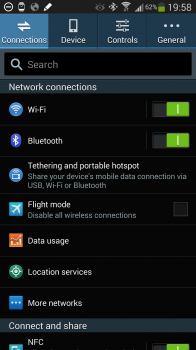
Settings has been split into categories (Connections, Device, Controls and General) in an attempt to make them easier to find. While it’s a nice idea (“stock” Android just has a very long list of options), Samsung’s had to make some unusual choices owing to their choice of categories.
It seems that they started with some very specific and obvious choices for categorisation (Connections), but ended up with a less specific catch-all bucket (General) which is basically “anything that’s not in Connection, Device or Controls”.
I found this frustrating, because certain settings aren’t in the categories I expected them to be in. It’s something that can’t be changed, but you’ll learn where to find the options you use most frequently.
Notification Shade
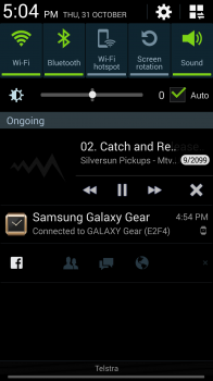
Samsung had again brought about some improvements and some frustrations with their changes here. The notification shade is now loaded with buttons, sliders and groups of items, making for a pretty complicated and busy user interface.
Lining the top are Quick Settings shortcuts which can be customised and changed. You can add as many icons as you like – the area scrolls horizontally – but due to the large font only 5 buttons fit across the 5.7 inch screen. Below the Quick Settings you’ll find a brightness slider that takes up a fair bit of space and can’t be disabled. We haven’t even gotten to notifications themselves yet.
The notifications themselves are split into Ongoing and New groups, with at least one group heading always present. It’s a distinction that doesn’t need to be drawn, though – if Blocking Mode is enabled (Quiet Hours), it becomes an Ongoing notification and you cannot dismiss it. Add to that a persistent Facebook notification, Google Now notifications and a Galaxy Gear Connection notification and you’ve already got a full screen before you get to the timely information that you actually WANT to see.
It gets worse if you plug in headphones, too – another group is added to this list, offering a selection of apps that Samsung thinks you’ll probably want to run, but this list can’t be configured.
S Pen software
Samsung has added a range of software modifications to the system to increase the functionality and usefulness of its S Pen digitiser stylus.
When the S Pen is first removed, a menu pops up in the bottom right corner providing quick access to common S Pen tasks – handy, but it can be annoying to dismiss if you don’t intend to use any of them.
Screenshots can be taken by pressing the button on the S Pen then holding the pen on the screen. The picture then can be further edited and then saved or shared.
Samsung’s also continued its confusing tradition of loading two different note-taking apps onto the Note 3. Action Memo – intended more as a digital assitant for storing quick notes on-device – is invoked by holding the S Pen button and double-tapping on the screen, while S Note must be invoked specifically by the user.
S Note has seen a significant update over its previous version. It now offers more templates and has the ability to sync with a Samsung account, or Evernote, making the Note 3 legitimately useful for taking notes and backing them up to share later.
S Voice
Double-tapping the home button brings up Samsung’s S Voice software, a voice recognition assistant.
My experience with S Voice hasn’t been good. It takes a long time to recognise my voice, and when it does react, it rarely does what I’ve asked.
I find Google Now a far superior experience but, unfortunately, the double-tap action cannot be reassigned to invoke it without root access and system modifications. If you’re not using S Voice, then it just becomes an annoying distraction when you accidentally double tap the home button, and can slow down the phone by having to exit before continuing what you intended to do.
Included Apps
Beyond the Note-specific software and UI customisations, Samsung has also included its usual suite of apps – the Entertainment Hub, its Samsung Apps app store, ChatON.
The Note 3 also sees the debut of My Magazine, the company’s attempt to provide a Samsung-backed competitor to the BlinkFeed system seen on HTC‘s 2013 phones.
Galaxy Note 3
Samsung
- Qualcomm Snapdragon 800 Quad Core 2.3GHz CPU
- 5.7 inch 1080×1920 display at 386 PPI
- 32GB storage
- 3 GB RAM
- 13 MP rear camera
- S Pen stylus
- Android 4.3
- 3200 mAh removable battery
- 151.2 x 79.2 x 8.3 mm
- 168g
Model number: N9005
I have no hesitation recommending the Note 3 to anyone who’s after a new phone outright, or about to enter a contract. I’m confident it will last owners a full 24 months and continue to perform well over the life of the contract, especially in light of Android 4.4’s moves towards lower base specification requirements.
The Note 3 is a great phone that’s enjoyable to use if you can look past some of its idiosyncracies (“Samsungisms”?). Based on specifications, it’s probably the best device currently available – light, comfortable to hold, looks good, has great battery life, plenty of storage with the capacity for more, accurate pen input, good camera, full HD screen and runs a recent version of Android.
Samsung’s history with software updates for the Note hasn’t been the best, with the Note II only recently seeing the first major software update in almost a year, but at least the device launched with Android 4.3. Samsung seems to be getting better with software updates now though, and you can reasonably expect the Note 3 to see an update to Android 4.4 sometime in the next few months.
The only people to whom I wouldn’t recommend the Note 3 are those looking to upgrade from the Note II – still a great phone, and likely to last me another 12 months with the 4.3 update. This is a credit to the quality of last year’s device, rather than a failing of this year’s.
Finally, those who value the ability to modify their system and stay up to date really can’t go past the Nexus 5 at that price point, unless stylus input or the Note 3’s enormous battery is important.
For anyone else, you seriously can’t go wrong with this phone.
Availability
All three major carriers offer the Note 3 on-contract, and it’s widely available at retailers as an outright purchase. You should have no trouble finding a unit should you decide to buy one.
Telstra Telstra currently charges $77 per month with 1 GB of data included, while Optus asks $74 per month for the same deal. Vodafone presents a compelling case at just $50 per month due to their current double data promotion (good until the end of January 2014).
You’ll find the device stocked by the usual local stores – Harvey Norman, Dick Smith and JB Hifi are selling it outright for $888, $897 and $877 respectively at the time of writing, but you might be able to bargain that price down to around $800.
Online retailers Mobicity, Unique Mobiles and Kogan can supply both imported and Australian units at varying prices.
If you’re looking at importing overseas units, make sure it’s the same model – N9005 for 4G (N9000 is 3G only and hasn’t been released in Australia). There are also a few 16 GB models floating around (this was the model released in Hong Kong), so make sure you check the listed memory capacity carefully before committing to buy.



“The only people to whom I wouldn’t recommend the Note 3 are those looking to upgrade from the Note II” Wrong! I could not recommend the Note 3 because it runs Touch Wiz. That makes the experience so bad. That might change when CM11 comes out for it.
I agree that having the dock icons fixed is totally ridiculous! I’ve installed Nova launcher and the phone works perfectly well and I’ve got it looking and working exactly the way I want. It is a great phone – but that word does not do it justice – it is a PDA in every sense of the word!
I’ve had mine about a week. First Samsung phone and I now realise why people don’t like touchwiz. I had to root just to overcome some of the frustrating parts of it… Once rooted it’s a simple text edit to be able to change the dock icons and enable rotation in the gallery (change two sections from True to False). Battery life is great though I’ve already received my spare, I always like to have one on hand just in case. The phone really speeds up if you delete the bloat ware and only keep the essentials.. I’ve yet to… Read more »
Just picked one up today. I was tossing between g2 and note 3 but note 3 had me…expandable storage i just cant live without and good battery life. Those borders on z1 just cant live with and reports of battery life being less than stellar so note 3 won out. Loving it.
Nice review. Too bad about the custom ROM situation. Mainly the aosp-based ones.
For folks that don’t have a tablet or portable gaming device I reckon the Note 3 would be awesome for gaming with the big display and battery.