
Google+ for Android has received a massive update, and it’s taken it to the next level. Gone are a number of frustrating UI quirks and inconsistent design elements, replaced with a nice, clean, and dare I say it beautiful design that works really, really well. It isn’t just design though; there are a raft of new features that you should try out if you’re a Google + user.
First, here’s the official changelog for the update:
- Auto Awesome Stories now combine your photos, videos and the places you visit into beautiful travelogues. You can read more at googleblog.blogspot.com.
- Auto Awesome Movies are now available on Android, iOS and the web, so lots more people will receive highlight reels of their photos and videos. Here’s one example: http://goo.gl/9ljcdj.
- You can now create animated GIFs and photobooth-style images on demand. Just tap the new plus button in Photos, and select either Motion or Mix.
- Really big photo libraries are now supported on Android, so you can access your many thousands of photos quickly and easily.
- You can now browse your entire photo library, as well as your highlights, by date. Just drag the new scroll bar to move forwards or backwards in time.
- Profiles now display total content views on both Android and the web. (You can choose to show or hide this number via settings.)
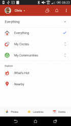
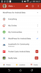
- A new navigation menu makes it easier to switch between your favorite circles and communities, as well as other places in the app.
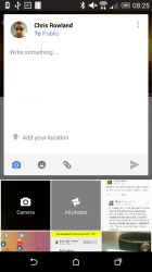
- It’s a lot easier to share content from your phone or tablet. To give it a try, just tap the new pencil icon at the bottom right of the stream.
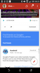
- The app menu now slides away as you move down the stream, letting posts fill the entire screen.
There’s some other neat new features too, some of which we’ve found this morning and some which have been picked up around the web. Here’s a short list:
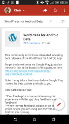
- Communities with links in their description are now visible — great for signing up to beta apps on the go
- Search button is more prominent
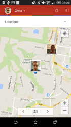
- You can get directions to people in the Locations screen
- Navigation drawer is completely gone, replaced with more useful navigation options
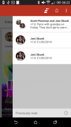
Having installed the new Google+ APK this morning, and having read through the changelog above, you can now take a look at what’s on offer pictorially, in our little gallery of updated Google+ goodness:
The update will be rolling out to the Play Store, but as is usual, this won’t hit at the same time for everyone, so don’t expect it to show up immediately. If you’re the impatient type, you can grab the updated version for Android 4.4 or higher or for Android 3.0 or higher. (Links courtesy of Android Police)
Of course, you can keep an eye on the Play Store for the new version as well:





Nice to see I am still being stalked…. 🙂
I wondered how long it would be until you noticed .. 😉
Thanks for the info on this update, Chris.
Installed and running flawlessly on my Aldi Bauhn tablet on JB 4.1.2
🙂