With the imminent arrival of Android L not to far away, free video calls and chat app imo has just been updated with a UI makeover inspired by Google’s Material Design guidelines.
According to imo’s blog:
“We created better visual hierarchy in the app through the use of deliberate colors choices, edge-to-edge imagery, new icons, and new typography using different weights and styles of Roboto. We also increased spacing for better scannability and comprehension of content.”
The updated app generally features new fonts, increased spacing and more white space.
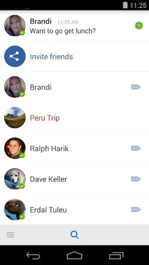
The contact lists have small improvements including increased row height and The Chat Window has a subtle makeover with added shadows and new icons.
The Voice and Video calls now support immersive mode which removes the status and navigation bars from your device to create a full-screen experience during video calls. They have also added floating action buttons to manage incoming and outgoing calls.

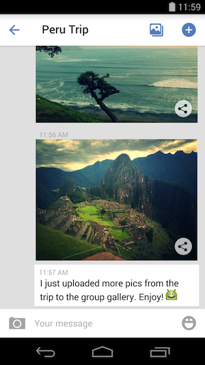
The Group and Contact Profile now feature edge-to-edge imagery with more white space to immerse users and they have added bright colours and floating action buttons.

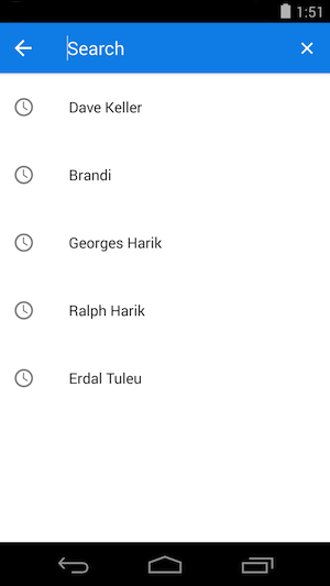
The Search function now shows your five most recent searches and the action bar is now the same colour as the search icon.
I have never used the imo app but have just downloaded it and will give it a try to see how it looks and performs. Anyone else using it at the moment or interested in seeing what the Material Design UI looks like?
You can download the updated imo app from the Play Store link below:
[pb-app-box pname=’com.imo.android.imoim’ name=’imo free video calls and chat’ theme=’discover’ lang=’en’]