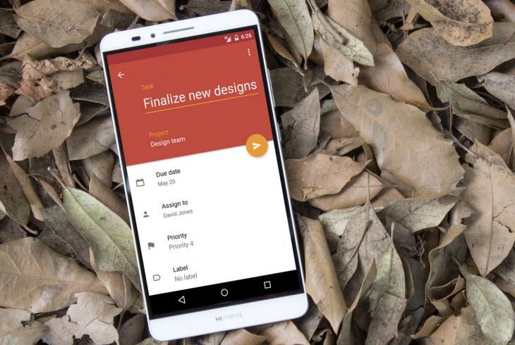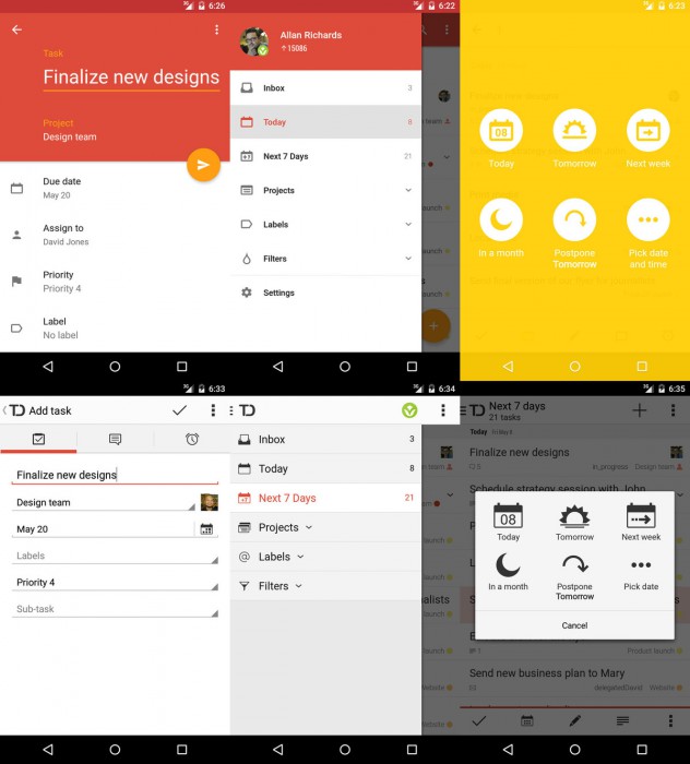
Todoist is a pretty popular todo app (and associated service) and we can say this with authority; we use it behind the scenes at Ausdroid, and we think it’s pretty fantastic. However, one thing that it has been for quite some time is a little bit … well, ugly. While the functionality is top notch, they’ve been a little bit behind the curve with material design, but that is very quickly about to come to a screaming halt.
 As you can see in the old vs new shots (above), they’re really chalk and cheese. One is bright and beautiful, in keeping with Google’s Material Design guidelines. The other is yesterday’s news. While the paintjob has been updated, the same great functionality remains beneath, ensuring that Todoist is going to remain a popular todo service for quite some time to come, especially insofar as Android is concerned.
If you’d like to get your hands on the material update before it hits the Google Play Store, you can apply to join the beta test groupand get some early access going.


