Google Play Music

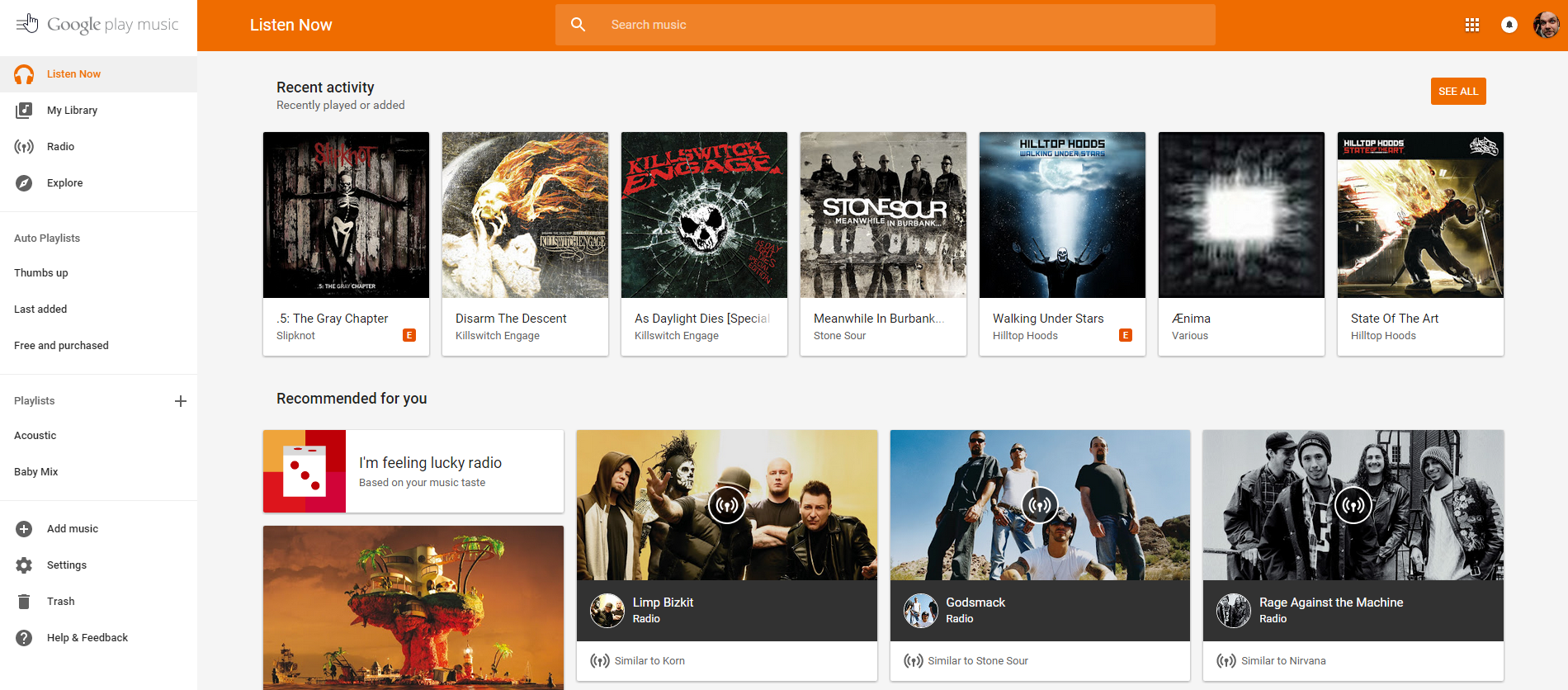
Google offer a massive number of services to users and Play Music All Access is just one of those. Google continue their push towards Material Design by updating the web interface to their popular All Access streaming music service to match their mobile interface design guidelines.

The redesign is wonderful; Clean, functional and familiar to users. It brings the website design into line with all of the mobile based apps Google offer, making the transition from mobile to web comfortable and very easy for users who don’t often use the service away from their mobile device.

If you are an All Access subscriber; Do you use your Play Music account on mobile, web or both?

Source: Google Music.
    3 Comments
    newest
    oldest
    Inline Feedbacks
    View all comments
    deanomalino

    Just realized you can use the keyboard shortcuts to play/pause and change tracks. ^_^

    JeniSkunk

    Did they actually TEST this new design?
    In FF on Win7, it lags so much that it’s barely usable.

    Benjamin Dobell

    Has anyone used this on a desktop? It’s horrid… like, really really horrid. Also their feedback tool is broken whilst the navigation drawer is out.

    A navigation drawer is terrible user interface on large screen devices, a split pane (i.e. side menu) is substantially more logical.

    Matt

    I sent them feedback pointing this broken feedback system out. Would be good if you can do the same.

    It’s jarring having the new design but I think I’ll be used to it quite quickly.

    I don’t mind this so much but like everything that’s deisgned with touch in mind it feels dumbed down. It might now change much but it feels it. Maybe it’s the information density on Material. The thing that gets me every single time is Google Drive with it’s FAB button… totally out of place on desktop.

    Benjamin Dobell

    Matt, yeah I’ve already sent feedback.