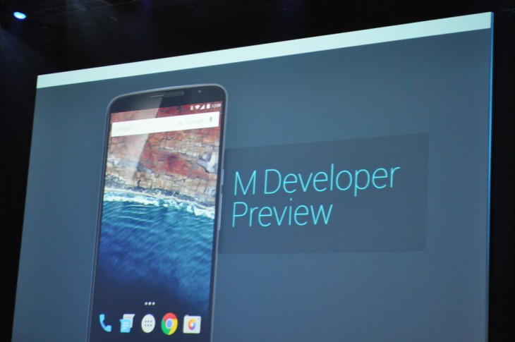
At Google I/O this year we were introduced to Android M, well… The developer preview at least and given a taste of some of the things to come in the next release of the Android Operating System. At the same time, Google announced that there was a developer preview of the upcoming OS available on the Android Developers website for the Nexus 5, Nexus 6, Nexus 9 and Nexus Player.
Over the following 36 hours or so followed a slew of information about the upcoming update including the fact that it was scheduled for several monthly updates before the final release and a guide on how to install it on your compatible Nexus device. Well after enduring some annoying bugs and app incompatibilities, the first update for Android M is out and there’s some very interesting as well as welcome changes.
I’ll be the first to admit I have not yet had time to explore the release notes thoroughly so may have missed some of the deeper, darker secrets of this first major update to Android M but here’s the quick hit list for the stuff you’ll notice pretty quickly when moving over from the first release.
Landscape Launcher on phones
Possibly because I’m a clicker; I found this very quickly when I was playing with a mates Nexus 5 on the developer preview, just head to the launcher settings for your device and toggle landscape on the home screen. Its very simple but surprisingly powerful and extremely useful! The landscape mode allows you to naturally use the phone in landscape as well as portrait, unfortunately it doesn’t appear to be an option on my Nexus 9 at this point.
App Drawer
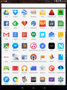
Not a major change, but welcome by those using Android M on mobile phones rather than tablets is the app drawer changes. I know a few people (on smaller screens) that weren’t happy with the app drawer on Android M and it seems Google have listened, they’ve move away from the letter based scrolling back to a more “traditional”, alphabetically listed scroll through your apps.
Widgets Screen
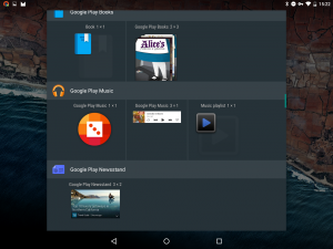
Look at it, isn’t it pretty? Seriously though, this is a really welcome visual change. If you’ve just installed an app and want to use the associated widget, often it’s not until you put the widget on your home screen that you know what it’s going to display like or even if you like it. This update adds to the preview of widgets that was added in the first Developer preview, this time adding a scroll bar like the app drawer enjoys so you can scan through all of the available widgets on your device.
Storage and Memory Settings
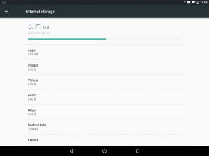
Under the system settings, the adventurous among you will find that there are a couple of new areas to explore. The first which is going to be quite useful is the storage view which gives a quick view (and access to) the areas within your phone or tablet that are using the storage space.
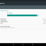
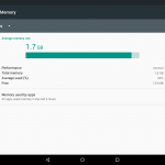
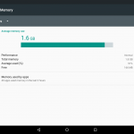
For those who occasionally suffer performance problems with devices, the one thats going to please more people is a similar function to view where your device memory is being consumed by what apps and over what period of time (3, 6 or 12 hours are the options) sorted by the highest memory use to lowest over the selected period of time. Very useful to see if a dormant app is chewing RAM and hindering the performance of your device.
Bugs and Performance Fixes
I’m not an Android developer so won’t even pretend to understand a lot of the technical wizardry that goes on under the hood of the operating system. Suffice to say though, with this update there is a bunch of little bugs that have been squashed and some noticeable performance increases. If you’re running the first Developer Preview of Android M you’re going to see a significant jump in this one and it’s worth your time (if you’re not patient enough to wait for the OTA this week) to sit down and flash the update to your device.
Delete screenshot
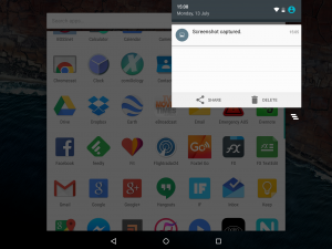
I’m just about ready to publish this article, taking a couple of screenshots and noticed this one at the last second. Another “not a big deal” item, but if you take a lot of screenshots like we do at Ausdroid for articles its very welcome. In the notification drop down you now have the ability to delete a screenshot without having to go into your screenshots folder to select and delete the images.
It’s great to see Google delivering on the promise of updates and (seemingly at least) listening to the feedback that is coming back to them via the Developer Preview program. If you’re using the Dev preview of Android M and something is not quite right, make sure you feed it back because you’re probably not the only one who’s noticed or annoyed by it. It the feedback from users that makes the Android platform great. I look forward to spending some more time with this update over the next week or so, checking if unstable apps are now stable and (hopefully) finding some that previously didn’t work on release one but now do. On first impressions, the first update is a big step forward from the release at I/O lets hope the subsequent updates are as progressive.
If you’re rocking the Android M preview; what are the most exciting and disappointing points for you so far?



I am sad they removed the alphabetical app list. I loved it, it was so much easier to find things.
I am wondering just what improvements M brings Android TV so far.
Really enjoying this update. I had the previous preview that was released and I couldn’t wait for this one. Too many crashes and phone restarts.
So far so good. New lease on life for my nexus 5.