
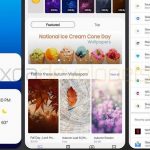
The annual release of Android updates to flagships is currently a big focus, with Samsung currently working on their update. An early build of Pie for the Galaxy S9 has shown up on XDA-Developers showing a fairly major redesign.
The build being shown off is fairly early, with a number of things not working but it gives a good indication of the visual direction in which Samsung is heading for the Pie update.
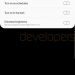
The big inclusion is a new AMOLED Dark theme which Samsung is calling ‘night theme’ which when activated will flow not only through the system UI, but throughout the various system apps including Messages, Dialler and more. As noted by the XDA team, the dark theme is the only one enabled – and you can’t turn it off in this build, but they do believe that a light theme will be available. The dark theme will be able to be scheduled, or switched on automatically in the dark, and an option to decrease the screen brightness automatically will be present.
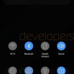
Samsung is going with the overall design of Android Pie in a number of places, including using the more rounded icons in Quick Settings and frustratingly copying the ability to quickly access things like Wi-Fi settings from a drop-down menu. Their Overview (Multi-tasking) view has also been updated to look similar to Android Pie with a side-scroll of apps instead of horizontal – and there’s a nice ‘Close All’ button to clear all your apps.
Samsung has decided to add in more gestures as part of their Android Pie build, they’re not re-working Google’s included gestures in Pie, but adding more when the navigation bar is hidden. In their build, there’s a gesture to swipe up from the bottom to the left to go back, or to the right to go to multi-tasking.
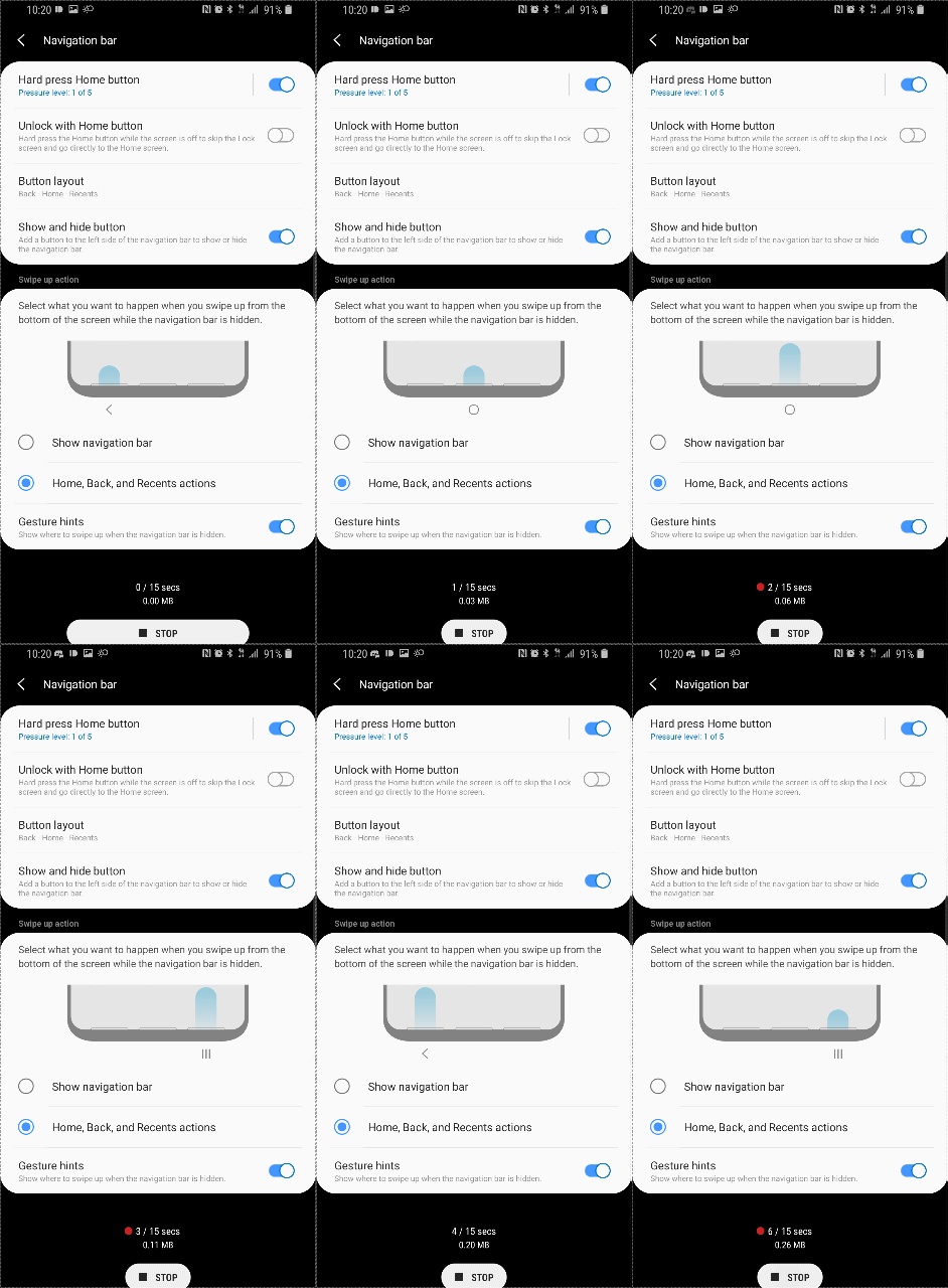
It’s an early build of Android Pie with the Samsung Experience UI on top, but it’s looking pretty decent for an early build. At this early stage, anything could change in the design so if you’re not happy with something in there, it may change. There’s a lot more screenshots over at XDA-Developers if you want to delve a little deeper.






I can’t help but dislike Samsung’s UI/UX choices. Everything is just a bit too rounded and there is just too much happening on every screen.