Android originally had a dark Holo theme UI but then Material Design came along and Google white-themed all the things. Now Google is slowly introducing dark themes back into their apps, one by one.
At the 2018 Android Dev Summit Google discussed how their research had shown that using colours, especially light ones, in apps negatively affect battery life. Of course it is the increased brightness resulting from these bright colours that causes the drop in battery life.
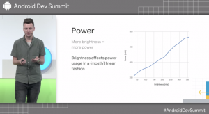
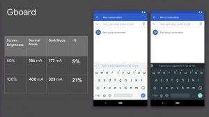
Google discussed how they moved in the wrong direction with respect to battery life when they moved from the black theme to the light Material Design theme. Google showed research that showed that there was a linear relationship between the brightness of the display and the power consumption. They discussed that using a dark theme in their keyboard, GBoard, can reduce power consumption by up to 21%.
Guess which color we’ve been pushing you towards over the past couple years. Material came out three years ago and we change from Holo, which is nice dark theme, to this white theme instead. We kind of shot ourselves in the foot, slightly, in terms of power.
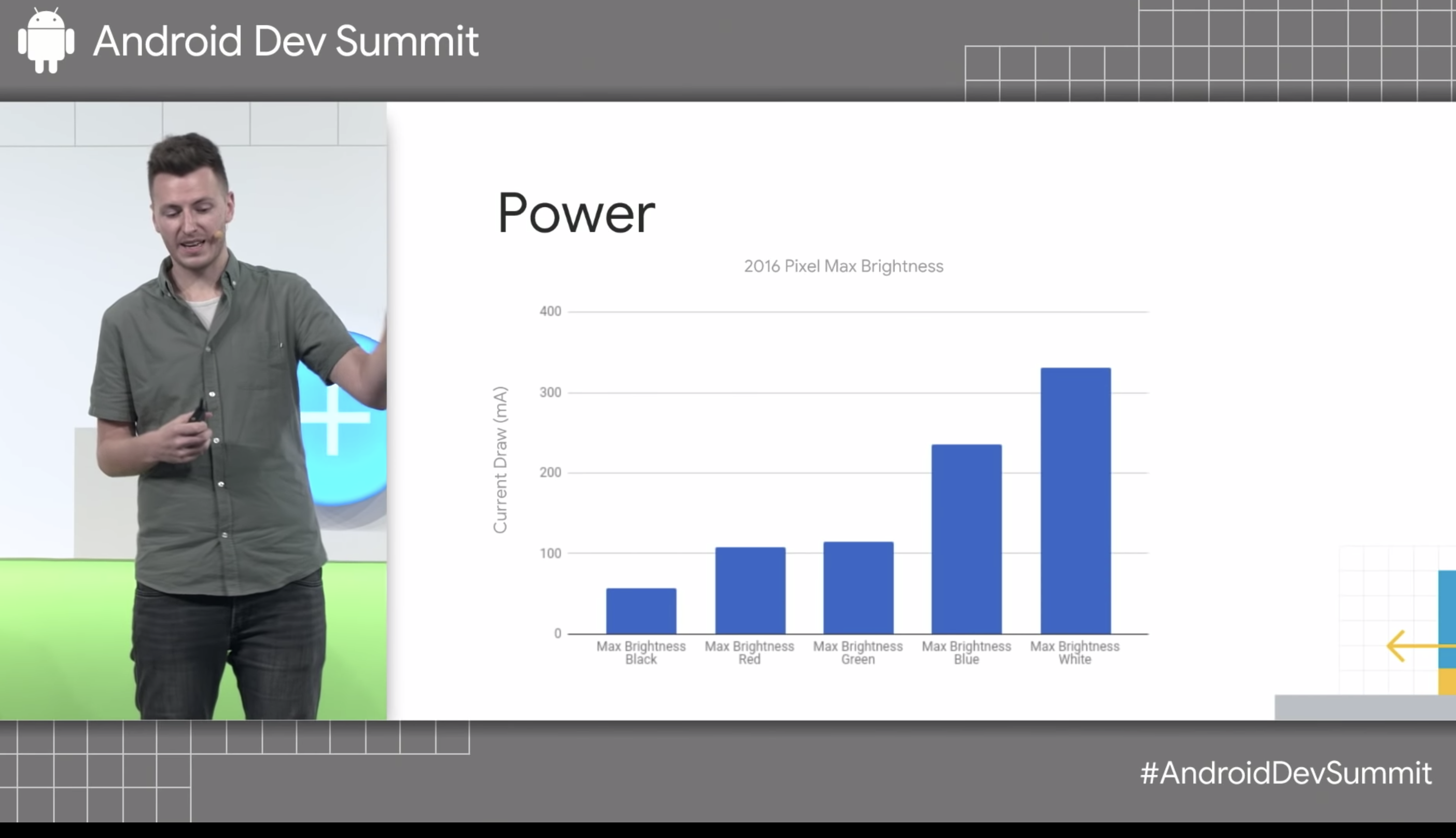
Lately Google have introduced a night mode to their phones to ease strain on the eyes at late hours of the day but it also can decrease power usage by up to 63%. There is also a difference in the power draw from different colours with blue drawing 25% more power than red and green in the standard RGB arrangement.
Google then went on to not only encourage developers to use a dark theme in their apps but also provided tips for developers to help them in their implementation of said dark theme. Expect to see dark themes showing up in a lot of your apps and every single Google app going forward. You can check out the entire talk in the video below.
Do you prefer a light or a dark theme?


So how long will it take Google to provide a dark theme on all of their own apps? Given their history of totally uncoordinated development I reckon we’ve got a few years to wait.
Finally, Google have come up with an internally acceptable excuse to themselves, to say why removing the good, dark, UI of Holo, for the blanding white of Material, was a mistake.