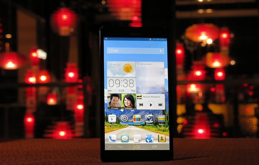
Can Huawei compete in an increasingly crowded super-sized phone market?
A lot of our time at Ausdroid is spent paying attention to the top tier of Android device manufacturers – while Samsung is doubtless the heavyweight of the Android world, you’d almost certainly include HTC and LG as peers. Below that, there exists a broad second tier, where other manufacturers toil away without the mindshare, design, manufacturing, marketing or technical prowess that characterises that top tier.
It’s here where we usually find Huawei, despite its best intentions – while it’s a networking technology heavyweight with a rich (and occasionally controversial) history, the company has remained something of an underdog in the smartphone industry. While it’s caught plenty of headlines with a moderately successful series of Ideos and Ascend devices, it’s yet to cross the barrier to mainstream success and is still hunting for a must-have hit.
If there’s one thing that could be said for Huawei’s devices, “competent but unremarkable” seems fair. While their hardware has been put together well enough to maintain customer satisfaction, it often lacks a “wow factor” – premium materials and high quality components are largely absent, in favour of a “cheap and cheerful” approach. It’s a tactic that works well in the prepaid market where customers buy phones upfront and balk at the typical high price of a flagship handset, but it tends to turn away high-end customers looking for something more.
Huawei appears ready to make that jump into the premium market and become a top-tier, front-of-mind manufacturers. No longer content to sit on the sidelines with also-rans, they’re garnering more and more press interest and the company has a newfound focus on product design and user experience. As it unites its Android device range under its Ascend moniker,you can’t help but see in it a miniature version of Samsung of 2010 with its fledgling Galaxy brand. If Huawei hopes to follow a similar trajectory in the years to come, it’ll need solid product portfolio.
A few months ago, we reviewed the reviewed the Ascend D1 Quad and found it a great performer at a bargain price, whose only problem might be the name on the box causing it to be overlooked. Since then, Huawei’s also launchd the Ascend P2 which at the time generated a lot of buzz for its so-called “world’s fastest download speeds” – although seems to be bypassing Australia as it heads for commercial release – and is expected to launch the design-focused Ascend P6 in the coming weeks. It’s also decided that it’s ready to answer the Galaxy Note, and take on the new “superphone” market of 5-inch+ devices.
It’s here that we find the Ascend Mate, clocking in with a gargantuan 6.1-inch 720p IPS+ LCD display and a battery that lasts all day in a body that – surprisingly – weighs just under 200 grams. Huawei’s brought its own CPU to the party – a custom-built 1.5 GHz quad-core unit – and paired it with 8 GB of internal storage, a Micro SD slot, 1 GB of RAM and NFC. It’s an affordable monster, launching with an RRP of $429. You’ll also find a set of headphones, AC USB charger and cable in the box.
Despite the size, it amazingly still looks and feels like a phone, and manages to occupy the middle ground between a phone and a tablet – the very definition of a “phablet”, a label Huawei wishes to capitalise on, positing that you can buy a Mate instead of a smartphone / tablet combination.
Make no mistake, this is a big phone – although you can still fit it into your jeans pocket – but is it any good? Let’s find out.
- Great screen
- Huge battery
- Feels good in-hand, despite size
- Sluggish performance
- Complicated user interface
- 6 month old Android OS
- Incredulous looks from bystanders
Hardware
The Mate has a featureless front face, save speaker grille (with its embedded notification LED) and a modest Huawei logo. The front of the phone is protected from bumps and scratches by Corning Gorilla Glass II, a notable addition to a budget-priced superphone.
The back of the device is a pleasant soft-touch plastic that should give enough grip to stop the phone sliding out of your hands, although in practice this didn’t really achieve its goal. It’s curved in a pleasing way to fit the shape of your hard, and there’s no sharp edges where it meets the metallic edges, as we’ve seen on devices like the Xperia Z.
You’ll find power and volume buttons on the right edge, great for holding the phone in your left hand, as your index and middle fingers will naturally fall on the buttons, not so good for holding it in the right as you’ll have to do some thumb contortions to reach the buttons. The Micro SD slot is the sole disturbance on the left-edge, while you’ll find a 3.5mm headphone jack and SIM slot on the top edge of the device. The Micro USB port is dead-center on the bottom edge, and while it’s nice to see Huawei get this right, they don’t really get any points for it.
The edges at first seem to be made of plastic, but they’re actually metal, giving the device a sturdy feel. The dark grey material contrasts nicely with the glass-covered front and soft-touch black of the back cover.
The Mate wants to be liked – it’s got an appealing – if pedestrian – design, and it feels good in the hand. It’s far from weightless, but you don’t expect that of a device of this size. Wielding it in public often earned looks of disbelief from bystanders.
Screen
If there’s one place you shouldn’t skimp on for components, it’s the display. Happily, Huawei’s taken this advice to heart and the IPS+ LCD panel in the Mate is notable for its quality and viewing angles.
Time spent calibrating a display pays off – customers enjoy watching their movies and viewing their pictures with proper, accurate colours for some reason. It’s a mystery why this is so difficult for some to grasp, but Huawei’s delivered in this respect. The display holds its own at full brightness, and while you’ll struggle in direct sunlight this is hardly surprising.

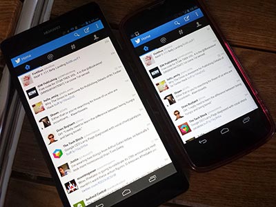
Despite running the same 720p resolution as a Galaxy Nexus, the lower DPI means you can actually fit more on screen than you would on a smaller phone.
Camera
The Mate comes equipped with an 8 MP rear camera and 1 MP on the front. The rear camera has a built in HDR mode and can produce some decent results with a little time and patience. The front camera is serviceable for video calling, but that’s about the best that can be said of it.
The Mate is a reasonable shooter – it’s responsive with little shutter lag, and on a clear day it took decent images with bright colours and foreground detail, but didn’t produce a lot of background detail and had some unfortunate fringing and haloing around contrasting edges. As conditions deteriorate, the picture quality unfortunately similarly diminishes, but it redeems itself with HDR quality and some neat (if gimmicky) software tricks, including image distortions and the ever-present image filters.
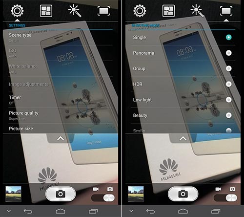
When shooting video, the Mate is surprisingly capable. The 720p video looks crisp and clear, and is able to track objects passing through the frame and adjust focus accordingly. You’ll want to find a good mount or a place to rest the device though as there’s no image stabilisation.
You could use the Mate as a camera and get away with it, although you’ll eventually want to reach for something better. Sample pictures and a video can be found below.
Battery
The Mate holds an enormous 4050 mAh battery within its sizeable body. Controversially (or not, depending on your view), the battery is sealed into the device. It’s neither here nor there for me.
It’s great to see a manufacturer focus on battery life, and the Mate delivers. It comfortably runs for a full day with no sense of urgency to find a charging port, though after a day of heavy use you’ll still want to plug it in (that’s a BIG screen).
Connectivity
Given Huawei’s networking pedigree, the connectivity options aren’t surprising on the Mate. It supports all Australian 3G HSPA+ networks on 850, 900, 1700, 1900 and 2100 Mhz bands, Wifi a/b/g/n networks, GPS with A-GPS, and lists NFC and Bluetooth 4.0 Low Energy with Enhanced Data Rate amongst its connectivity options.
While cellular connectivity wasn’t troublesome and its GPS lock was reliable, the Mate had trouble connecting to hidden networks. A disappointing result, but an edge case and perhaps more down to network configuration than capability. It may also be indicative of other issues…
Storage
There’s no getting around the small internal storage of the Mate – you get 8 GB of storage space, and Huawei is quick to point you to the device’s Micro SD card support (including the ability to run apps from the card) should you want more storage.
A device with a large HD display promotes media consumption, and it’s disappointing that you’ll almost certainly have to invest in a Micro SD card to watch more than a few hours of high definition content on the go – that’s to say nothing of the number of 8 MP photos and HD videos that will be vying for your limited storage space.
Performance
Without a name-brand CPU running the show, the question of performance hangs over the Mate. Unfortunately, while Huawei’s own silicon has proven quite capable in benchmarks, it’s let down in other areas.
In bringing the Mate to Australia, Huawei decided to change one of the device’s most important specifications – they traded the overseas model’s 2 GB of RAM for 1 GB and an NFC chip. It’s a puzzling decision given the extremely slow adoption of NFC technology in Australia, and unfortunately seems to have hobbled the Mate in a critical area.
As you click and swipe around the Mate’s home screen, you’d be hard-pressed to notice anything amiss. The interface is smooth and Android’s Jelly Bean buttery smooth performance is evident. Unfortunately, once you launch applications things start to go wrong – you may be left looking at a partially-drawn screen as the device struggles to move data around available memory.
With a big battery, I looked forward to putting the phone through its paces playing Ingress, a known battery hog, to see how it fared. Criminally, this was the answer:

Unfortunately, I wasn’t able to do much in my favourite game, as it continually crashed when accessing the portal information screen. This might be the app’s fault, but it DOES work properly on comparatively low-specced phones of yesteryear.
As with many manufacturers, Huawei’s tweaked the multitasking menu to allow you to kill or “clean up” all applications. Handily, this reports the amount of RAM you’ve freed, which usually amounts to 80-200 MB of RAM.
Huawei tells me that the Android OS currently consumes about 300 MB of RAM, and it’s working on a software update which will free up an additional 100 MB. Given these numbers, it seems the device might not actually be running out of RAM (although it could be close) – I suspect, but can’t prove, that the Mate’s RAM is somehow connected on a slow bus.
Switching between open apps was slow, and led to frequent bouts of frustration. If you were to only use one app at a time – and that app wasn’t too demanding – the Mate could serve you well. Alas, modern power users might have Hangouts, Facebook and/or Twitter, a browser and other apps going at the same time.
Operating System
The Mate is launching with Android Jelly Bean 4.1.2, a disappointing choice from Huawei. There’s no sugar-coating this – it’s over 6 months old. The Android world has moved on to 4.2, and is now anticipating the arrival of 4.3 (or 5.0, we can’t really tell). Huawei hasn’t said anything about updating to a newer version of the OS, save that the device is “technically capable” of running newer Android versions.
There is however a lingering question of what features 4.2 will actually bring to the table for an OEM-skinned device. Huawei already has their own implementation of Quick Settings built into Emotion UI, and a panorama mode in their camera seems more likely to see usage than Photo Sphere. It’s questionable whether Huawei would see any need to expose Android 4.2’s multi-user support, especially given the device’s Micro SD slot – they may even be reluctant to update and lose the ability to move apps to the SD card.
There’s also a lingering question about whether or not you’d want to inflict an upgrade to a newer version of Android on a device which has such obvious performance problems. Historically, newer versions perform worse on older hardware, and the Mate would be starting at a significant disadvantage.
Emotion UI
It’s no secret that we like devices running “Stock Android”. Huawei has enjoyed favour from the community in the past for this very reason, as their devices ran a version of Android with minimal tweaks and changes. Those days are now over, with Huawei diving deep into their host Android OS and delivering a customised software experience called Emotion UI.
On the face of it, Emotion UI doesn’t significantly change anything about the way Jelly Bean works, but it’s far from untouched. The general UI has been changed to a light style featuring black text on a white background – arguably a good decision, given that it seems to be where Google’s going, although the font choices aren’t as refined as Google’s more modern card-based UI designs, and the blue accent of the default theme is a questionable choice.
Huawei has regrettably decided to change the design of standard elements of the user interface – bizarrely, checkboxes are now round and settings toggles have been changed to have a more physical switch-like appearance.
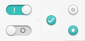
I do wish manufacturers would stop messing with standard UI elements in this way, and I’m puzzled as to what benefit this actually brings for the user.
Out of the box, the Mate had a dark grey, transparent draggable button on screen. I eventually learned this was called the “Suspend” button. It behaves like a Facebook Messenger Chat Head in that you can drag it around the edges of the screen, although it’s not as much fun to drag or fling it around as there’s no sense of inertia. It expands when pressed to reveal shortcuts – some to mini-apps that can run on top of your current application (notepad, calculator, a la LG’s Q-slide apps), and some just launch apps (media player, messaging, etc).
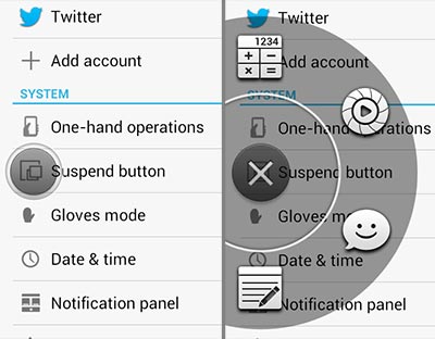
Unfortunately, the shortcuts aren’t configurable, and Huawei told us they currently have no plans to make them so. It’s a nice idea, but feels like its implementation is incomplete.
The Notification shade has an array of toggles and switches at the top to turn hardware and software functions on and off. This feature seems to have become a defacto standard in Android OEM customisations, but it’s unfortunate that every manufacturer seems to implement the functionality themselves instead of working with the community and embracing or enhancing an existing project to accomplish this. Consequently, the interface and design of this feature seems incongruent with the rest of the device. Reinventing the wheel seems like a waste of effort.
The final big customisation is Huawei’s power profiles system, which overlays a camera-style dial allowing you to choose from a preset power profile. Profiles control things like screen brightness, wireless connectivity, ringtone and notifications volumes.
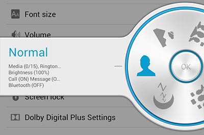
The user interface is novel and easy to use, although you could do just as well with a dropdown menu (and might save some much-needed RAM in doing so).
Launcher
The biggest change Huawei’s made to Android is that there’s no app drawer – in Emotion UI, your homescreen is your app drawer. While this ensures there’s only one place where all your app icons live, it forces the user to move seldom-used apps into folders and remember where they live.
App icons are presented with embedded within a rounded square panel, which can lead to a bit of fatigue looking at rows and screens of identically-sized icons and folders. There doesn’t seem to be a good reason to do this. It looks simplistic, in the way Windows XP was seen to be “Fisher-Price-y” and also ruins Android’s clean, straight line aesthetic. Some of Huawei’s own apps seem exempt from this treatment, which makes it even more confounding.
Emotion UI has switchable themes, controlling things like lock screen design, wallpapers and app icons. You can switch themes using a builtin app, which does actually change the visuals quite drastically – regrettably, there isn’t a “Stock Android” option. The theme system contains some badly-translated Engrish, with themes labelled Offical (sic) and one theme asking to Drug to Unlock. Changing themes will appeal to some users, but I expect most users will never even realise it’s possible.
Homescreen arrangement is nonstandard, but not bad. Screens extend to the right, and the default screen is #2. This means you get one screen to the left where you could place widgets and shortcuts to frequently-used apps, and Huawei’s arranged a group of folders and built-in apps for you on screen #3. As you download new apps (remember, there’s no app drawer), they’re added to screen #4 and beyond (you can add screens to the right, but not the left). I like seeing new takes on Android’s basic homescreen layout, and this one gets a thumbs-up from me.
Me Widget
The main homescreen (#2, for those keeping track) packs Huawei’s Me Widget – a combination widget that displays two contacts, a clock, a photo album, the weather and music player controls by default, all packed densely into a 3-row, full-width widget.
The widget’s individual components can be altered and rearranged, but you need to do it within the widget’s settings screen. You can also long-press the widget to drag it as a whole around the screen as you would any other. This can lead to a confusing game of “how do I change what’s on my homescreen?”
It feels like the Me Widget needs more thought put into its configuration and better integration with the rest of the OS. I’d much rather see Huawei build individual widgets fit for their purpose.
Settings
Changing the location and layout of preferences items seems to be one of the first things manufacturers do when customising Android, with varying effectiveness. I feel Samsung has made some decent choices on the Galaxy S 4 in dividing Settings into 4 tabs, but Huawei has some work to do.
Emotion UI’s Settings app is divided into two tabs, General and All. There’s no intuitive way to know whether the setting you’re looking for is a General setting or not, so you’ll probably end up going to All, er, all the time. General actually appears to just be basic options – wifi, bluetooth, brightness, etc.
Emotion UI offers a deep range of options, but it seems overly complicated – it feels like controls are there for the sake of it, and may not provide benefit to the user. Examples of this include the ability to hide Android’s onscreen soft buttons, subscribe users to beta versions of software updates and control the colour temperature of the screen. Huawei needs to pay more attention to helping the user find what they want and arrange settings logically – rather than asking can they do something, perhaps they should ask whether they should do it.
Onboard Software
Huawei provides a number of apps with the device, including KingSoft Office and their own Backup software that can back your device up to (or restore it from) your Micro SD card. There’s also a Help Center that actually provides useful information about how various parts of the phone work, a basic video editing tool, DLNA controls and an FM Radio. And of course, a flashlight.
Keyboard
Huawei’s keyboard draws particular ire, a comment trait shared by so many OEM keyboards. Text prediction and autocomplete features are nonexistant, and it lacks modern features like gesture (or swipe-based) input. Compounding these problems, the punctuation keys are all in different spots, so getting used to the keyboard on your new phone incurs a learning curve. It seems like a change for change’s sake.
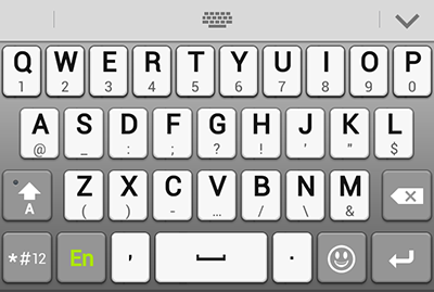
A bigger problem with the keyboard took me a while to figure out. If you tap a key and swipe down off the key, you’ll activate the long-press key. If you press ‘H’ you’ll get ‘H’. If you swipe ever so slightly down from the ‘H’ key, you’ll get ‘!’. At first, this seems like a useful addition, but dropping and raising my index finger on the keyboard while holding the device in my other hand, I found a number of letter taps were misinterpreted and required correction to remove errant punctuation marks.
Ascend Mate
Huawei
- 1.5 GHz quad-core Hi-Silicon K3V2 + Intel XMM6260
- 163.5 x 85.7 x 9.9 mm (6.5 x 3.4 x 0.4 inches), 198g
- UMTS 850/900/1700/1900/2100, GSM 850/900/1800/1900 MHz
- 6.1-inch HD IPS+ 1280 x 720 LCD
- Corning Gorilla glass
- 8 MP AF HDR rear camera, 1 MP HD front
- 1 GB RAM, 8 GB Storage
- 802.11 a/b/g/n, dual-band, Wi-Fi Direct
- NFC, Bluetooth 4.0 LE EDR
- 4050 mAh battery – 9 days standby on WCDMA
- Android 4.1
The Mate wants to be liked, and Huawei has done a great job on the device physically – the build quality is solid and the device is good to hold, despite the size. Unfortunately, great looks can’t save a substandard user experience.
The puzzling choice to swap 2 GB of RAM for 1 GB + NFC has disadvantaged the device, as its powerful quad-core CPU is constrained by the lack of RAM. As a result of this, you never really get to appreciate the power on offer, and are instead left wondering what the device is actually doing while you wait for it to respond.
The hardware problems are matched with some poor choices on the software front, with Huawei’s Emotion UI customisations to Android leading to some odd design and functionality choices that impact the device’s usability. While you could certainly live with Huawei’s system, it feels like a first attempt – it lacks maturity, and needs refinement. It’s worth remembering that Huawei started working on Emotion UI in a Gingerbread world, and compared to the modern Android “Nexus” user experience, this shows. It’s disappointing that Huawei has felt the need to meddle with Android to this level when it seems their developers aren’t up to the job.
With problems on both the hardware and software side, the device’s $430 price tag begins to tell a tale of compromise. Despite the pricing sweet spot hit by devices like the Nexus 4, it seems other manufacturers can’t quite hit the target where these compromises are concerned. It’s a shame, as the device has a capable CPU, a great display and a decent camera.
If you’ve decided that you’d like to make friends with an Ascend Mate, perhaps you should consider purchasing an import unit from MobiCity – the overseas model on offer will have 2 GB of RAM and should address the unit’s performance issues.



Nice photo at the top there… not sure about the phone though… I get really annoyed with manufacturers messing with Android for the sake of it! I understand when companies with the R&D dollars make the phone great, then work on the UI to “improve” it, but it sounds like all the development dollars for this phone should have been spent on the hardware, not changing the UI.