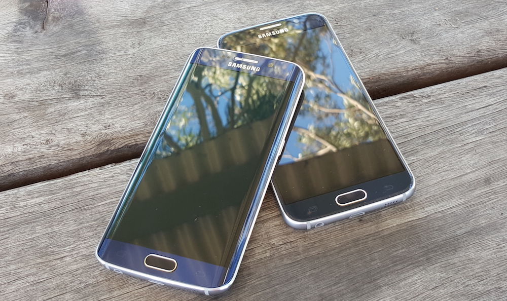
Samsung has lead the Android market with its Galaxy S line of mobile phones for a number of years now, producing one of – if not the – top-selling mobile handsets on the market. The company has achieved mass-market appeal by providing consistently leading-edge specifications, even if the components have been housed inside phones with sometimes-disappointing plastic-heavy industrial design. Paired with a significant marketing budget, that’s been enough to buoy their market share, but in recent years the strategy has seen diminishing returns with stories of falling market share and missed sales expectations.
It’s not hard to see why. While Samsung’s Galaxy S5 was a popular handset, it reportedly missed its sales forecast by up to 40% and this allowed Apple to claw back Samsung’s lead in the market with the iPhone 6 and 6 Plus. The Galaxy S5 didn’t show a significant difference in design over the previous generation, and the retro-styled chrome egde wasn’t to everyone’s liking. While many agree that Samsung’s design changes move in 2 year steps (or more), accounting for the most common mobile phone contract period, the prevailing voice said it’s been high time for Samsung to make a significant change to its industrial design.
With Galaxy S6, Samsung has delivered an amazing evolution from just one year ago. Gone are the plastic / rubbery back and the gaudy chromed plastic edge of the phone. Replacing them is a newfound focus on design and “premium” materials that make the phone feel great in the hand. The metal frame makes the phone remarkably strong while fitting comfortably in the hand with its expertly-machined curved edges and the phone is clad – front and back – with Corning’s latest Gorilla Glass 4. While opinion is split as to whether a phone should feature a glass back in 2014 after the lessons we learned from the iPhone 4 and the Nexus 4 / Optimus G, it’s hard to deny just how good the smooth, cool glass feels on the palm of your hand. The Galaxy S6 might not look very different to its predecessor, but its construction is almost a complete departure.
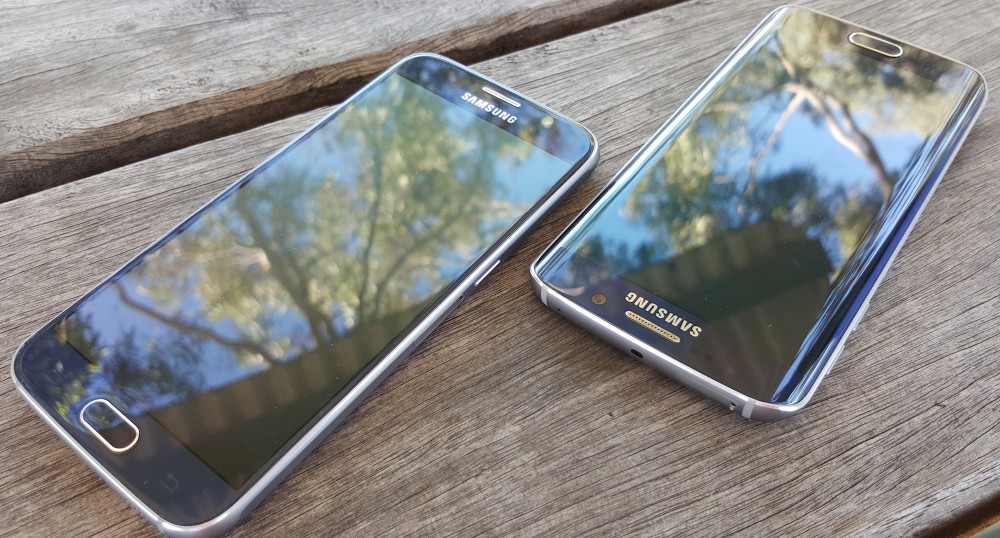
The Galaxy S6 Edge seems to have gotten the lion’s share of the design love, and it’s not hard to see why. It represents a major push from Samsung towards evolving phone design, with curved edges on both sides of the screen (a significant upgrade from the Note Edge’s single, right edge), and the result is a visually distinctive phone that’s attracting interest from almost everyone who sees it and is still clearly a Samsung phone. The S6 Edge minimises the metal frame around the left and right sides of the screen resulting in a phone that has a very different feel in the hand compared to the standard Galaxy S6. It commands a $150 premium over the standard Galaxy S6, and lots of people seem willing to pay that premium and try something new. Kudos to Samsung for taking a risk, and it seems to be paying off.
One of the biggest features of the Galaxy S6 is its camera – or cameras, really. The phone represents a significant step up not just in terms of Android phone cameras, but smartphone camera technology in general. The Galaxy S6’s front and rear cameras both offer an f/1.9 aperture which captures more light than almost any other camera on the market. The rear 16MP camera also features Optical Image Stabilisation (OIS) which can correct your shaky camera hand and allows that f/1.9 aperture to do great things in low light. It’s undoubtedly one of the phone’s key features, and one that both Jason and Chris enjoyed testing out.
The Galaxy S6 also answers another criticism often levelled at Samsung, and it’s perhaps more a surprising one – Samsung’s software side. “TouchWiz”, the name given to Samsung’s Android customisations, is really what makes a Galaxy S phone a Galaxy S phone. It’s long been a divisive feature, with many calling for its removal or overhaul in light of slowing down otherwise speedy hardware or missing functionality. With its bright, garish colours and layouts it’s always seemed to be clinging to design established the Froyo/Gingerbread (Android 2.2/2.3) days that, as time went on and Google established new design guidelines for Android apps, detracted from an otherwise enjoyable experience.
Samsung’s clearly been paying attention to the criticism, and moved forward in a significant way. Gone this year is 2014’s confusing and awkward Settings app, replaced with something much more akin to “standard” Android (with an extra, useful twist), Samsung’s moved with the times and has (mostly) embraced Google’s Material Design in its own apps with bright, clear layouts. They’ve packed less apps onto the handset and the Galaxy S6 is easier than ever for a new user to get started with and become accustomed to.
We’ve put the Galaxy S6 and S6 Edge through their paces to present you this review. We’re reviewing both of these new Galaxy S6 devices together because of their overwhelming similarity – their internal specifications and broadly identical save for a couple of minor differences, and we’ll look at those where they arise. Read on to see whether Samsung’s new handset is right for you.
- Cheap plastic is gone, replaced with classy glass and metal.
- Built-in Qi charging! Rejoice!
- Fantastic camera — better than previous models, and better than most of the competition.
- Fingerprint sensor is much, much easier to use and it’s significantly more accurate.
- TouchWiz has been toned down even further, and it’s now actually nice to use and doesn’t look too bad.
- Launched with Android 5.0.2; latest and almost greatest, though there are issues.
- Battery life is okay, but not great. There are ways to deal with it, though.
- Significant slowdown and stutter over time until the phone becomes virtually useless until you reboot it.
- Data connectivity stalls quite frequently.
- No IP rating – unlike the S5, this isn’t waterproof or dustproof.
Hardware
Construction
The Samsung Galaxy S6 is a remarkably well constructed device – a stunning example of industrial design done well. The hardware Samsung’s delivered this year would be impressive from any OEM, but that it’s come in the space of one year from Samsung – known to have been a little blasé with its design in the past – its a stunning feat. The design of both phones easily holds its own against HTC’s One M9, and shows up the Xperia Z3 as a little bit dated (though we know Sony hasn’t innovated an awful lot in its exterior mobile design).
The S6 range is clearly “premium” – fast becoming the most overused word in smartphones for 2015 – and it feels so even compared to other “premium” phones. It gives Apple’s iPhone 6 range a run for its money in the design stakes, and that’s saying something given Apple’s well-known industrial design prowess.

The front panel of the S6 is a 5.1″ Super AMOLED display, with dramatically smaller side bezels than past models (and the competition). The S6 Edge has virtually no bezels, whereas the S6 has a mm or two there. The Gorilla Glass 4 front fits seamlessly with the aluminium band around the sides of each device, fitting so snugly that you can’t even slide a piece of paper between the two. This is quite an achievement, and protects the S6 from accumulating fluff and dust from your pockets.
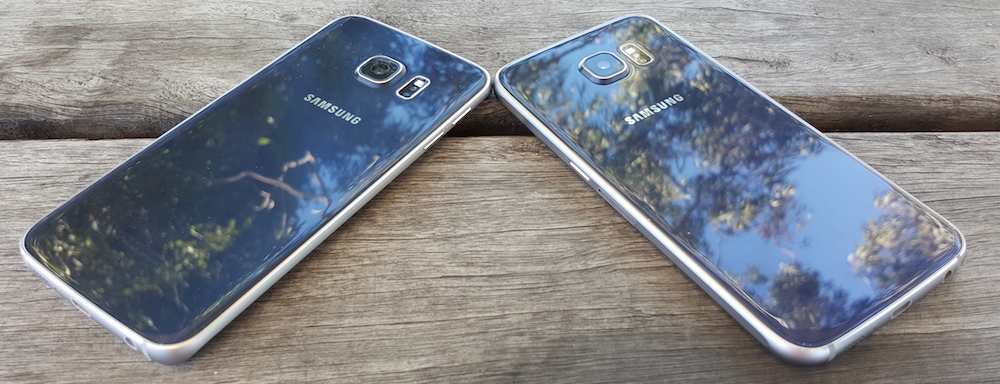
While the design has taken a step forward, it’s come at the cost of some features. Significantly, Samsung has ceded ground on two of the features it used to leverage against its rivals – the Galaxy S6 has no Micro SD expansion slot, and its battery can’t be removed. The company has put forward some reasonable compromises for these changes though, with the handset’s multiple internal storage variants finally being sold in Australia. You can get your Galaxy S6 and Galaxy S6 Edge in 32, 64 and 128 GB models, in black or white. On the battery front, Samsung’s given customers choice by adding Quick Charge technology to ensure the phone can refill its relatively modest 2,550 mAh battery quickly, and added wireless charging for ultimate convenience. Finally, the Galaxy S5’s ingress protection is gone – for all its good looks and sealed back, the Galaxy S6 is neither water- nor dust-proof.
The back of the phone is broken only by the presence of the camera, flash, and heart rate sensor. As with previous Galaxy phones, the camera ‘mound’ protrudes a little from the rear of the S6, and with a completely flat glass back it’s quite noticeable. It’s not a deal breaker (it’s actually pretty sturdy and won’t easily gather scratches) but it does look a bit poor and speaks to a compromise on the design – the body is too thin to accomodate the camera. The addition of a case makes it much less obvious, and offers a bit of protection too (if only because it stops the camera from sticking out quite as far as it does.
Having said that, the S6 is remarkably comfortable to hold, and that is only improved by the addition of a slim-line case for some extra grip. You see, the S6 being constructed of a glass and aluminium exterior does make it a little slippery, which is sure to cause some angst with all that maybe breakable glass.
The S6 Edge is a bit different. With its edge screen (and thus much slimmer shoulders), the S6 can be quite difficult to comfortably hold and use without a case, though a case does improve it significantly. The curve of the Edge screen made it difficult to hold comfortably and use single handedly, and made typing subjectively more inaccurate than it otherwise might have been. Chris found typing on the S6 much easier, and overall found it much more enjoyable to hold and use.
Buttons and other hardware
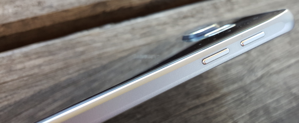
Samsung, like other manufacturers, experiments with moving things around, and while it hasn’t gone as far as LG moving its volume and power keys to the rear of the phone, it found a winning combination some years ago and has stuck to it – the power key on the right, and volume keys on the left. It’s a fairly standard layout, though Samsung has scored points this time around by having physically separate volume buttons (rather than a more traditional “rocker” setup), and by keeping the alignment of the power and volume down buttons off, so you don’t accidentally press one instead of the other.
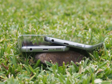
More controversially, the 3.5mm TRRS headset jack has been moved to the bottom edge of the phone, alongside the Micro-USB port and loudspeaker grille. This placement makes a lot of sense for those of us who carry our phones in our pockets, but infuriates those who dock their phones in desktop or car charging cradles, as they’ll usually obstruct the port and leave Bluetooth audio as the only real way to get sound out to an external speaker or headphones.
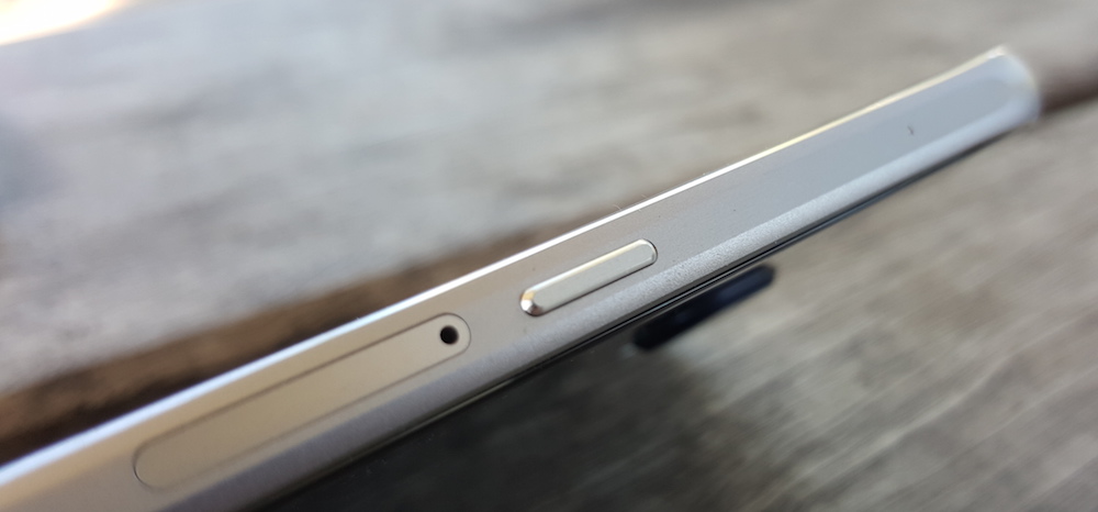
Samsung hasn’t followed HTC and Sony to front-facing stereo speakers, and I for one am actually a fan; this removes the temptation for thoughtless media consumption in public which just annoys everyone nearby. It has at least moved the speaker to the bottom edge of the device instead of its traditional placement at the back of the phone, so you’ll likely find your hand will naturally push the sound in your direction when you’re holding it.
Like previous models, the S6 range retains the hardware home key and capacitive buttons, rather than going with Google’s on-screen buttons as LG, Sony and HTC (and in fact just about everyone else in the market) have done. Samsung’s not likely to change this, and while I don’t personally think it’s the best solution, it remains quite usable. In other words, you get used to it and you’ll forget about it quickly enough and you’ll enjoy a little more screen space for your troubles.
The hardware home key is slightly taller than before as it now contains the fingerprint sensor, and it works really well, justifying the choice of a physical key. There is of course the issue of Samsung’s button layout though – the multi-task key is on the left, while the back button (traditionally indicated by a left-facing arrow or triangle) is on the right. While we wish they’d put them the “right” way around, opinion is split on the issue and you’ll get used to the button layout quickly enough anyway.
An aside: Fingerprint sensor
Samsung toyed with the fingerprint sensor idea in the S5, presumably following Apple’s inclusion of a similar sensor in the iPhone 5s. We say similar, in that it relates to fingerprints, but the similarity stopped there. The iPhone 5s worked damned well in this area while the S5 frankly was an abomination, requiring a swipe down over the key instead of simply holding your thumb on the sensor. It was notoriously inaccurate, to the point that it really was little more than a novelty, and a novelty which was quickly forgotten about.
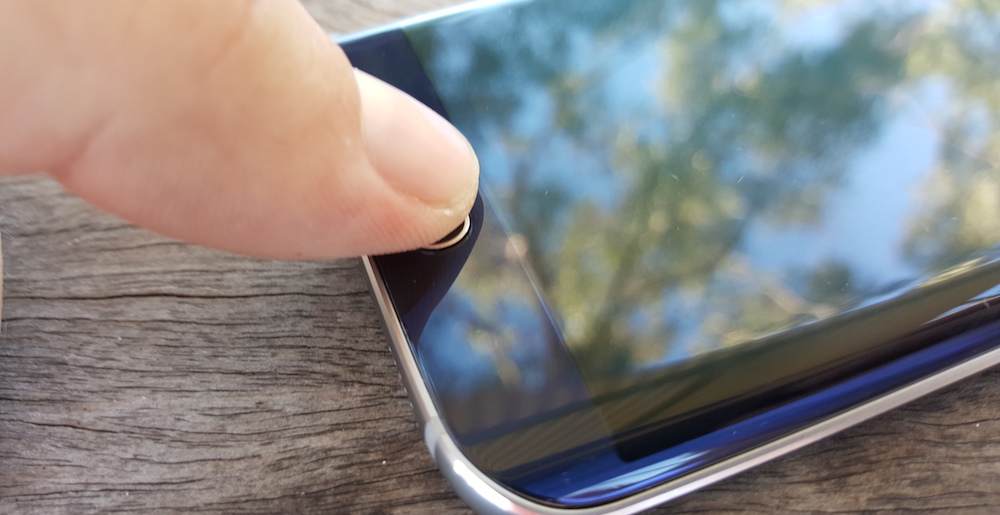
This year, Samsung has gotten it right. The fingerprint sensor being built into the home button means all you need to is rest your thumb on the home button, and hold it there momentarily. If you’re into efficiency, you can use your thumb to press the home key to wake the phone, leave it there a second longer to activate the fingerprint lock, and you’re on the home-screen before you know it. It works really, really well.
Registering a fingerprint can take a little while, but once it’s done it’s done. You can register up to four fingerprints, and you’ll probably decide to make those the index fingers and thumbs on both hands. The phone recognises and unlocks with any finger quickly and reliably. Through some magic and voodoo, the fingerprint sensor even seems to work when fingers are wrinkled after a decent swim… no idea how Samsung has done that, but it’s pretty amazing.
Display technology and experience
Samsung’s AMOLED panels have always been enjoyable to use and the S6 range is no exception. The screen is a 5.1″ panel, with a resolution of 2650×1440. It’s big, it’s bright, and it’s beautiful. The only phone I’ve used which can best the subjective experience of Samsung’s panels is LG’s as-yet unreleased G4, which is slightly bigger at 5.5″ but the same resolution, but it feels sharper and brighter.
Long the bane of any Android user’s existence, the auto-brightness control works surprisingly well on the Galaxy S6. Given the dynamic range of the AMOLED panel; it can range from under 10 cd/m2 for use in a dark room through to a full 600 cd/m2 for use in an outdoor environment. Better yet, the fluctuation between these two extremes is smooth and dynamic; there’s been absolutely no need to use any third-party tool (or even any manual intervention) to get the brightness right while testing the devices. If you do go the manual control route though, there’s a significant bump in brightness going from the absolute lowest end of the scale up through some of the lower levels. Colour reproduction and experience remains steady across that full range. For those who remember the way the S5 behaved at low brightness (i.e. purple shifting), this is a welcome improvement, and of course as an AMOLED, the viewing angles are perfect on either device.
Samsung has again included different colour/display profiles on the S6 for those that like to tinker, but there’s really no need to do so. AMOLED Photo mode gives slightly more vibrant, brighter colours, but there’s really little reason to move away from the default Adaptive mode with its crisp whites, black blacks and brilliant colours. Better yet, it adapts the colour mode based on ambient light and what’s on the display.
You can’t beat this display in performance.
Camera
Samsung has always had a passable camera, but mobile photography has always been a bit of a hit and miss affair. Manufacturers have toyed with different options and features to try and improve photography on the go with varying success, but it’s safe to say that most mobile cameras have just kind of sucked for a long time. 2015 seems to be the year in which that all changes.
While HTC delivered serviceable but somewhat underwhelming performance with the One M9’s camera, Samsung has hit that ball clear out of the park, besting every other camera already on the market. If it wasn’t for the looming LG G4 there’d be nothing that compares to it on the market today.
Though its a 16MP shooter (some cameras do go higher), more megapixels don’t mean better performance. What makes all the difference here is a wider aperture f/1.9 lens, and built-in optical image stabilisation. This combination, together with a camera that opens in a heartbeat brings a stellar performance across all situations. The S6 camera nails it at night, handles everything during the day, and produces an enviable result. It’s simply brilliant.

Samsung has clearly spent a lot of time optimising the camera performance, and it shows. The camera launches in less than a second, and can take the first photo not long after that. A quick double-tap of the home key opens the camera almost instantaneously, and that’s something which is an absolute must if you want to catch things that are going on around you.
At full resolution, the 16MP images captured are in 16:9 format, but you can step down to 4:3 at 12MP if you prefer that aspect ratio (particularly if you want to print things without cropping them). Video defaults to capture at 1080p, but you ca step it all the way up to 4K if you wish, and Samsung’s internal storage can keep up with the storage speeds here.
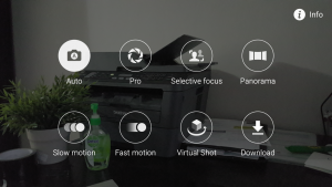
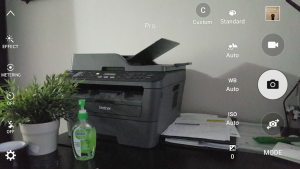
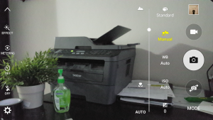
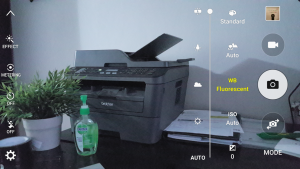
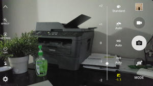
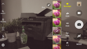
The camera performs strongly in the default auto mode, but the inclusion of ‘pro’ features adds a bit more range to the already good capable camera. Options include adjusting ISO, white balance, exposure and focus, as well as light metering. The inclusion of a live HDR preview mode is pretty cool, and for those demanding more, Samsung’s included support for Lollipop’s Camera2 API, so third party cameras can take full advantage of the sensor, adding the ability to capture RAW for example.
Where the camera still struggles though is in fast-moving scenes, or in low light wide scenes with a lot of movement (for example, a crowd inside a venue). You’ll still find your kids are a bit blurry and your pet’s sudden movement can still spoil your photos. It’s not perfect, but it’s still a damn sight better than what we’ve had before.
When you see what Samsung has done with the S6 camera, you’ll be impressed, but if you’re a true photog, you might wish to wait until we can publish our LG G4 camera shootout; the results that LG have extracted from a mobile camera look like they can rival DSLR quality, and the fine-grained manual focus/shutter speed controls (amongst others) are an order of magnitude above the S6, which itself is one or two orders above everything else.
If we must list some complaints, then it’s these: burst mode accidentally fires a little too easily; in auto mode, the shots can sometimes be exposed slightly brighter than we’d like – especially in daylight; and in Pro mode (which is supposed to sport DSLR-like controls) you don’t get the ability to set an exposure time / shutter speed. One more glaring problem is that the camera will sometimes simply fail to work, showing the camera UI on a black, empty screen. You’ll need to reboot to fix that, and it happens more than you’d like. Hopefully all of these points are addressed in a software update.
By moving the needle so significantly, Samsung’s turned mobile photography into one of the next battlefields. LG is about to fire the next shot, and Apple will surely deliver another step up later in the year. Having companies in pitched battles for better mobile photography can only benefit us as consumers and 2015 is without doubt the year that mobile phones can finally go up against low- to mid-range DSLRs.
Internals: no guts, no glory
Samsung has finally walked away from the industry-standard Qualcomm chips with the Galaxy S6, and in the process of doing so it’s shaken things up a little. Instead of using the Snapdragon 810 which is found in other top-shelf smartphones at the moment, Samsung’s using its own in-house Exynos 7420 processor. Supposedly, the reason for the move stemmed from the heat issues the 810 faced, but the Exynos chip also heats up under heavy performance and you’ll feel it in the rear of the phone. The Galaxy S6 can get pretty warm, but it also cools quickly.
For those who like a bit of technical detail, the Exynos 7420 has an ARM reference big.LITTLE design with four Cortex-A57 (big) cores and four Cortex-A53 (LITTLE) cores. The chip is based on a 14nm manufacturing process that offers improved speed and thermal performance compared to most other chips on the market. The GPU is also an ARM reference design, the Mali-T760 MP8.
Both phones in the S6 range come with 3GB of RAM, and storage options of 32 GB, 64 GB or 128 GB at the top end. There’s no Micro-SD slot, which is a bit disappointing, but with staggering on-board storage options available, it’s really not that big a deal considering how Android has effectively neutered the external storage options that previously existed. If you need more storage than what’s offered, you’re frankly out of luck.
We’ve done a little side-by-side comparison of the S6 against its contemporaries; HTC’s One M9 and LG’s G4. While the figures on benchmarks are one measure, as you’ll see, it’s not the only one.
| Samsung Galaxy S6 (S6 Edge) | HTC One M9 | LG G4 | |
|---|---|---|---|
| Geekbench 3 | 5215 (5095) | 3761 | 2532 |
| AnTuTu 5 | 69,396 (70,053) | 51,427 | 49,777 |
| Kraken 1.1 Lower is better |
4,154 (3,989) | 5,500 | 7,842 |
Let’s use a car racing metaphor. While the S6 is a fast track car, it just doesn’t feel as well suited to general driving. This is where the gloves come off.
Inexplicable, inexcusable performance concerns
Over the course of a couple of weeks spent with the phones, we’ve both noticed significant performance issues that simply don’t show up in benchmarks.
It’s well known that the first releases of Android 5.0 Lollipop suffered from a memory leak issue, and this was very prominent on the Nexus devices that received the release first. Put simply, over the space of 24 to 48 hours, performance gradually slowed as memory slowly ran out due to a memory leak that’s actually connected with the screen on/off animation.
While this may not be the precise cause behind the issue faced by the S6 and S6 Edge, the result is the same. The phone is snappy and lightning quick from a reboot (in fact, it probably equals or bests other contemporary handsets). From there, though, it’s all downhill.
Chris experienced the keyboard lagging behind tap input, apps switching so slowly that you could count out a few seconds in the transition, and the phone being generally so unresponsive that it almost met with a brick wall on more than one occasion. Jason found a camera that refused to connect with its software (you’ll just get a black screen) and apps that crashed in the background despite not event being recently launched.
This is inexplicable and completely inexcusable. Both Sony’s Xperia Z3 (now on Lollipop) and HTC’s One M9 don’t suffer from this issue. Why this wasn’t picked up by Samsung’s QA process and fixed before release is astounding. I don’t know whether this is purely the memory-leak bug in Android causing this, whether it’s some quirk of Samsung’s use of Exynos over Qualcomm, whether it’s a lack of optimisation, the result of insufficiently extensive testing or all of the above. It doesn’t really matter.
This performance blight has almost single-handedly neutered all of the benefits that Samsung has strived to include in the S6. A decent fingerprint sensor, a beautiful screen, and a class-leading camera in a mobile phone mean absolutely zero if you can’t get the basics right, and in 2015, a smartphone should not be stuttering as it switches between apps or processes input – it simply should not happen and in a handset that costs close to (or over) $1,000 RRP, it’s outright inexcusable. It’s the kind of launch issue that can completely sink a phone’s reputation – ask the Nexus 5 if it ever got over its lacklustre camera performance.
The fix is apparently contained in the Android 5.1.1 update, which leaked out in the US recently, and was quickly recalled. This makes sense, as the issue was apparently not finally resolved by Google’s developers until Android 5.1.1 but goodness knows how long it’ll take to get past carrier testing and approval in Australia. Telstra has some kind of update scheduled for May 25, Vodafone says an update has failed testing and Optus seems to have no record of an update. It is interesting to note that other manufacturers (e.g. Sony) fixed this precise issue before releasing Android 5.0.2 for its Xperia line of devices. Samsung could’ve done the same thing, but it seemingly hasn’t. Samsung is aware of the issue and is working on it, but we don’t have a timeframe for a fix. Not quite the news we’d like to report.
Jason fell so in love with the Galaxy S6’s camera that he’s said numerous times that Samsung can do anything they want as long as he gets to use that camera. It’s fair to say that he didn’t realise quite how much he was going to have to live with.
Battery life
Samsung has done something else new with the S6 range, and it isn’t all roses. The decision to ditch the plastic, removable back came with a decision (or restriction) that the Micro-SD and removable battery have to be abandoned as well. I suppose some heavy phone users might have invested in multiple batteries for their S5, but most would probably use a larger capacity battery (or external power pack) instead.
Given that restriction, the limitation of battery size to 2,550 mAh in the Galaxy S6, and 2,600 in the S6 Edge, is a curious choice. It seems that Samsung has prioritised slender phones over reasonable battery size, and when there are phones on the market with huge batteries in slim cases (Sony’s Xperia Z3, anyone?), Samsung’s decision to go for around the 2,500 mAh mark is not a great one.
This has a measurable impact on battery life, which is usually a very subjective experience. The way Chris uses his phone is different to Jason, and Daniel is a serially bad offender when it comes to pushing phones far beyond the ‘average’ daily usage pattern. Some of us use LTE extensively, and some are outside coverage areas. Some of us watch TV or movies, listen to music during a commute, or play Ingress all day, while some of us just make a lot of phone calls.
In short, it’s a very tough thing to compare against, because almost every use case is different.
Before talking about our subjective experiences, we’d like to refer to some (mostly) independent testing. GSM Arena does an amazing job thoroughly and objectively testing the battery life of just about every phone available, and here we’d like to compare the S6 and S6 Edge against some of its contemporaries:
| Overall Endurance | Talk time | Web Browsing | Video playback | |
|---|---|---|---|---|
| Galaxy S6 | 73h | 19:48h | 10:56h | 12:12h |
| Galaxy S6 Edge | 73h | 19:48h | 10:56h | 12:12h |
| Galaxy S5 | 83h | 27:37h | 9:39h | 11:15h |
| HTC One (M9) | 62h | 20:44h | 7:31h | 8:21h |
| Sony Xperia Z3 | 85h | 23:13h | 12:03h | 11:47h |
| Sony Xperia Z3 Compact | 101h | 16:40h | 14:52h | 15:03h |
These figures are based on the following usage patterns:
- 1 hour of calls per day
- 2 hours of web browsing
- 1 hour of video playback
What these figures show largely matches the experience that we’ve found, too. The S6 battery life isn’t bad, but it certainly isn’t class-leading good either. In most cases, the phone battery lasts a day (i.e. from about 7 am to 7 pm), sometimes a bit more, and sometimes significantly less, depending on how heavily you push the phone. If you’re a light user, a day and a half of battery life is not impossible. If you’re a heavy user, well you’d want to have a turbo charger handy, or a Qi charging pad on your desk.
Compared to the Galaxy S5 from 2014, the performance is about 10 – 15% worse, but we feel that’s made up for by the inclusion of fast charging (which can charge the phone to 80% in less than an hour) and the inclusion of Qi which makes casual charging throughout the day even easier.
If you’re a more demanding user, and you’re worried about battery life, you have those choices to help buoy you. There are also 3rd party solutions, such as an external power pack (which we both carry in our bags), and we’ve heard that Mophie is making a power-case which will snugly fit the S6 as well.
It might sound like we’re well down on the battery usage front, but in all honesty it’s not as big a deal as we thought it was going to be. It’s not as good as the Z3 (especially the Z3 Compact) but then, realistically, nothing much is. The S6 range performs adequately in terms of battery life, and that’s good enough for me.
Software
The Galaxy S6 comes with Android 5.0.2 out of the box. It’s due to see an update to 5.1.1, which is said to fix some performance issues and bring some additional features. There is a smaller update now hitting some US devices, and we’re waiting for word from Samsung Australia as to when we can expect to see it here.
Android Customisations – TouchWiz
TouchWiz is a lightning rod for controversy in every Samsung flagship. It’s earned that reputation a good few times over, raising a chorus of naysayers when news comes out of a phone not getting an OS update because it can’t fit the OS and TouchWiz, or the huge amount of storage space that it’s eaten up on a freshly booted device in years gone by.
All of these incidents are deserving of criticism, but a lot of it also stems from the fact that TouchWiz replaces standard Android AOSP apps with Samsung’s own versions of said apps. Some of those apps don’t always have particularly well thought-out user interfaces, and along the way an overly colourful set of icons manages to offend some design sensibilities. Many of Samsung’s apps didn’t change for years, with the Galaxy S5 showing up with some distinctly Gingerbread-era UI decisions in Samsung’s apps.
All of that’s changed this year. Well, much of it. The parts that matter. Mostly.
In 2015, Samsung has shown a welcome amount of restraint – perhaps a newfound maturity – in how far it takes TouchWiz’s Android customisations. Perhaps this is the result of all the hush-hush rumours we’ve heard for the last couple of years about Google being disappointed in the direction Samsung’s taken their Android phones.
TouchWiz 2015 appears to be the “scaled back” version we’ve heard so much about. Most of Samsung’s apps have in some way embraced Google’s Material Design guidelines (although they haven’t always gotten it completely right), although the dirty little secret might be that Material Design is a little more in line with the bright colours Samsung’s always applied to its own apps.
Regardless of who’s moved more towards whom’s design, the result is a skin that finally feels light and pleasant to use. TouchWiz doesn’t feel like it’s holding the phone back any more, and it’s a very welcome change.
Launcher
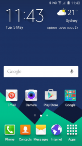
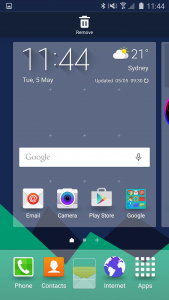
The TouchWiz launcher seems to visually take after the Google Now launcher, or at least Lollipop’s AOSP launcher, more than we thought Samsung would be willing to. It’s got a big, bright and open layout and you can finally drag and drop icons around it and – yes – even edit the dock.
It’s still got a few wild Samsung-isms about it – there are downloadable themes, the apps in the app drawer don’t seem to be in any particular order (but you can rearrange them yourself) and everything seems to have a weird drop shadow under it, but that’s ignoring the forest for the trees.
The launcher has a left-to-right screen layout, which has become popular on Android in the last couple of years and to the left of the leftmost home screen is “Briefing”, a Flipboard-powered newsreader that is Samsung’s (next) answer to HTC’s BlinkFeed and takes the place that Google reserves on Nexus devices for Google Now. Briefing has a wide range of categories and subcategories that lets you customise your news feed, but it’s all pretty high-level. In reality, it wants you to install the dedicated Flipboard app.
So, the launcher is okay. Jason’s still replaced it with Action Launcher 3, but at least he had no problems doing so.
Settings
Ah, settings. How we hated what Samsung did to you on the Galaxy S5 in the name of user friendliness. Thankfully, Samsung’s taken another run at customising settings this year and has mostly thrown out the 2015 attempt.
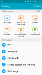
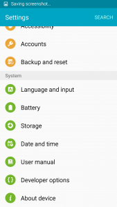
Most of the settings panels are brought straight across from Lollipop’s defaults, with some changes where they’re needed for Samsung-specific things like SoundAlive+ (which apparently recreates the effect of rich surround sound) or the screen mode settings panel.
Never one to completely admit defeat and move on, the 2014 Settings app’s circular, color-coded icons remain, but this time they’re grouped accordingly. The search function also makes a return, and is actually pretty welcome as it means you don’t need to hunt for a seldom-used option. Where there are a number of settings that a user might not be familar with, there’s often a small explanation at the top of the page that tells you what everything does.
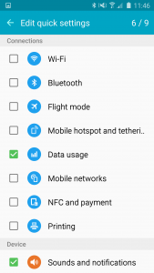
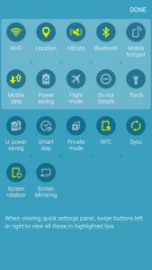
There’s also a customisable quick settings area at the top of the settings list, which allows you to place up to 9 shortcuts to frequently used settings pages. You can push any of the main settings pages up into this area, and they display 3-across (or 6-across in landscape mode). It’s a nice touch, seemingly an acknowledgement from Samsung that everyone uses their phones differently and they might not always prescribe the solution that suits everyone.
Edge Screen Settings
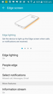
All of the settings for the Edge screen are tucked away neatly under a single page within Settings with a neat explanation of what each of them does at the top.
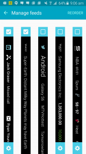
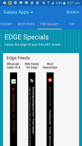
You can use Edge lighting to light up the Edge screen when calls are received (best used when the phone is face-down, though we don’t know anyone who puts their phone on a table face-down these days), People edge can highlight missed calls, messages or emails from important contacts, while the Information Stream brings details from Briefing and a number of other configurable (and downloadable) sources into the Edge screen.
Notification Shade
Notifications have been left pretty much alone, functioning as Google intended. The notification shade itself looks more like a Galaxy S5, though that might be okay.
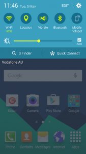
Samsung’s completely eschewed Google’s Lollipop double-pull-down system for Quick Settings, instead preferring to keep its line-of-icons at the top of the screen. This is actually a-okay by me, as it means settings are faster to access and the user has definitive control over what goes where. Remember how we said Samsung seems to want to let you control things this year?
Below Quick Settings there’s Samsung’s brightness control, then a 50-50 split bar offering S Finder (which nobody’s used, ever) and Quick Connect which offers you a shortcut to connect to nearby Bluetooth or Wi-Fi Direct devices. This can apparently be used to send your device’s screen out via Miracast, but not via Google’s Cast protocol. A bit of a missed opportunity with the number of Chromecast devices out there.
The Smaller Stuff
Notably missing from the Galaxy S6 – also said to be delivered with the Android 5.1.1 update – is multi user support. There’s simply no way to activate the guest account or set up a separate user on the phone without installing Samsung’s “My Knox” app. You also won’t find any screen pinning controls.
Another interesting omission is less about what Samsung’s removed so much as what they haven’t. Google caused a fuss when it removed the animations showing data flow from the system status bar in KitKat, until it explained that updating the status bar actually caused quite a hit on the battery. The Galaxy S6 – you guessed it – shows data up/down indicators under both the cellular data network type and the Wi-Fi indicator. One can’t help but wonder whether this might account for some of the Galaxy S6’s middle-of-the-road battery life.
Samsung’s Gallery app has finally matured to the point where it’s quite useful and doesn’t suffer from the slowdown it used to in previous generations. You can browse by time (most recent first), albums/folders, events (which you might use to group photos together) or categories which seem to be predefined like “People”, “Scenery” and “Food” and the app is scarily good at sorting your photos appropriately.
Samsung has also – wisely, I think – chosen to keep the power button menu that Google mercilessly chopped down to simply “Power Off” on Nexus devices running Lollipop. It still provides a shortcut to Airplane Mode, along with Power Off, Restart and a shortcut to Emergency Mode – the reincarnation of Ultra Power Saving mode.
Emergency Mode turns the screen black and white, turns off data when the screen is off, runs a minimal home screen (thought it could still be persuaded to run Twitter and Facebook) and allows you to quickly send emergency help requests to predefined contacts. It’s hard to think of a situation where we’d need to use it with our urban city life, but if you like to go bush and go off the beaten track then you might find it useful.
Overall
There’s a certain segment of the market that will never be happy with Samsung’s UI customisations. They’ll point to the incongruence of the font design or the slightly-off drop shadow around the Fast Action Button in a particular app. Samsung faces a non-undeserved uphill battle to atone for the sins of its past, and there are some people they’ll just never be able to convince.
The reality is, none of this really matters. Samsung’s software customisations this year are mostly in line with Google’s own apps and services and create a user experience that is closer than ever before to what we expect from modern Android apps on a Samsung handset.
Preinstalled Apps
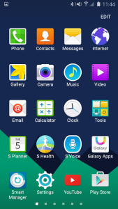
There are a number of apps bundled on the Galaxy S6. Samsung’s got their own Music and Video apps along with their own Gallery, but it’s the “S” apps that usually attract ire for being preinstalled, and not much has changed in this regard, but they are all hidden away in the app drawer instead of front and centre on the home screen.
You’ll find S Planner, S Health and S Voice alongside Galaxy Apps and Smart Manager, which shows you information about your device (RAM usage, storage space and battery percentage) and offers device protection powered by MacAfee – for better or worse (I’m not convinced that it’s needed).
There’s also basic Memo and Voice Recorder apps alongside the “My Files” file manager that’s been seen on 2014 devices like the Galaxy Tab S. It’s good to have a file management system built in, even if it’s a basic one. My Files will even connect to Google Drive.
Moving to third party apps, there’s two from Microsoft – OneDrive and OneNote. You get 100GB of free OneDrive storage space with your Galaxy S6 for two years, and OneNote is quite a capable note-taking app.
Peel Smart Remote is also installed, and is responsible for using the IR transmitter still present at the top of the Galaxy S6. It works, but the software itself is really poor. It desperately needs an update to bring its UI into line with what we expect of modern Android apps and it places a remote control into your notifications that you simply can’t get rid of, short of opening the app and turning it off – Jason left it there for 24 hours to see if it would go away if it wasn’t used (it didn’t).
Facebook is also on the home screen, although it’s really a shortcut to install the app itself. Interestingly, it doesn’t install from the Play store and seems capable of updating itself, though its not clear whether this is coming from the Galaxy Apps store or from Facebook itself (it wouldn’t be wouldn’t be the first time Facebook has tried this). It’s probably best deleted in favour of a properly installed version of Facebook from Google Play, and there’s no problem doing that.
Galaxy Gifts are on offer, but aren’t preinstalled on the phone. The Galaxy Gifts for 2015 seem pretty good! You get things like Here Maps, 2 months free AFL, 3 standard def (boo) movie rentals from EzyFlix, 2 months free subscription to The Australian, 1 month subscription and 2 new releases from QuickFlix, a free Kindle e-book every month, free VSCO presets, ad-free Shazam, 6 months of Parallels Access, 6 months of LastPass, 3 months of Evernote Premium, 6 months of Pocket Premium and more. It’s very likely there’s something in that list that takes everyone’s fancy.
Other than the Samsung and Microsoft apps, Samsung seems to have learned their lesson on bloatware. Another welcome change.
Samsung Galaxy S6 / S6 Edge
- 5.1″ Super AMOLED capacitive touchscreen, 16M colours, 1440×2560 resolution, 577 ppi, with Corning Gorilla Glass 4
- Quad-core 1.5 GHz Cortex-A53 & Quad-core 2.1 GHz Cortex-A57 — Samsung Exynos 7420 chipset with Mali-T760MP8 GPU
- 3GB RAM
- 32/64/128GB on-board storage, non-expandable.
- Camera:
- Main camera: 16MP, 2988×5312 pixels, OIS, autofocus, LED flash. 2160p@30fps video, 1080p@60fps, 720p@120fps.
- Front camera: 5MP, 1440p@30fps video, Auto HDR available.
- NFC, Bluetooth 4.1, Wi-Fi 802.11 a/b/g/n/ac (2.4 & 5 GHz), DLNA, GPS (with A-GPS) and GLONASS
- Sensors: Accelerometer, gyro, proximity, compass, barometer, heart reate, SpO2
- Radios:
- 2G/2.5G – GSM/GPRS/EDGE: 850/900/1800/1900 MHz
- 3G UMTS: 850/900/AWS/1900/2100 MHz
- 4G LTE:
- FDD: Bands 1, 2, 3, 4, 5, 7, 8, 12, 17, 18, 26, 28
- TDD: Bands 40
- Dimensions:
- 143.4 x 70.5 x 6.8mm @ 138 grams (S6)
- 142.1 x 70.1 x 7.0mm @ 132 grams (S6 Edge)
- Android 5.0 with TouchWiz
- Battery:
- 2550 mAh (S6)
- 2600 mAh (S6 Edge)
Samsung is on to a winning formula with the Galaxy S6 and Galaxy S6 Edge. The effort that’s gone into the design of their new hardware shows, and it’s great to finally see Samsung working with new materials. We could conclude on that, and be entirely justified. Samsung has brought itself to Apple’s level in its ability to make a mobile phone that people want, or even … need.
Price is a significant factor for many, and at $999 for the S6 in 32GB, through to $1,449 to the S6 Edge with 128GB of storage, these are not cheap. Equally, these are not cheaply made, and I have little doubt they will last the two year average cycle of mobiles in Australia. Samsung handsets have a history of falling from their launch RRP fairly quickly though, so if you wait a couple of months you might find that the prices are lower and the software fix is out there. If you’re upgrading from a Galaxy S4, you’ll be in for a treat.
We’re not entirely sure that the value offered by the S6 Edge justifies the $150 premium over the standard S6, but we understand that it’s selling like hotcakes regardless, just because it looks so cool. On that at least, we agree. It does look cool. It is cool. That’s been enough to get people to buy the phone, and more power to Samsung as a result.
The Galaxy S6 faces some stiff competition in terms of battery life (Sony’s Xperia Z3), camera performance (LG’s G4) and beautiful design (HTC’s One M9), but the S6 could be the jack-of-all-trades. It’s a gorgeous device with a fantastic camera and one of the most powerful chipsets on the market, and its sporting industrial design that appeals to the eye and feels even better when you hold it in your hand. The loss of waterproofing is regrettable, but is a feature that people would probably happily trade for a phone without a garish chrome trim and the “elastoplast” backing of last year’s Galaxy S5.
It’s a crying shame that the hardware is let down – right now, anyway – by the software.
Why Samsung has released a flagship smartphone in 2015 with such significant performance issues beggars belief. Launch issues cause stigmas that are incredibly hard to shake off, and this is currently the achilles heel on both handsets. It suggests to us that perhaps the Galaxy S6 was rushed to market – perhaps in response to the ever-earlier launch cycles of Samsung’s competitors – before thorough and proper testing could be conducted. Other manufacturers have managed to avoid the performance issues. Sony’s Xperia Z3 runs the same version of Android (5.0.2) but doesn’t stutter and lag. We’re hoping that the software update that addresses the issue comes to Australia sooner rather than later.
Would we recommend you buy a Galaxy S6 or S6 Edge? Absolutely. With the exception of LG’s upcoming G4, you’re not likely to see a more powerful and well rounded package being released in smartphones this year.
The Galaxy S6 will dominate the Android landscape in 2015, and will still be ahead of the curve in 12 months time. It will be the standard that Android is judged by for some time to come. Mark our words.













“Significant slowdown and stutter over time until the phone becomes virtually useless until you reboot it.”
That’s more than a con. that’s a major issue
Said theme. Couldn’t post it from the app, curiously.
Loving the Urban Theme. Flat, clean and minimal. I think some of you with a GS6 who go for a more simple look might like it too.
If it could replace the cyclist on the cruiser, with a pedestrian using a wheelie walker, I’d want that theme on my G3.
Ripper review as usual Chris! So, it’s interesting that I’ve not experienced the sort of performance issues that you and Jason have. I find the recent app list half a second slower than it should be and on a few occasions apps have taken a second or two to launch but that’s about it really. Pretty good for 4 weeks of use I’d reckon. The lag that I bemoaned in the S5 really hasn’t been seen in my S6. So, of course, I begin to analyse where I might be doing things differently… For starters, I don’t use the fingerprint… Read more »
Thanks for another first rate completely comprehensive review Chris. I think I can describe a scenario where Edge Lighting would be very useful, without needing to put the device face down on a table. The phone in a top or bottom flip folio case. The screenshots of the new TouchWiz show it’s really scaled back from last year. This is something I could live with, although I’d prefer it to have a dark Material like UI. One thing I have become fond of in the LG G3 UX3 Settings is the tabbed system it has. Does the Samsung have anything… Read more »
Settings is back to something closer to AOSP Android, straight up long list but with configurable shortcuts at the top.
It’s funny, I didn’t mind the tabs on the S4 but they were roundly criticized (& really, even i will admit half of them were not that well thought out).
I just had a look back at the S4 review, Jason, to compare the settings tabs on it, to what I have on my G3. Those S4 tabs were indeed horribad. The ones on my G3 are actually good and useful, which was why I was wondering if there were settings tabs on the S6.
Great review fellas. I haven’t really experienced any of the performance issues that I can recall but I do restart my S6 regularly if it seems a bit sluggish as I did this with the Moto G.
Just a question in relation to the ability to re-arrange the app draw alphabetically. Do you think there will be an update to allow this on the retail versions?
Hi Jamie, I see that you have Nova Launcher and Screen Off in the image that you posted. You could try Action Launcher 3, this will give you an alphabetically sorted app drawer on the side, plus double tap anywhere to turn off – and more things that Nova probably has as well.
Yeah, I really want to stick with the TW launcher as it’s actually quite good. Who would have thought…
It’s better than its ever been. That didn’t save it from being replaced with Action Launcher for me.
No idea what will or won’t be done with updates. I kind of feel like there’s a way to do it that I just didn’t find.
I did mine manually. It took about 15 minutes of my life. I hope I don’t have to do it again any time soon.
15 minutes, that’s fast compared to how long it took to properly organize the apps drawer on my old LG Optimus One when it was still on original Froyo, back in Feb 2011. From memory, that job took me about an hour.
Question on the battery life chart:
Seeing as how you have Sony’s top model from last year in the chart, could you please add the LG G3 to the chart now, and the G4 when you’ve finished testing for its full review?
Typo in the performance concerns section:
“finally nailed by Google’s developers until this most version of Android”
Thanks Jeni, editing a 7500 word review always misses a few typos 🙂