[dropcap]I[/dropcap]n starting this review, I could wax lyrical about how Huawei are the next big thing in mobile, how the Chinese entrant is making the best phones on the market, or any of a number of superlative statements about the company, its vision, or its products.
While I could do that, I don’t need to.
The Huawei P10 pretty much speaks for itself. Having used many of Huawei’s previous phones, I can say this is the best one yet, and perhaps by some measure. Everything from the design, the re-imagined software experience, through to the robust feel of the construction … the whole lot oozes quality, and far from being a gimmick like it appeared to be last year, the dual camera setup is back, bigger and better, giving the Huawei P10 one of the best cameras in smartphone.
In short, it feels like Huawei might have just hit it out of the park this year with the P10, and throughout the course of this review, I’ll tell you what I liked, the few things that I didn’t, and whether you should considering buying one when they arrive in Australia in a couple of months time.
Huawei P10 Hardware
Huawei’s P10 follows the lead set by previous models; it’s thin, designed to be easily used in one hand, and to look good, and it achieves all of those things. At just 7mm thick, this is quite a comfortable phone to palm, and at 145.3mm tall, you can quite readily reach from the bottom of the screen to the top one-handed.
The design is not unlike many other thin rectangular smartphones of today; looking at the P10 next to a Pixel and next to an iPhone, you can see more similarities than not, and that’s not necessarily a bad thing. It means that the P10 looks like what people expect a phone to look like.
There’s a range of colours and styles available, but the one we’re looking at is a silverback, white-faced model, and as you can see, it both doesn’t stand out especially, and yet, it does.
What’s inside
Huawei have opted for their own chipset in the P10, rather than using the more common Qualcomm Snapdragon of the day. The HiSilicon Kirin 960 might sound somewhat less familiar to those who are used to comparing 820 to 821 and 835, but the Kirin 960 lines up neatly alongside the Snapdragon 835, with the same 4 x 2.4 GHz + 4 x 1.8 GHz cores. Without a Snapdragon 835 to compare it to, obviously we can’t do much of a meaningful comparison, except to note that the Kirin 960 feels fast.
Also inside are a standard 4GB RAM and 64GB storage in our review model, though we understand configuration may vary a little depending on which particular models Huawei brings to Australia. MicroSD support is definitely included, though, with the ability to take cards up to 256GB in the SIM tray.
| Key Specifications: | Huawei P10 |
|---|---|
| Release date | March 2017 |
| Screen size | 5.1-inch |
| Screen technology | IPS LCD |
| Resolution | 1,920 x 1,080 |
| PPI | 431 |
| Rear camera | 20MP mono + 12MP RGB |
| Front camera | 8MP |
| Chipset | Kirin 960 |
| Core config |
|
| RAM | 4GB |
| Storage | 64GB |
| MicroSD | Yes, up to 256GB |
| Battery | 3,200 mAh |
| Battery removable | — |
| Connector | USB C |
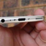
| Headphone Port | Yes |
| Headphone Location | Bottom |
| Speaker Configuration | Bottom |
| NFC | Yes |
| Android OS | Android 7.0 |
| Vendor skin | EMUI 5.1 |
| Dimensions | 145.3 x 69.3 x 7 mm |
| Weight | 145g |
| Colours |
|
What else is inside? A fairly sizeable 3,200mAh battery, dual 20MP + 12MP f/2.2 rear cameras with Leica technology, and a few other odds and ends. We’ll go into those in more detail, below.
Build quality
One of the perks about writing stories for Ausdroid is the ability to use a wide variety of smartphones, from those itching at the $1500 mark, down to those which might retail for $100 or $200 or so.
In the last six years, I’ve used phones with a lot of variance in quality, and I can say — hand on heart — that the Huawei P10 feels good. In fact, I think I already said that in this review, but it’s true: it feels good.
There’s perhaps one area where the design seems to be a bit lacking, and that’s the lack of oleophobic coating on the screen. The factory-supplied and fitted screen protector is oleophobic, and does a great job of getting rid of greasy fingerprints. However, if you take that screen protector off, fingerprints will become your new best friends. They’ll be everywhere, and we’re not sure whether that’s because this is an earlier production sample handed out at MWC, or whether this is what the final product will look like. We’ll let you know.
Huawei P10 isn’t quite a metal unibody design, but it’s very close, with a brushed aluminium back, accented by lines for the antennae, and a white highlight up the top housing the camera and flash. The fingerprint sensor has moved from the rear of the phone — a position I rather like, I must add — to the front, somewhat like a home button.
Except that it isn’t really a home button … except when it is. Confused?
The fingerprint sensor on the front isn’t a button, however you can opt to use ‘gestures’ with it, which makes it function rather like a home button. Unlike some other front-mounted fingerprint sensors which just looked out of place, on the P10, it makes sense and looks at home (pardon the pun), and the gesture based controls (short tap for back, long tap for home, swipe left/right for multi-tasking) actually work rather well, giving you a little bit more screen real-estate.
There’s little reason to draw much of a comparison between the Huawei P10 and Google’s Pixel. Side by side, they look almost identical in size and construction, and they both feel rock-solid.
Sometimes, it’s quite jarring going from the phone I use daily to a review phone, and other times, as with the Huawei P10, it feels like putting on a familiar comfy pair of slippers.
Huawei P10 Camera
The selling point of Huawei’s P9 last year was their dual-lens setup engineered with Leica, and while it was pretty good, it wasn’t what I would call the best camera on the market. I felt that I could take better, more exciting photos with a range of other phones that we had access to last year, and the P9 quickly became just a little bit… boring.
Fast forward to 2017, though, and the dual-lens setup is back, with a bit of a vengeance. With a 20MP monochrome sensor and 12MP RGB sensor, again engineered by Leica, the P10 can do some pretty tricky things, and it probably shares more in common with this year’s Mate 9 than it does the P9 last year.
While the aperture might not be too remarkable (f/2.2 is rather slow by 2017 smartphone camera standards), you could be easily fooled that your camera was much faster, as the Huawei P10 truly captures beautiful images — in colour and black & white — across a range of situations.
The front camera, surprisingly, has a much faster aperture (f/1.8) which almost certainly is there for better selfies in low light. Given I don’t take many of these, I can’t really comment, but it does seem to be more than adequate.
Camera interface
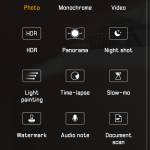
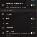
Huawei’s camera interface on EMUI 5.1 doesn’t feel all that new, but it’s one of the things from prior iterations that hasn’t really needed a lot of work. All settings are easy to find and drive, and you’ll be taking great photos in no time.
Some of the great features are the ability to take pure black and white photos, adjust depth of field (though this seems to be at least partially done in software, which isn’t quite as a realistic as a purely lens-created effect) and more. There’s a lot to explore in here, but take it from me: the camera features are both powerful and capable — a great combination.
One of the other features of the Huawei P10 camera (though it is by no means unique to this phone) is the quick launch feature; simply double-tap the down volume key while your phone is asleep, and it’ll launch the camera immediately. Better yet? It will show you how quickly it responded, showing you how quickly the camera can start from scratch. Why’s this important? The quicker you can open your camera, the faster you can take a photo, and consistently, the Huawei P10 camera was ready to go and take the first photo in a second or less. That’s really fast. Here’s a quick video showing this feature in action:
Photo samples
One thing we really love the Huawei P10’s monochrome camera for is portraits; it simply takes some amazing shots. Of course, you can do some of this on your smartphone too, but a 20MP monochrome sensor just feels like it does a much better job than simply running a black and white filter over your favourite photos.
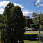
Of course, the Huawei P10 does more than portraits, and here’s some lovely photos out and about showing what this camera can really do.
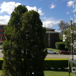
Here’s a couple of examples which show how the depth of field feature works. I think these two photos perfectly capture the P10’s abilities. It can take a great photo if you take a bit of time to set it up, and have a few tries. However, if you’re not careful, you’ll find that the P10’s software isn’t as careful as it should be, and some parts of the photo which should be in focus aren’t, and you’re left with a less than satisfactory photo.
You can, however, adjust the depth of field after you take the photo, allowing you to ‘rescue’ a photo which doesn’t appear to have taken well. This feature, though, requires the use of Huawei’s Gallery app; you can’t do it in third party galleries such as Google Photos.
The way in which you can take these photos and adjust (even fix) them after the fact makes it almost worthwhile using Huawei’s Gallery app, even if you continue to use Google Photos to back up your photos online. I know I’ll be keeping it in my Photo Apps folder.
Huawei P10 Software
The elephant in the room with the Huawei P10 is twofold; first, it launches with Android 7.0 rather than something newer (like 7.1, or 7.1.1), and it also has Huawei’s much-maligned EMUI at version 5.1.
I have rather disliked EMUI in the past. In fact, it has annoyed me to the point that I’ve passed on the opportunity to review previous Huawei phones running the Emotion UI skin, because I simply couldn’t stand it. With the Huawei P9 I wanted to like it so badly, but I just couldn’t; I passed on the opportunity to review it and gave it to (or lumped it with) someone else.
EMUI 5.1 feels like it might have been designed by someone completely unrelated to Huawei or their previous EMUI adventures. It actually looks good and enhances the experience of Android, rather than taking it and destroying it.
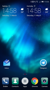
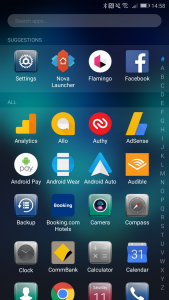
Sure, the default EMUI launcher is not really my cup of tea, but it doesn’t have to be either; I can readily replace it with something else, and enjoy it so much more. Once you do this, you realise what a great thing it is that Google has laid out some common UI elements and procedures for Android 7.0 Nougat, because it takes away so many of the pain points that manufacturers liked to introduce.
On the Huawei P10, the notification drawer looks a lot like it does on any other modern Android. Quick toggles up the top, a quick slider for brightness, and you can configure which quick toggles are shown. Notifications are rich and you can interact with them the same as you would on any other Android. The silly notification system which the P9 used — and which was awful — is long gone.
Even the Settings menu, something often changed just for the sake of it, remains fairly close to standard Android, with settings generally easy to find, even though there’s an awful lot of them. They’re sensibly grouped, and the design isn’t ridiculous.
Probably the one thing Huawei have done which I really don’t like is butcher the sharing menu. Instead of adopting the nice and very functional Android sharing intent, Huawei have come up with their own design which looks very Apple, and it works rather worse.

The only good thing about it is that it learns, so your most used destinations for shared content (for me, it’s Telegram) tend to show up on the first screen so you don’t scroll around. However, there’s something to be said for not fixing things that aren’t broken… and Huawei have broken this.
Huawei P10 Performance and Battery
Personally, I don’t like benchmarks. I don’t think they really tell us anything anymore; a phone with superior benchmark scores can still perform like a dog, and a phone with a lower score can easily feel much faster in real-world usage.
| Device | Geekbench Single | Multi | Basemark OS II | Basemark OS II 2.0 | Basemark X |
|---|---|---|---|---|---|
| Samsung Galaxy S7 | 2,093 | 6,097 | 2,004 | 2,128 | 32,345 |
| Samsung Galaxy S7 Edge | 2,094 | 5,563 | 2,107 | 2,050 | 28,480 |
| Huawei P10 | 1,953 | 6,129 | 3,393 | 2,913 | 39,433 |
| Google Pixel XL | 1,883 | 4,252 | – | 2,281 | 30,861 |
| LG G6 | – | – | 2,291 | 2,126 | 30,507 |
On these scores, particularly looking at the multi-core score — which is probably the more accurate reflection of processing speed — the Huawei P10 comes out well ahead of the Snapdragon 821-powered Google Pixel and Pixel XL, though it isn’t significantly faster than the Galaxy S7 range which is now about twelve months old.
We can attribute this to Samsung’s excellence in processor design; their Exynos chipsets have been known to be lightning quick for some time now, and that the Huawei P10 is only slightly ahead of a year-old chipset is nothing to be ashamed of; quite the contrary, it shows that HiSilicon’s Kirin processors really are catching up in a meaningful way.
When we look at the Basemark benchmarks, though, the picture is a little more clear. Huawei’s P10 is a good order of magnitude faster on all meaningful scores than the current top-of-the-crop smartphones.
We’ll update this little table when the Galaxy S8 makes its way into the Australian market, as it will undoubtedly set a new standard at least insofar as benchmarks are concerned. Will the P10 retain its place at the top? Hard to know.
Of course, as I said earlier, benchmarks only tell a little bit of the story, and the in-hand experience with the Huawei P10 is overwhelmingly positive. It reacts quickly to your touch, apps load almost pre-emptively, fingerprint recognition is instant, and I haven’t noticed it slow down even once in the two weeks I’ve been using it for this review.
Battery life
Battery life is like measuring a piece of string; using phone x, you might get two days of battery life, whereas I might struggle to get through a day, or vice versa.
At the moment, I don’t use my phone extensively during the day, but I do enjoy streaming music on the way to work, catching up on emails and social during the day, taking some photos when the opportunity presents, and a few other things.
In short, my usage isn’t too demanding, but equally, I do have a charger on my desk and in the car. I don’t always use them, mind you, but they’re there just in case.
I’ve found the Huawei P10 can easily last a full day, well into the evening and probably into the next day if you’re not taxing it too hard. For such a svelte phone, the 3,200 mAh battery packs a big punch, and I think you’ll find it meets your needs just fine, whether you’re a light or a heavier user.
Huawei P10 Connectivity
Huawei’s P10 is not unlike most other phones available at the moment when connectivity is concerned; it has USB-C, WiFi 802.11 a/b/g/n/ac, Bluetooth 4.2 with A2DP and LE, and every GPS technology that exists.
Some of the neat tricks include Huawei Supercharge, which allows just 20 minutes of charging on the supplied Huawei charger to deliver a full day of battery power. Unfortunately, for those of us that seem to use other USB-C chargers around the house or at the office, that trick doesn’t seem to work unless you’re using the Huawei charger, but you still get fairly fast charging which USB-C generally delivers.
Huawei P10 Conclusion
Huawei set the claim that the P10 was their best smartphone yet, and that’s something that virtually every manufacturer says about its new phone. However, the Huawei P10 might almost be the best smartphone yet. It sets the new line in the sand in benchmarks, and in the hand, it feels perfectly usable. The software is quick, responsive, and enjoyable. The camera launches very quickly, takes great photos, and offers some excellent creative effects which really jazz up your photos with adjustable colouring, depth of field, and more.
Charging is quick and easy, connectivity is simple, and the Huawei settings app makes it very easy to change just about any conceivable setting on the phone. We’ve criticised Huawei in the past for overdoing it with EMUI, making it hard to find some settings, and making the rest of the phone just look a little bit too little like Android.
Sure, there’s some things which you could be critical of. Huawei’s design, while perfectly acceptable, is just a little .. boring. The P10 looks good, but it looks much like most other slab-style smartphones on the market. It doesn’t really stand out. I feel like it really should stand out somehow .. but it doesn’t, and that’s about the only criticism I can really think of.
With EMUI 5.1 on the Huawei P10, they’ve finally got it right. Just as I said of the Galaxy S7 making the Galaxy S7 look like the ‘beta version’ of what was to come, the P10 makes the P9 look the same. The P9 showed us what Huawei could do, and the P10 showed us how they could take that, and make it right. The Huawei P9 was a phone that I didn’t really click with, but the P10 is a phone that I definitely do.
Usually when it comes to reviews, I use the phone for a couple of weeks and go back to whatever I was using before (in this case, a Google Pixel). However, I intend to keep on using the Huawei P10 until I find something better to replace it with, and that’s saying something.
Good job, Huawei.
Huawei’s P10 will arrive in Australia in a couple of months, with pricing and availability yet to be determined. We’ll update this review (and potentially revisit it) closer to the Australian launch. Device photos in this review were taken with a Sony RX100MkV on loan from Sony.
Disclosure Statement
Ausdroid received the Huawei P10 as a gift from Huawei while at MWC, and it is not able to be returned.









hmm thinking hard about switching it Huawei, looking at the mate 9 or p10 plus(if it makes it to our shores). only thing stopping me is continual release of firmware updates. currently using the sony z5p. Any news on p10 release date?
So how are they with security updates? I assume they aren’t on a monthly update path like some others.
I want Oporto for lunch now
Hopefully Huawei bring P10+ to Australia , the P10 is a bit on the small side for some of us .
Huawei finally have an app drawer! Now that is a welcome change indeed!
Huawei might make great phones, but it charges a lot for them too. I think most people would choose a more familiar brand if they’re spending $1,000.
As for Chinese phones, the Xiaomi Mi5s is 5.15″, has the Snapdragon 821, a 3,200mAh battery and the Sony IMX378, which is the same camera sensor as the Pixel. It’s currently $387AU on AliExpress.
Yeah, there’s no Australian support, etc, but I’d take a chance and save $600+. I could buy a Oneplus 3T with the change.
That is an excellent point about the support , i might add , its not just support but buying basic stuff like screen protectors , cases , accessories and no doubt parts can be a real quest if you have a lesser known or unpopular model. After buying a G5 last year ……. (yes i was one of the 6 people that bought a G5 🙂 ) , i thought i should buy some spares , like tempered glass screens , or even plastic screen protectors , and i wanted to sus out a few cases to protect my new… Read more »
Perhaps the move to front located home/gesture ‘button’ is about retraining people for nest years phone which, like all of the manufacturers, are rumoured to have an under glass finger print sensor? I hope Huawei consider the p10 plus for Australia. I’d also like some sort of commitment for software updates, given the p9 is stuck on 6.0 for many.