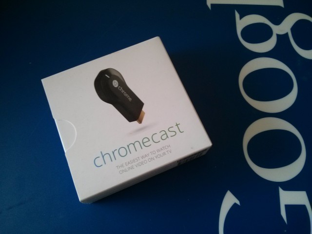
The Chromecast is a massively popular device, with a heap of functionality and Google is keen to make it easier for you to find new ways of using it. Today, the Chromecast site has been updated to make that happen.
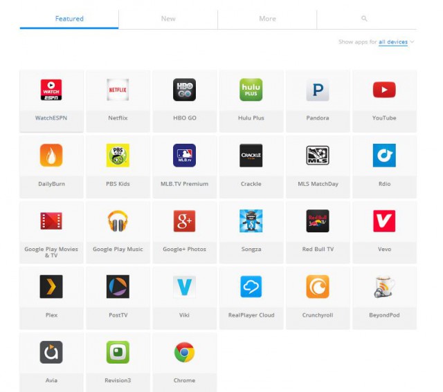
The apps section of the Chromecast site is now showing a tabbed interface with four tabs. The first tab is the featured section, with a New section, More and a search section.

Looking at the More section, you’ll find there’s a ‘Show More’ button at the bottom and you’ll take a fair time if you want to go through all the apps available. The Search section should make it a little easier to find some Chromecast compatible apps, so you can try that out.
There’s still no ‘Chromecast’ section in Google Play, which is a disappointment, but hopefully this goes some way to making Chromecast apps more discoverable.


Erm, it’s had the 4 tabs since Google IO
The phone app called photowall is still doesn’t work in Australia. Did you guys try?