Most will admit that Chrome OS, in its relative infancy, still has a few rough edges that need smoothing and polishing. It seems that the design gurus at Google are looking at looking to do just that. The proposed changes that may seem minor but each minor improvement to the UI of Chrome OS is a welcome improvement in my opinion.
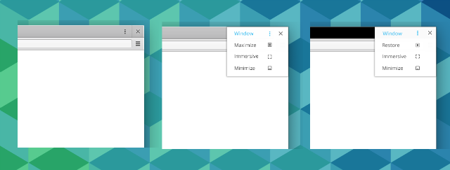
The first change proposed was to change the “radial” menu to a more android-like dropdown menu. The developer stated:
While pretty and conceptually interesting (radial menu), the window controls are hard to understand by a lot of people. We should fix this situation especially before Spring. This bug is about the visual improvements.
* Make the radial menu a drop down list as seen in the mock
* The drop down should be able to be scrubbed (meaning I can press and drag down to select)
* We should keep the left and right tile hold+drag we have currently

Personally, I agree with the developer. It took me quite a while to determine what the radial menu actually did. With Chromebooks and Chromeboxes slowly being marketed to the average user more and more I find the transition would be a lot easier with a more intuitive menu here. Not a massive change but a small improvement, which we all like to see.
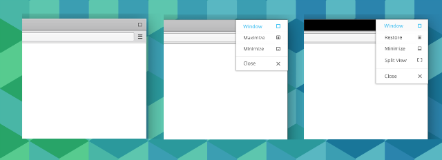
The second proposal is to remove the close button entirely and leave a single menu dropdown menu with the options here. The same developer this time proposed:
229464 should be built in a way that we can run an experiment with different amounts of window controls. (1, 2, or 3). So for example, we may want to see what happens if we hide all window controls behind a single Control button like in the attached mock.

Personally I like this idea as with Chrome OS everything opens within this window so there really is rarely a need to continually be closing windows as you would for other desktop operating systems. It seems a lot more sensible to me as with only one button/option in this corner the user should automatically know that something is hidden here and a single hover or click on it will display all options here.
Interestingly, the second and more recent option aligns Chrome OS up with Android and it’s menu functions. Coincidence? I don’t think so. We can speculate about it being a step towards unifying Chrome OS and Android but in my opinion the developers have seen how well it works in Android that why not apply it for Chrome OS as well? I doubt the Android lawyers will be hitting the Chrome OS with a C&D anytime soon for use of a patented menu style and I applaud the Chrome OS developers for thinking about “borrowing” ideas from other open source operating systems.
What is your opinion? Will it make one iota of difference to how you use your Chrome OS device? Is it a sign of things to come with respect to Android/Chrome OS convergence?


Yeah I can imagine the ‘scrubbing’ being incredibly intuitive for power users with touchscreens, just like !,.? in swiftkey. But at what cost for everyday users? Will they know where to look?
And while it is true that most windows are in a ‘chrome’ tabbed window with an individual x on the tab, for some reason the file manager isn’t, and I doubt they would have designed/added this whole new type of window unless they planned to make repeated use of it?
But yeah, visual overhaul would be nice 🙂 it is looking kind of Gingerbread at the moment lol
Makes it more touch friendly. The action overflow button is shared with Android and so people who use either OS would quickly be comfortable with that and saves them learning something new.