![]()
Over the past few years we have seen the visual nature of Android change constantly. We saw Material Design take over and since then we have seen many tweaks of that. Not happy to leave it there Google are set to introduce new launcher icons for their apps when Android 7.1 arrives in a few weeks.
Android Police tore open the new Pixel Launcher, set to appear on their new Pixel phones (RIP Nexus) with Android 7.1. Inside they found a change in the design nature of the icons for Google’s apps. They have noticed that the new updates recently have pointed at new icon names (eg. “ic_duo_round_icon”) and now they have managed to get their hands on the icons themselves, and yes they are round.
As you can see below, with the new icons next to their current counterpart they are definitely different in shape but keep the style/colour in most cases.
While some of the icons are nicely crafter to be circular some are just the current/old icon minimised and stuck inside a white button. At this stage it is unsure why this is but possibly updates will arrive in the future so the haphazardly created white button icons match the fully round icons. Android Police are reporting that the calendar icon will change like it currently does, dynamically based on the current date.
How these icons will be accessed is unknown but it is interesting that the call for them calls them nexusicons. And here we thought the Nexus name was dead. The icons will be accessible by all third party launchers. Sounds just like an icon pack made by Google for their Pixel Launcher. Circular icons packs are a dime a dozen on the Play Store so it is unsure what Google’s motivation is here. All will hopefully become clear on October 5 when we all drag ourselves out of bed at 3am for the Pixel handsets launch.




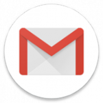
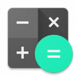
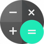






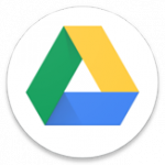





I hate that white circle background on most of these new icons. The originals look much more polished IMO. The only advantage I can imagine is that the new icons will be slightly easier to see on multi-coloured images used as wallpapers.
Seems like a pointless change favouring style over substance. There’s information in some of those shapes.
It’s worth noting their new Google Trips app from the other day already has a circular icon, instead of just a suitcase, it is a suitcase inside a circle; much like the new Gmail one up above.
Edit: the inconsistency of the new icons is the only thing that frustrates me; like the old Contacts to new Contacts ditches the flip-style of the icon, but the Calendar one retains the flip-style. I guess it is harder to convey the idea of a calendar with simply a number in a circle though, sooooo
Balls to that ….