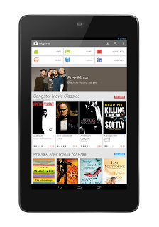
Google has announced that the Google Play redesign that has been circulating around and leaked out over the last couple of weeks is now officially rolling out. The Official Android Blog emphasises the fresh new look that they say is simpler and helps you find great entertainment fast.
 |
 |
With larger images and a new light theme, the new Play Store looks great. Although a little sparse for Australia as it appears that Focus and Promotional content has not been enabled outside the US as yet. Google has advised that they are focusing on larger images that ‘jump off the page’ with similar content grouped together to help you find things you like easier.
Purchasing content has also been streamlined, with Google saying that it’s been simplified. I found the new purchasing interface a little more simple, however what I am most impressed with is the better management of multiple accounts, I’ve previously had issues with the Play Store defaulting to my Google Apps Account and not allowing me to purchase apps, this is now resolved.
The update will be arriving on Android phones and Tablets running Android 2.2+ around the world over the next few weeks. It appears that the US is first to receive the update but you can download the new update right now. The download is a signed file from Google and will update over your existing Google Play Store. Apart from the missing Focus and Promotional content, it does work and does indeed look cleaner. Click HERE to download the APK.
If you’ve installed the new Google Play store, what do you think?


What is the build version of the new play store?
4.0.25 is the new version that’s being rolled out.
I installed the APK. Definitely much, MUCH better than the previous Play Store app. Only thing is I don’t think it’s supposed to be rolled out for Australia yet, so there’s a big gap on the front page where “Categories” is and I assume whatever apps/movies/music they’re promoting should be there.
Still though, a very nice, very clean app. Much more visually appealing. Get ready, as this clean, white/light grey card look is probably what Android 5.0 will look like. I personally think it looks great.
I’m really annoyed about that, HTF IS THAT SO COMPLICATED. -.-
Or you can use this link to download it now
https://www.dropbox.com/s/mpthhyb32329tt8/com.android.vending-4.0.25.apk
Or, you know, the link in the article 😛
just remember people, it’s going to take a little while to roll out. so if you get impatient… download the apk lol
I just noticed that music is now there… 2.19 a song bit steep
But the albums are very good value
Google Music is now available also.
It’s still missing a few things here in Australia but I like the new look.
Oh and I don’t know if anyone’s noticed but Google Play Music seems to be working!!