
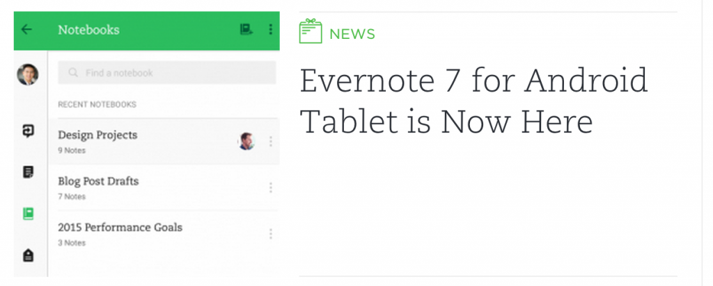
In mid-March, Evernote updated their Android app for phones with a Material Design makeover, bringing the app in-line with the latest design standards from Google. Today they’ve announced they’ve now pushed the update to Android tablets.
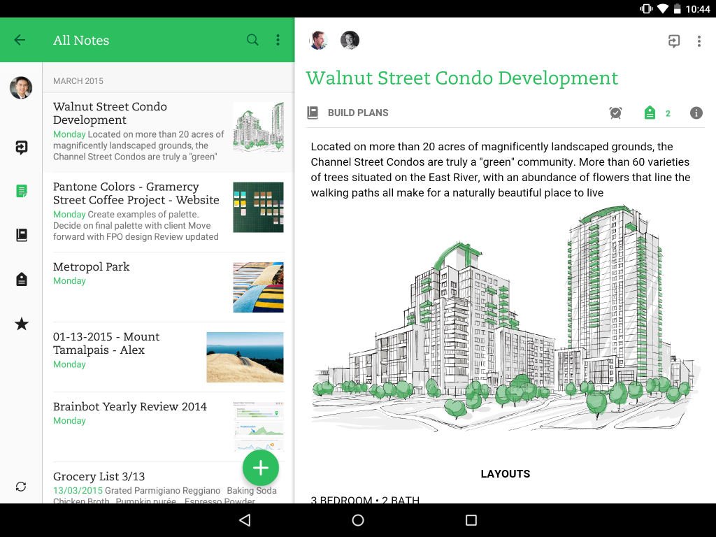
Evernote obviously want to keep the experience the same for users no matter what type of device you’re using. The app takes on all the flatter design elements you’ll find in the phone app, but with a larger screen available, they’ve optimised the interface to take advantage of it:
We used the metaphor of tangible surfaces to provide depth relationships between navigation and your content. And subtle improvements to typography and alignment let us create a much cleaner interface. We’re able to offer more functionality, including an updated new note button that mirrors our Android phone app.
The update to Evernote version 7 for tablets is now available in Google Play if you’ve got it installed, you should see a prompt to update, if you’re not using Evernote you should try it out.
Which note-taking app do you use?
[pb-app-box pname=’com.evernote’ name=’Evernote’ theme=’discover’ lang=’en’]


