Google’s new logo has been mostly hit for most people with the new font really giving a new and modern feel to the logo, even though the last version was only introduced in 2013.
The latest logo uses a brand new font called Product-Sans, a sans-serif font, meaning the small decorative flourishes from the ends of some of the characters have been removed. The font for the most part is the story here, though the actual logo has been made completely flat now as has been the trend throughout the last few iterations of changes.
Google spoke about the new font on their design blog when the new logo was unveiled saying
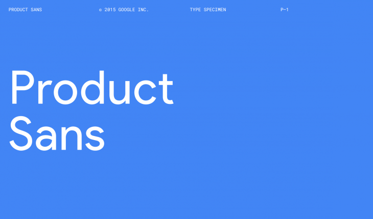
In tandem with developing the logotype, we created a custom, geometric sans-serif typeface to complement the logo in product lockups and supporting identity materials. We call it Product Sans. The typeface design takes cues from that same schoolbook letter-printing style, but adopts the neutral consistency we’ve all come to expect from a geometric sans serif. This allows us to maintain an appropriate level of distinction between the Google logotype and the product name.
Google released a type specimen for the new font, which shows off the characters in Upper and lowercase as well as the symbols, alternate characters, punctuation, symbols, fractions and of course in Cyrillic and Greek options. You can view the full type specimen on the Google site.
But if you want the font to use on your Windows or Mac PC, you can with Google making the font available as a Google Font API. You can simply add this code to your site to add it:
Before adding this to your CSS:
font-family: ‘Product Sans’, Arial, sans-serif;
Now, how do you get the font for your Mac or PC? Well, Xamphyx has extracted the individual characters from the Google Font API to create the file. You can grab the TTF file from their website, where you’ll find instructions on adding the font to your Windows or Mac PC as well as some custom font substitutions to add the Google or ‘G’ logo.
The font looks perfect and of course being pulled from the font API it pretty much is. The one criticism I’ve seen is that the ‘e’ doesn’t look right and if you’re going off the e in the Google logo, you’re right. But remember that the jauntily turned e in the Google logo is their design flourish for their logo, so you’ll just have to settle for the e from the real Font API.
It looks pretty great, and if you’re a fan of the new logo, you should probably add this to your arsenal of Google products. Check it out and see what you think.


I’m a little surprised this hasn’t been made a selectable font in Blogger.
Just put in a test webpage (sorry, not for the public)
It’s nice. Got a little style, but not over done.