Google Translate is a great, free service, but their online presence has begun looking a little dated in light of the Material Design makeovers being applied to other Google Services. That’s now being resolved with Google rolling out their new design on the web.
According to the blog post from James Kuczmarski, Product Manager, Translate Web the new, long awaited design now looks a lot better when you want to translate one of the 30 trillion sentences submitted every year, in 103 languages.
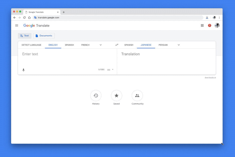
The new design is built using the same ‘updated labeling and typography’ used across other Google products which Mr Kuczmarski says makes it easier to navigate the site. As well, the website makes it easier to save and organise important translations you use or search for, with labels added to each translation. The website is also now responsive to different screen sizes adjusting dynamically to fit, allowing for a consistent experience across mobile, tablet and desktop.
The update is now live so you can try it out for yourself by heading over to translate.google.com.