The Galaxy S III was super popular, but can Samsung repeat last year’s success against renewed competition?
The Samsung Galaxy S 4 is set to be the hottest smartphone of 2013, and considering the success of its predecessor, will likely cement Samsung’s place as the number one smartphone manufacturer in the world. It does face some tough competition from all fronts though, with HTC really stepping up their game with the One, renewed efforts by Nokia to place Windows Phone 8 on the radar with its beautiful and colourful Lumia series, as well as solid devices from Sony and LG. Samsung have the advantage of being the incumbent champion, but there is the risk that the success of the Galaxy S III could make it hard for Samsung to deliver a worthy successor to that beast of a device.
It’s not really a secret that I have not been an admirer of Samsung’s phones in the past. When it comes to buying a phone, I value design pretty heavily – both in the software and the hardware – and Samsung’s offerings just have not appealed to me. For me, tasteless and overdone skeuomorphism, or even worse, fake skeuomorphism – designing software to look like it could be a real-world object, but isn’t – is the epitome of bad design and it’s a large part of why I don’t use an iPhone. When Samsung started talking about their ‘Nature UI’, I basically wrote them off as having joined Apple’s bad design party, and so I was an interesting choice of Ausdroid writer to review the pride of Samsung’s stable, considering how dismissive and critical I have been of them in the past. I have to admit though, that over the two weeks I’ve had the Galaxy S 4, I’ve grown to really like it.
As part of Samsung’s ‘Nature’ experience, the Galaxy S 4 comes in a fake-wooden box printed with soy ink. I hated the phone before I even turned it on. And then I hated it more once I had to sit through what has to be the longest setup process of ALL TIME, with 7 separate sets of terms and conditions that you must accept before you can actually use the device. To make matters worse, every single time you tap the screen, the Galaxy makes a sound like a drop of water falling into more water. Not only was it annoying and lame, water is the last thing you want to associate with your brand-new smartphone. At this point, I don’t think I’ve ever hated anything more – I’ve been disappointed before – but if the Galaxy S 4 were a person, I would have punched it right in the mouth.
Once I had finally gotten through the setup, the home screen appeared. In an instant, I forgot everything else but the phone’s glorious 5 inch 1080p Super AMOLED screen. In that moment, nothing else mattered. My experience with the Galaxy S 4 has been fairly up-and-down, but throughout it all, I never felt anything but pure, unadulterated love for that screen.
Anyway, to the review!
- The screen – the beautiful, beautiful screen
- Light and thin, but much sturdier than the Galaxy S III
- LTE
- Infra-red blaster
- Camera
- Battery life
- TouchWiz
- Weird button layout
- Some performance issues
Hardware
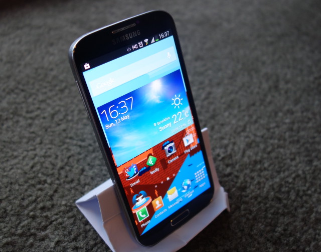
When you first look at the Galaxy S 4, you’ll notice that it looks similar to the Galaxy S III. But the longer you use the phone for, the more you notice the differences between the two phones. Samsung have done away with the cheap plastic feel of last year’s device to a large degree, building the Galaxy S 4 with a sturdy plastic frame that I actually thought was metal for most of the time I had the phone, which adds a more solid feel and a more premium look to the phone. I still personally prefer the sturdiness and design of HTC or Nokia’s phones, but if you’re not sold on all-metal devices, or you absolutely must have an SD card in your phone, Samsung have really done a good job with the S 4.
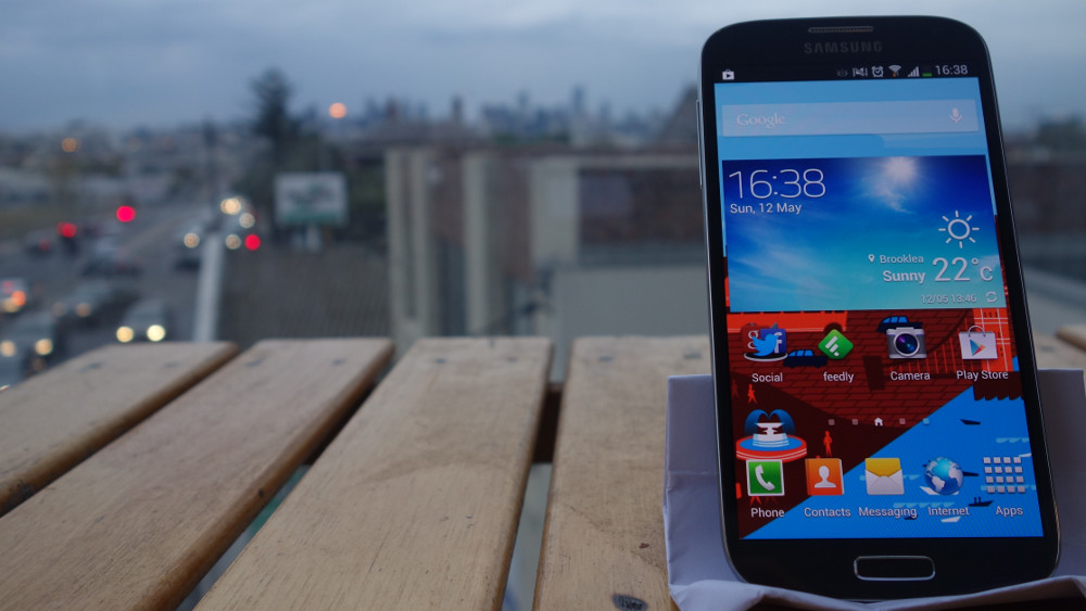
The front of the phone is largely taken up by the 5-inch 1080p display, with just enough room up top for the speaker grille, front-facing camera, light and proximity sensors as well as a second camera to track your eye movements; and at the bottom is the physical home button and the two capacitive buttons. At the top left corner of the screen is the RGB display notification LED.
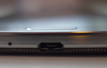
Atop the phone is the 3.5mm headphone jack, noise cancelling microphone and infra-red blaster. The left side has the volume controls, the right side contains the power button, and the bottom holds the micro-USB port and second noise-cancelling microphone. The power button sits exactly beneath my thumb when I hold the device in my right hand, but the volume buttons are possibly a little too high. Each of the buttons blends into the Galaxy S 4’s frame, but stick out just far enough that they are not a struggle to find.
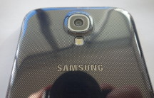
The rear of the Galaxy S 4 holds the 13-megapixel camera, LED flash, and loudspeaker; as well as the obligatory ‘Samsung’ and ‘4G’ logos. Under this cover lies the S 4’s removable 2600mAh battery and slots for a micro-SIM card and microSD.
About the only thing that disappointed me with the Galaxy S 4’s industrial design was the back cover. It seriously feels like it’s made from the cheapest, flimsiest plastic I’ve ever seen, and I thought that it was going to snap when I opened it to insert the battery and SIM card.
Display
As I’ve mentioned, the screen on the Galaxy S 4 takes up a generous portion of the front of the device, and as soon as you turn it on, the rest of the phone fades into the background. The 1080p Super AMOLED display truly is a thing of beauty – with 441dpi over 5 inches, text and images are crisp and clear, with vivid colours (thankfully the Galaxy S 4 doesn’t seem to suffer from the oversaturation problems that plagued earlier AMOLED screens), and rich, deep blacks. I thought the screen on HTC’s One X was the best that I’d ever see, but Samsung proved me wrong with the Galaxy S 4. I never want to stop looking at it, and every other screen in the world is now ruined for me. It’s just that good.
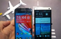
I’ve taken some photos of the Galaxy S 4 and the HTC One X side-by-side for comparison, using the Display Tester application, and both screens at 100% brightness. The sheer beauty of the S 4’s screen doesn’t quite come across in the photos, but in person it looks incredible.
Battery life
My personal phone is the One X, so almost anything is an improvement on the battery life, but the Galaxy S 4’s battery went beyond my wildest dreams. There have been a number of times when I’ve forgotten to charge it overnight and each time, it’s still been functioning the next morning. You can get about a day’s worth of use out of a 20 minute charge, and with very minimal use (but still with syncing and data enabled) it is possible to make it through the best part of two days.
To help prolong battery life, Samsung have included a power-saving mode that is automatically activated when the battery level falls below 30%, but that you can optionally switch on at any time. The battery-saving mode limits the CPU speed, reduces the display brightness and disables haptic feedback. It seems to work reasonably well, and it’s one of the few features Samsung have added to Android that I wish would make its way over to AOSP.
The buttons

Like many other manufacturers, Samsung have resisted Google’s push for on-screen navigation buttons. I personally prefer them, but I understand that some people see the soft buttons as a waste of screen space. That’s fine, I can accept that, no problem. But I do have a number of pretty serious complaints about Samsung’s chosen button configuration:
- The Galaxy S 4 still has a hardware menu button. For the love of all that is good in the world – why, Samsung, why?
- The home button is an actual, physical button, while the back and legacy menu buttons are capacitive keys. I didn’t understand why Samsung did this on the original Galaxy S, and I don’t know why they’re still doing it. It’s inconsistent, awkward, and I hate it.
- The back key is on the wrong side of the phone. ‘Back’ buttons are almost always on the left side of your device. On a timeline, previous events are shown to the left of the current time, and going left is going backwards in time. This is why all web browsers have their back buttons on the left of the screen. Samsung, you’re doing it wrong.
- And to top it all off, the Galaxy S 4’s buttons blend into the bottom bezel of the device, so you can’t see them when the backlight is off. Which wouldn’t be too bad if they were lit up when the screen was on, but no – the backlight only switches on once you’ve already pressed the key. I have watched several people struggle to figure out how to go back, before giving up in frustration and handing the phone back to me.
Different functions can be triggered by long-pressing or double-pressing the Galaxy S 4’s keys. The app switcher can be brought up by long-pressing the home key, while a double-tap will trigger S-Voice. Long-pressing the legacy menu key acts as a search key, and long-pressing the back key will enable or disable multi-window.
Performance
The Galaxy S 4 is powered by Qualcomm’s Snapdragon 600 system-on-a-chip, with a quad-core CPU clocked at 1.9GHz and an Adreno 320 GPU, so you’d think that it would be a performance beast. And yet somehow, Samsung managed to bollocks up the software to the point that simple things like unlocking the screen, or switching between applications took a couple of seconds while Touchwiz chugged along. The performance was disappointing at the least, but with a few simple fixes, it was possible to reduce the issues to a minor annoyance.
Network
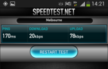
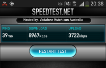
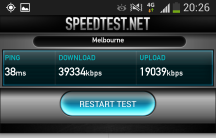
As much as I love Vodafone, their network can be pretty terrible a lot of the time. In Melbourne’s CBD, data speeds were terrible, and everything from Google Now to Speedtest would time out before it had a chance to finish what it was doing more often than not. Outside the CBD though, I had almost no performance issues. In Footscray (where I live), which is about 5km from the city, I was able to take advantage of Vodafone’s DC-HSPA network, and boy was it an improvement over their standard 3G network.
Software
I’ll be up front about it – I hate TouchWiz. I hated it on the original Galaxy S, and it’s only gotten worse since then. I tried not to be biased with this review; to give TouchWiz the benefit of the doubt, because if HTC can make Sense into something that I want to use, anything is possible. But it took all of about 10 minutes before I swapped the launcher out for Action Launcher, and Samsung’s keyboard was gone by the end of my first day with the Galaxy S 4. I’d heard a lot of people having problems with the gallery application, but it wasn’t an issue for me until I had taken a few photos with the phone, and then it basically became unusable. Fortunately, Quickpic is an excellent alternative and works beautifully.
In terms of design, Touchwiz is [still] horrible. While HTC’s Sense 5 is a cohesive experience that blends HTC’s own brand and sense of style into Android’s already beautiful experience, Samsung have just ruined everything. The Frankenstein’s monster of a UI stitches together pieces of Gingerbread and Jelly Bean that the good doctor must have found in his six-year old nephew’s colouring book. The font size is increased a couple of points in Samsung’s applications, but not across the entire device – third-party apps have normal-sized fonts, and reducing the font size in settings only affects third-party apps, so the problem only gets worse! Some of Samsung’s applications use the ancient tabs from pre-ICS versions of Android, and whether or not any given application will support lateral swiping between tabs is essentially a lucky dip. Over time, your eyes burn less and you become less frustrated with the way TouchWiz works, but you will never actually enjoy it.
I’ll hand it to Vodafone though – they really held back from loading the phone with bloatware. The only applications Vodafone had pre-loaded were their own tools for managing your usage. There are also a couple of Channel 7 applications for news and streaming TV, but these aren’t unique to Vodafone — it seems these come from Samsung themselves.
The best part? Every single one of these apps can be completely uninstalled from the device if you don’t want them. Go, Vodafone!
Touchwiz launcher
The default launcher on the Galaxy S 4 is not immediately horrible. Its animations are fast and fluid and actually add a nice touch to the experience. It isn’t until you’re feeling bold and crazy that you’ll notice that the standard launcher is missing some of the more advanced features, like the ability to re-arrange your dock icons. Seriously, you are stuck with the five icons that Samsung have decided are the best, and there is no way to change them. Don’t want to use Samsung’s browser? Too bad!
On top of that, Samsung insist on hiding basic features behind their menu button. For about a week, I actually thought that you couldn’t re-arrange home screen widgets or icons once they’d been placed. I thought the only way to do it was to remove it, and re-add it. It turns out that even though a long-press on a home screen item brings up exactly the same dialogue as when you first place the item, you have to first tap the legacy menu button and then tap on ‘Edit’ before you’re allowed to change anything. You need to go through a similar process to uninstall an application from the home screen.
None of this is intuitive, and Samsung have really made this an unpleasant experience.
Android 4.2.2
Unlike the HTC One, which launched with Android 4.1.2, the Galaxy S 4 ships with the most recent version to come out of the Android bakery, although you’d almost never know it. The two big features of Jelly Bean – Google Now and Project Butter – are hidden away as if they’re something shameful. Instead of Google Now, you get S-Voice, Samsung having removed any obvious way to access Google Now except from your launcher (you can access it from the task manager by long-pressing the home button, then the little ‘g’ icon); and the device’s performance is nowhere near as buttery-smooth as other Snapdragon-powered Android 4.2 phones. It’s a lot more responsive than my One X, but it also isn’t burdened with a Tegra 3. Still, the S 4 ships with all the necessary APIs, so even though Samsung have tried their hardest to make you forget you have an Android device, you’ll still be getting a device with the soul of Android 4.2.2 intact.
Touchwiz ‘features’
Samsung threw so many features into the Galaxy S 4’s software that the 16GB device only has about 7GB useable storage space out of the box. Apparently, Samsung are going to address this, but at the moment, it’s still a problem. I’m sure that each person who reads this review will find different features more or less useful, so I’ll try to give as much information as I can, but I can really only write about my experience. Feel free to disagree or ask questions in the comments, and hopefully we’ll get as much information out as possible.
Features I liked
Universal remote
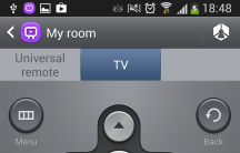
Being able to use your phone or your tablet as a remote for your TV is awesome, and thankfully more devices are being released with IR blasters for this very purpose. I guess we can now add ‘remote control’ to the list of things our smartphones have replaced. On the Galaxy S 4, setting up WatchOn (the remote application) could not be simpler – you select your region for the TV guide, and pick your TV brand, and you’re good to go. The range of the Galaxy’s IR blaster is not as long as the TV’s actual remote, but it’s great when I can’t find (or can’t be bothered reaching for) the remote. You can switch directly to different shows from within the TV guide, and add the remote’s controls to the notification bar or lock screen.
AirView
AirView is a feature that Samsung ported over from the Galaxy Note II, where hovering over specific items on the screen will show a preview, or reveal more information about what you’re hovering over. For example, in the messaging application, hovering over a message thread will show a more detailed preview of the last message; and hovering over an album in the gallery will show a preview of the photos in the album. I thought that I would have quickly dismissed Air View as a gimmick and never given it another look, but it has really surprised me with how useful it is when it works.
The main problem with Air View is that sometimes the phone doesn’t correctly detect the hover gesture – either not registering it at all, or misinterpreting it as a touch event. Another issue is that very few applications other than those Samsung bundle with the phone support Air View.
Samsung Music Hub
Samsung Music Hub is a music streaming service, similar to Spotify or Xbox Music. It costs $9.99 per month for one device, and $12.99 for up to four devices. When you first set up your Galaxy, you are offered a free one-month trial of the premium package. Like Spotify, Samsung Music lets you create playlists and save tracks for offline use. The selection of music available isn’t as large as Spotify, but it has most popular music and some more uncommon artists as well.
Status bar brightness
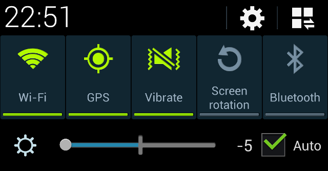
With most phones, auto brightness works pretty well, but there are times when you might want just a bit more or less brightness. In one of those ‘I can’t believe no one’s done this before’ moments, the Galaxy S 4 puts a slider in the notification bar that lets you switch auto brightness on and off easily, as well as being able to add or subtract a few lux from what the software would otherwise pump out. Samsung aren’t the first to have done this — for example, the LG Optimus G does similar — but it’s certainly a welcome tool for some.
Air gesture – quick glance
It’s features like quick glance that make me understand why people buy Samsung’s phones. Basically, the S 4 detects when you move your hand towards the phone, and it switches on the display to show you the time and any notifications you might have. When I saw this feature in the settings, I lit up. It’s such a cool idea, and even though it doesn’t always work terribly well, it makes you feel like a Jedi, which is a good thing in my book.
Features I disliked
Multi-window
Multi-window has been touted as Samsung’s killer feature, but I just wasn’t interested. It’s not that I actively disliked it, I just didn’t really think it was useful, and I think it could possibly have been done better. I see what Samsung were trying to do here, and I’m sure it works really well on a tablet, but I think on a phone, this kind of multitasking would be better served using floating windows, like Facebook’s chat heads or Cyanogenmod’s quick messaging popup. The only time that I’d find something like multi-window useful would be to reply to a text or email without having to switch out of whatever I happen to be doing at that time, and a floating window would work so much better than having to mess around with long-presses and window snapping and re-sizing.
Its lack of usefulness is further compounded by the fact that it doesn’t work with every application. There are some third-party applications that support multi-window, but the list is far from extensive. In addition to Samsung’s own applications, Gmail, Google Maps, Google Talk, Youtube, Chrome, Facebook, Twitter, Falcon Pro and QuickPic support snapping.
Keyboard
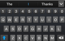
Apparently, the keyboard on the Galaxy S 4 is a modified version of Swiftkey, arguably the best third-party keyboard around, which has great autocorrect and can learn your typing style from your Twitter, Facebook and Gmail accounts, as well as SMS messages you’ve sent. I then naturally assumed that Samsung’s keyboard would be pretty good as well. I could not have been more wrong. By default, autocorrect is disabled, and I couldn’t think of a single good reason why this would be the case. Until I switched autocorrect on.
Once you enable autocorrect, you’ll soon wish you hadn’t. I don’t care what Samsung say, the keyboard on the Galaxy S 4 can’t possibly be built from Swiftkey. Samsung’s keyboard is truly horrible. Its autocorrect was consistently wrong, changing minor typos into completely different words (‘testinf’ became ‘yes’); it was not able to detect that the accidental ‘b’ or ‘n’ in between words was meant to be a space; and the dictionary was missing a lot of fairly common terms, such as ‘1080p’, which became ’10 0′. Even after telling the keyboard to learn from Facebook, Twitter, Gmail and messaging, it was still horrible. In fact, I think it actually got worse insisting that its predicted words were correct, even when I typed something completely. Needless to say, the real Swiftkey swiftly replaced Samsung’s version.
Smart Pause
‘Man, watching this movie is great, but I miss out on so much when I momentarily glance away from the screen! I wish the film would stop playing when I’m not looking directly at my phone.’ Said no one ever. And yet, this exactly what Smart Pause does, in a perfect example of Samsung solving problems that don’t exist.
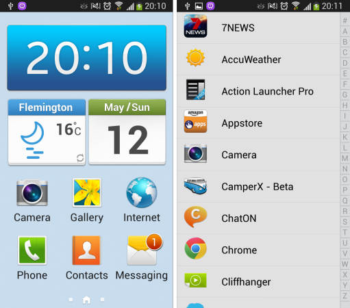
Easy mode
A carry-over from the Galaxy S III, ‘Easy Mode’ is basically a super dumbed-down launcher, and it should not be used by anyone ever. Apparently the standard launcher is too confusing for some people, and Samsung thought that this abomination would help. Seriously, check out these screenshots, and you’ll see what I mean:
Air Gestures – the rest
I loved the ‘quick glance’ gesture, but there are other Air Gestures with which I was less impressed. Basically, most of the time they don’t work, and are only supported in a couple of inbuilt applications. If you can get them to work, and you’re happy using Samsung’s standard apps, you can wave your hand in front of the Galaxy S 4 to scroll through web pages, skip back and forth in media applications or accept or reject phone calls.
S-Voice
S-Voice doesn’t work too badly for the most part, but it’s listed as a dislike because it has no reason to exist. Google Now is far superior and things like S-Voice are the cause of Samsung’s legal troubles. It’s clearly meant to be a Siri-ripoff, but it’s lacking the wise-cracking comebacks of Apple’s VI.
Samsung Apps and Hub
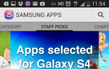
The cool thing about Samsung Apps on the original Galaxy S was that you could download some pretty cool premium applications for free. On the Galaxy S 4, this isn’t the case, and Samsung’s offering is just another alternative app store, but without the catalogue of the likes of Amazon. There are categories within the store called ‘Apps selected by Samsung’, and ‘Apps selected for Galaxy S 4’, which I thought would be a selection of applications that make great use of the unique features of the S 4, but in reality it’s largely a collection of mediocre applications seemingly selected at random.
The Samsung Hub looks really nice, but isn’t very useful. It’s meant to be a portal to various different types of content, but there isn’t a lot of content, and it certainly doesn’t offer anything over the Play Store. You do get a $20 credit to spend in the Learning Hub though, which is pretty cool.
Random quirks
The Galaxy S 4 has a bug which is apparently left over from the SIII, where enabling any accessibility function will automatically enable TalkBack whether you want it to or not. An example here is LightFlow, an application that lets you customise your notification LED. It runs as an accessibility service, and so enabling it will also make your phone read everything on your display to you. There doesn’t seem to be a workaround.
I’ve mentioned above that the phone suffers from performance issues. I’ve written a short guide on how to fix these, but they shouldn’t have been there from the start. Hopefully Samsung will address the problem in an OTA.
Hackability
The Galaxy S 4 is easily rooted, and considering the popularity of the Galaxy S III, chances are that its successor will be very-well supported. Steve Kondik (Cyanogen) himself was working on CM 10.1 for the T-Mobile variant of the Galaxy S 4, which has the same internals as the Australian version, and there are unofficial nightly builds available on XDA-Developers. Samsung phones are usually pretty great for custom ROM-mers, as the bootloader doesn’t usually require signed firmware and factory images are readily available if you want to roll back. The Galaxy S 4 is no exception, and I expect that if being able to root your phone and load custom ROMs is important to you, you wouldn’t be disappointed with the S 4.
Camera
The Galaxy S 4 has a 13 megapixel shooter on the back, which can record 1080p video, and a 2 megapixel front-facing camera capable of recording 720p video. During the day, the phone takes excellent quality photos – the contrast is great, the images are crisp and the colours are very true-to-life. Its macro mode is excellent, being able to focus on objects a couple of centimetres away with no problem at all – I didn’t even need to manually set the camera to macro mode. What lets the camera down though is its performance in low-light. Even when you’ve got a lot of electric lights on, without sunlight, the photos are pretty noisy. Sadly, the photos are only bad by comparison – in a world without the Nokia Lumia 920 and its image stabilisation technology, the photos would probably be quite good for low-light snaps, but in the crazy, post-OIS world in which we live, the Samsung just does not compare to the likes of the HTC One or Nokia Lumia.
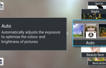
The software has a lot of different modes – some useless, but maybe a little fun (beauty face and the picture-in-picture mode); and some that are actually pretty damn cool, like the animated photo and eraser modes. The HDR mode doesn’t actually seem to be real HDR – the phone only takes one picture and does some processing on it, rather than magicking together a number of photos at different exposure levels – and the resulting ‘HDR’ images have not been anything to write home about.
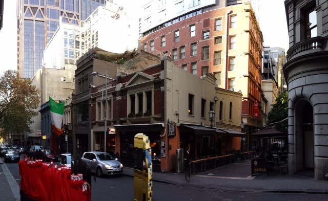
The phone has a sweep panorama mode, which works well, but isn’t quite as good as Google’s software at removing passing-by traffic, as you can see below. Sadly, Photo Sphere didn’t make the cut.
Videos
Inside the jazz club
Out in the sunlight. Not sure why it glitches halfway through.
Camera samples





Samsung Galaxy S 4
So, did I like the Galaxy S 4? Yes, a lot more than I first thought I would, and definitely more than I thought I would when I first started using it. Touchwiz is largely horrible, and I have certainly given it a beating in this review, but Samsung have done some genuinely cool things with it – things like animated photos, Air View and Quick Glance – that make you really want to fall in love with the device. And then there’s the screen – apparently, despite what almost every blog is saying, it isn’t PenTile, but honestly I found it hard to even pretend to care. Typing this review on my 24 inch monitor, whose resolution is only slightly higher than that of the 5 inch Galaxy S 4, I found myself reaching over to unlock the phone just to look at the screen more times than I’d care to admit.
But as much as I loved the screen, and as impressed as I was with the build quality of the device, I probably wouldn’t buy it. The S 4 costs upwards of $700 outright, and the cheapest on-contract price you can get it for is $49 per month on Optus’ $30 plan, which offers a paltry 200MB of data. Admittedly, the HTC One will cost you about the same, but I personally feel that it’s a better device for the money.
But that’s because I don’t care about things like removable batteries or SD cards, and I much prefer HTC’s style to Samsung’s. The thing nowadays is that it’s impossible to identify the objectively-better phone – for all intents and purposes, the One and the Galaxy S 4 are identical, with a few differentiating features and different software. You’ve probably read our review of the HTC One, and now you’ve read what we think of the Galaxy. We’ve done our best to identify the strengths and weaknesses of the two devices, and now the choice is up to you. The Galaxy S 4 is a fantastic phone with some software issues, and if you want a light, thin phone with a removable battery and SD card, you should go out and buy the Galaxy. You will not regret it.
For what it’s worth, if it weren’t for the cost, I’d happily have this phone, but with the caveat that Touchwiz would be shown the door in favour of some appropriate custom ROM. With on-screen buttons. Or, I’d just buy the cheaper, Touchwiz-less version announced at this year’s I/O.










It’s nice to finally see a fair play review of the S4. Having had a Galaxy S1 and each consecutive model since, I sometimes get a bit blinded by the brand name. I do agree though – TouchWiz has definitely become a con in the galaxy series. It needs to go or have a major overhaul. While being user friendly, it’s not particularly friendly to the phone itself and certainly not the best use of the on-board processor. Otherwise, the S4 continues to be worthy successor to the S3.
I think you’ve hit the nail basically right on the head here, Dan. The S 4 is a great phone that’s let down by its software. I like what Samsung are trying to do by increasing user-friendliness and packing the phone with cool applications, but Touchwiz is in serious need of an overhaul.
Thanks for the feedback!
Hey James, Interesting take on the phone. The back button is placed well for right handed people in my opinion because it’s something that we constantly use so having it right at your thumb is really handy. I personally also like the backlight button fade and think that the hardware menu button and things like that bring a sense of stability to the phone. I have no doubt if I was a One user or something like it I would no doubt find many of the features annoying and difficult to become comfortable with just like when I went from… Read more »
Hmmm… I had not considered that. And you definitely do get used to the way Samsung do things – when I went back to my One X, there were a few times I was pressing the wrong button by mistake. That was a bit awkward. I get that Samsung have tried to make the experience across their phones consistent, and the menu button is a part of that for them, but it’s no longer a part of Android and leads to an inconsistent experience across applications. And as the Galaxy S phones are the most popular Android handsets, there’s less… Read more »
I love how all the Samsung fanbois have their noses out of joint because the reviewer didn’t like some of the features. You have to review the device out of the box, as Samsung sell it to everyday people. How can a brand new premium phone have lag issues or chew up so much storage space out of the box? Sure the reviewer might be set in his ways, but you can’t deny TouchWiz is an abomination. And as has been pointed out in the comments, it’s not just a matter of installing a custom launcher to rid yourself of… Read more »
Thanks, Craig 🙂 I tend to read a lot of reviews, and if I’m in the market for a new phone, I want as many different perspectives as possible. Interesting that some people only want to read reviews that they agree with 😛
I like your description of Touchwiz as an abomination – nice!
James Finnigan darling, next time please stick to reporting the news only. Please leave the reviewing to the professional. BTW Samsung has sold 6millions Galaxy S4 that you truly hated!!
Right, well you mustn’t have actually read the review, because I didn’t actually hate the Galaxy S 4. Sure, there were a lot of things about that I didn’t like, but overall I actually liked the phone. But thanks for the feedback anyway.
i use most of the features on the phone believe it or not
I want to know how photo from htc one is better than photo from s4.
Poor review I have to say. I too am disappointed in the S4 and prefer the One but this review is clearly one sided and not balanced.
Did you read the same review I did? I found it pretty open minded and offered a fair opinion. Or are you simply trolling?
I personally check every single post as a early adaptor and this review is biased to anti samsung. I hate this and that and that and that. If you dont like the phone, why did you bother reviewing it? Write this in your diary next time please.
The keyboard has a bug. Not sure if samsung are aware of it yet. But if you turned on swipe, and use it once, then the autocorrect will work normally. you have to use swipe at least once every reboot of the phone. then the autocorrect can catch up normally. must be some bug with samsungs keyboard. you can start jamming words really fast and it will get you what you really want, instead of correct on the 2nd or third key you pressed in a long word.
are the best at bring us Aus Android news, but you guy sux at reviewing. BTW the reviewer is an idiot.
Ausdroid.net are the best at bring us Aus Android news, but you guy sux at reviewing. BTW the review is an idiot.
Yep, thanks for that. Anything specific you take issue with, or just too many kids on your lawn?
Clearly a HTC Fanboi you are. Why hot called Ausdroid.net HTC central?
i dont like hardware button, i love capacitive buttons.
I love the hardware buttons, and I know I’m not the only one.
I’m not the biggest fan of hardware buttons myself, but I understand why others are. My issue is with their configuration. The menu button needs to die.
Reviewer saying back button must be on the left not right. Is that what you call a review?
fake wooden box. Is there any company makes real wood box for a phone? They used recycle paper and it was just one idea to use yellow paper. I don’t care if you hate the left back button or not, do some benchmark or tell us how hot it becomes when you play game or drop test. something like that might be helpful as a REVIEW.
I don’t think Vodafone would have liked it if I went around smashing their phone. And besides, Buzz already did that for us – http://ausdroid.net/2013/05/10/psa-get-a-case-for-your-brand-new-phone/
It doesn’t need to die.
Personally, I love the fact that the Galaxy line (and Samsung devices in general) sport hardware buttons, particularly the physical home button. If hardware buttons were ‘really’ an issue with consumers, they wouldn’t sell phones in the quantities they do and you can bet Samsung would ditch them in a heartbeat. As for the dock icons being fixed, that inexplicably is an Australian market only modification introduced via an update to the SIII last year that removed the ability to edit as the user saw fit – go figure!! Hopefully, future updates will cut the bloat and let the hardware… Read more »
When I clicked on the videos it said “this video is private” but my biggest beef with this review is the yammering on about touchwiz .. I’d expect more from an ausdroid review. Seriously .. who doesn’t change their launcher within the first 10 minutes. I’ll agree touchwiz sucks but come on lets move on from the full paragraph rants about touchwiz just for one review.
I’m sorry, the videos should be fixed now. This was the first time I’ve ever actually uploaded something to YouTube.
The days where a manufacturer’s skin is only a launcher are long over – Touchwiz permeates every part of the device, and it’s a huge selling point for the device. And besides, a lot of people don’t change their launcher. I wanted to give full coverage to the device as Samsung sells it.
Its all good .. I think I just need to stop reading reviews of the s4 as they are starting to sound the same to me. I decided on the s4 over the one due the one’s lack of expandable memory and its camera .. those two are deal breakers for me. I have to wait until the end of this month to re contract and all these reviews are starting to make me over analyse the phone. I’ve had several extensive plays with the s4 now and I am even more convinced this is the phone for me. I… Read more »
Shouldn’t be too hard to flash the Google ROM though, right? 🙂
Yeah .. thats the one thing I am just no good at .. we’ll see how we go .. likely be an OTA update before I even get mine.. just hoping they release the 32gb model in Australia as well.. still no word yet.
The locked dock icons is a restriction specific to AU models and relates to a certain court case with a certain fruit company.
See that’s what I assumed as well, but I’ve not been able to find anything specific about it. I also did not know that it was an AU-specific thing… Weird.
Lacking ability as a reviewer. We all can flash uk firmware to edit dock icon.
Sorry to nitpick but the photos related to your comparison of phone screens “HTC One vs Galaxy S4” show an HTC One X device instead of an HTC One.
Whoops! My bad. Fixed now 🙂
Unfortunately, for all the cool geeky features they include (and I love some of these) we can’t hide from the fact that Samsung are horrible at hardware and software design. The hardware is a matter of taste I guess but their apps are generally garbage and their coding ineptitude explains why with the fasted mobile processor on the planet, the S4 still frequently lags. It’s a shame.
Couldn’t agree more!
mine dont lag and i had it since release and around 200 apps
Extremely personal review.
not recommended
personal yes, biased no. I thought it was actually very fair.
Thanks, I tried really hard not to be biased. I actually like personal reviews though. You can find out a phone’s specs by reading a table. If I’m going to read a review, I want it to show me how the device works in the real world, and how the reviewer actually felt about it.
exactly, if you just want specs they are easy to find
I agree. Great review. Very fair. Unbiased. Well done!
I just dont like how review is all about hate this and that. This is not even close to criticise. Review from verge criticise without biased.
I agree .. came across as a bit personal.
In all previous Galaxy S phones there has been an option to keep the light for the capacitive keys on at all times, I assumed the S4 has the same thing. Settings – Display – Touch key light duration (1.5s, 6s, always on, always off)
Yes those setting are still there….. but if you’re a Samsung user you just normally go there anyway…. muscle memory etc.
Call me crazy but I leave it at the default 1.5 seconds. I don’t need to look to see what button I’m pressing