Who doesn’t love a Material Design refresh? Google has today opened access to their new-look, Material-inspired YouTube website.
What’s new? Well, there’s less red and it’s got a dark theme as well as some ‘under the hood’ enhancements (switching to Polymer) which will apparently make development faster from here on out.
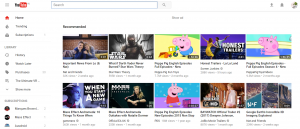
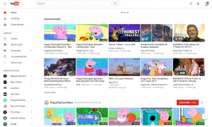
YouTube’s new look is not so different, with most of the changes in the look and location of the menu items.
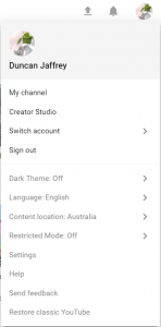
“Dark” mode is a new addition, and good for those of you obsessed with dark interfaces. It lines YouTube up with an increasing trend towards dark interfaces on video sites, focusing the user’s attention on the content.
Also, yes, my daughter is clearly the main user of my YouTube account. Try not to judge.
Want to try out the new look? Go to YouTube.com/new and sign up. Switching back is also easy, just pop into the settings (click your avatar) and hit “Restore Classic YouTube”.
A site redesign isn’t always such a big deal these days – many companies make minor evolutions to their design all the time, but when it’s an Internet institution like YouTube we’ll still sit up and take notice. Switch over now and see for yourself.
Spotted something significant in the new YouTube UI? Tell us in the comments!





I don’t like the new YouTube app’s display either; all white theme, gone is the red highlights. It should definitely have a dark theme option.
I can’t find the dark theme toggle.
Click your avatar at top right.
So it is. That’s not really the place I’d expect such a setting to be though. Would’ve made more sense in Settings or as a toggle in the sidebar.