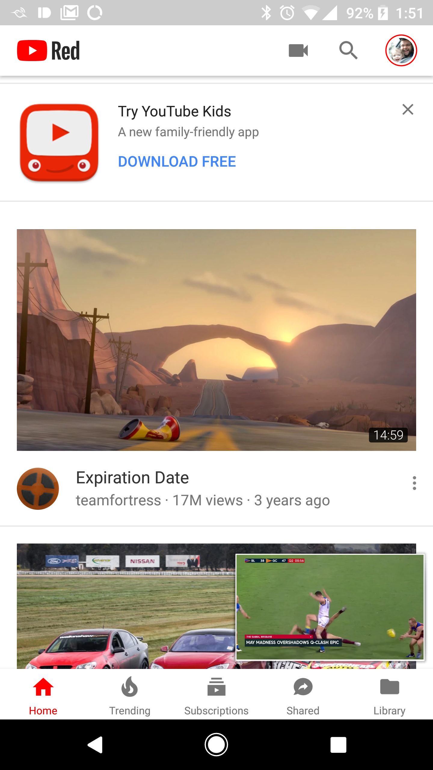
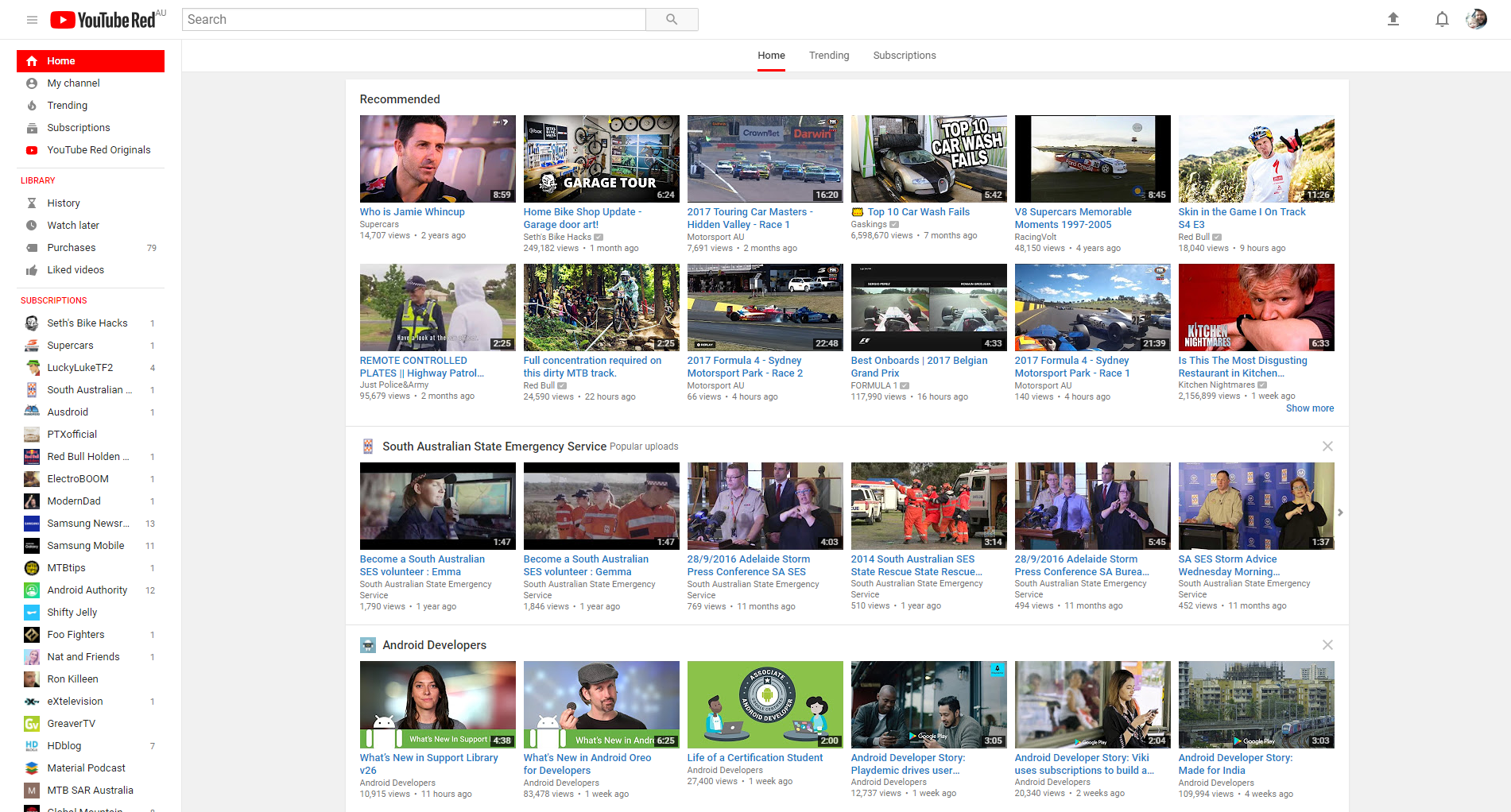
The YouTube app has received an update today and there’s plenty to look at.
Starting with the new logo, moving from the text only logo to a more modern logo with text that will instantly be recognised by users. On top of the logo change, users will notice a new look in the Android app and particularly the web interface which now has a material design. The new look immediately gives you more screen real estate to play with and cleans up the screen of often unwanted noise for users.
Another feature (seemingly not yet visible on my login) is dark mode which can be seen on the YouTube spotlight video below.
There’s a lot of change here in both the app and the web interface and surely more to come in the future.
What’s your favourite change to the YouTube interfaces?