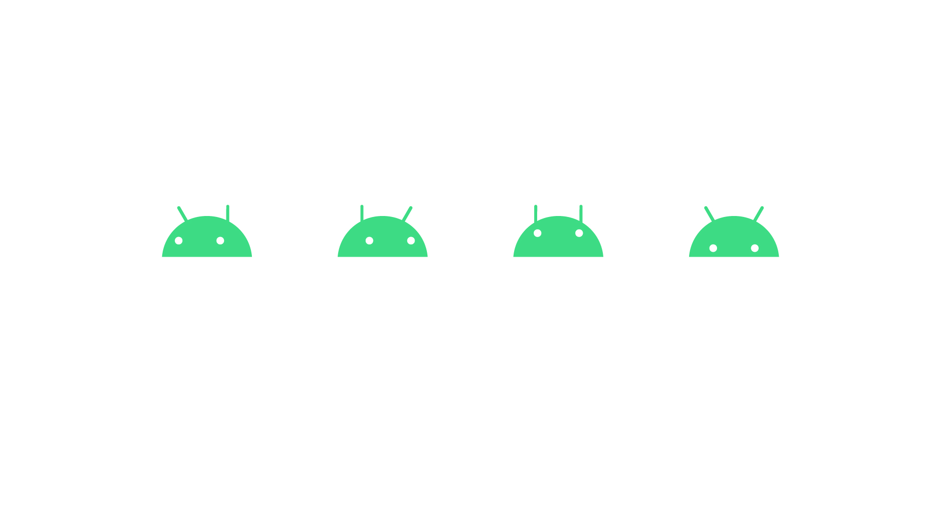
Alongside Google’s announcement that they were dropping the tasty treats naming in favour of simple and predictable version numbers, Google has also unveiled a branding update for Android going forward. Firstly, don’t worry the Android logo isn’t going anywhere, nor are they changing Android’s name.
So what are they doing? They have refreshed the typeface, included the Android head as an official part of the logo going forward and …. changed the shade of green. This being the internet we’re sure people will accept these minor changes and embrace the fresh new look going forward. Only kidding, we’re half expecting a full internet meltdown over the change in the shade of green. Strap in for what will most likely be many an unpleasant Reddit-style rage.
Google has updated the typeface to be a little thinner which Aude Gandon, Global Brand Director at Google, said makes it more suitable for displaying on a larger array of screen sizes and resolutions. The new logo has both a horizontal and vertical option letting device makers tailor the logo to display on a wider variety of displays.
Alongside the refreshed brand Google has also announced a new pallete of secondary colours to be used in apps, on websites and other official communications around Android. The eagle-eyed among you may notice that one of the shades of blue in the new secondary pallet is in fact the official Google blue bringing a little synergy to the new look.
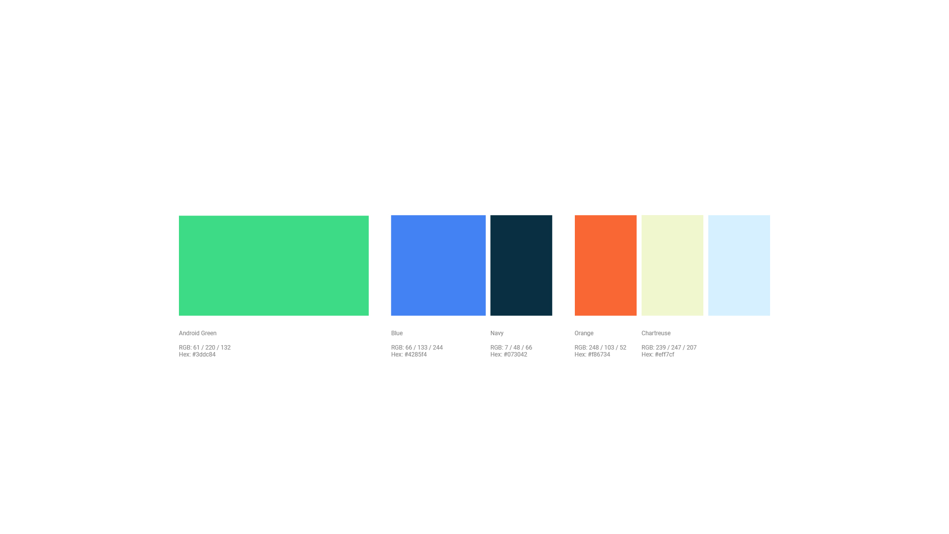
We also got a quick look at some new bug droid animations that Google will be using alongside the new branding, bringing some of that Google fun and whimsy along for the ride. The change to the shade of green is the “biggest” departure with the new green having more yellow and less blue than the current variant. For those of us who are resilient we will adapt to the change over time and remember what’s important is the functionality of the operating system not the RGB mix of the brand colours.
Overall we would call this a refresh to the current Android logo, and it’s interesting to see Google’s doubling down in including the iconic Android head as an official part of the logo.