
There’s over 2 Billion active users on the Play Store every month. Through the years, there’s been a steady evolution of the interface for users. Now comes the revolution with a brand new interface rolling out to users.
Google have focused on bringing the Play Store into line with the Material Design standard. There are a few particular key features to highlight. Starting with the new navigation bar at the bottom of the screen for mobiles and left side navigation for larger screens.
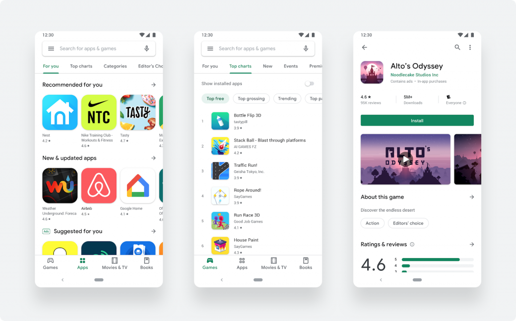
The pathway for accessing games or apps is very distinct now, helping users understand what they’re accessing. Ensuring that the users are accessing the apps they expect and are not led down a rabbit hole.
The changes also includes a more detailed listing page with a clearer option to install the app. The higher level of detail on the pages helps users make better decisions on whether or not to install an app.
The new icon system will bring a more uniform presentation to the user’s screen. This transition has been happening for some time, now finalised.
The developers blog also provides links for app developers to the new icon specifications as well as best practice for Play Store listings.
The changes are rolling out quickly, so if you haven’t seen it yet you shouldn’t have long to wait.


To access the section of play store where you buy music, open the Google Play Music all. Press the menu button at the top left and then select shop. This will relaunch the play store directly to the music area.
I recently noticed the music section seems to be completely absent.