
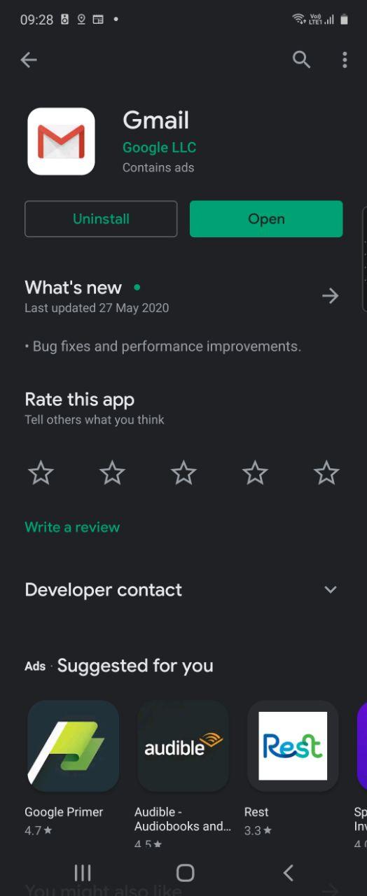
Taking a quick look around recently updated apps on my phone this morning and I noticed the Gmail app was listed. In their usual, highly descriptive way Google has listed bug fixes and performance improvements as the change made.
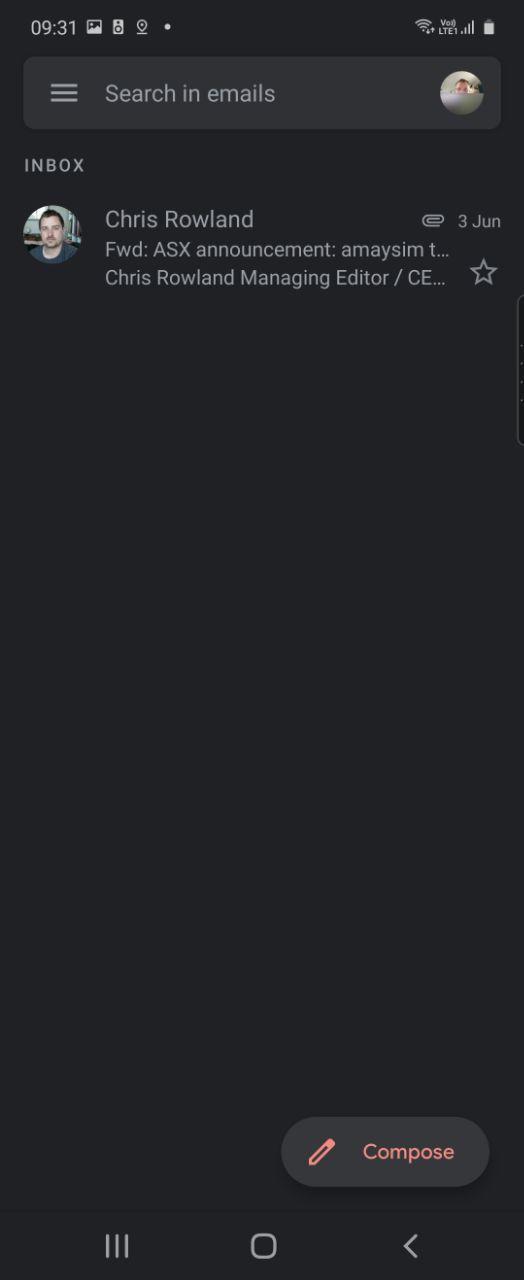
Well, that’s not entirely true since one thing has obviously changed: the compose button. The change is purely cosmetic from the “Google” coloured FAB (Floating Action Button) to a button that specifically says compose. At this stage — time has been limited — it’s the only change we’ve found in the updated app but there may well be more to come.
It’s unlikely that Google has made a change like this without consideration to the future. We’ll be watching other Google apps for similar changes that may signal a new pathway for development and app presentation.
Where do you think a change like this is taking us?


